Pentagram has designed a new brand identity for Rolls-Royce Motor Cars —acknowledging the marque’s extraordinary heritage while effortlessly carrying its unique presence into the future.
Rolls-Royce is synonymous with luxury; the brand is an icon for the very best and truest examples of their kind. The marque has experienced significant change in recent history with an expanded portfolio, an increase in demand for its Bespoke capabilities and the introduction of its Black Badge models. This created an exceptional opportunity to redefine Rolls-Royce’s identity as a luxury brand while asserting its position as the most precious marque in the world. With its unique brand values, it has the power to be a House of Luxury, unlike any other.
Rolls-Royce desired to further its appeal to its growing younger and more diverse demographic while respecting the company’s heritage. Based on a strategy developed by the Rolls-Royce team, Pentagram carefully reviewed each element of the existing brand, looking at its design ethos, its designers, items that are sacrosanct to the marque and the unique relationship the marque maintains with its clients.
The Spirit of Ecstasy is an iconic figurine (designed in 1909 by sculptor Charles Robinson Sykes) which appears on the prow of every Rolls-Royce. The symbol of luxury was carefully redrawn by the design team to work seamlessly across all offline and online platforms and at a wide range of different sizes. When depicted in this two-dimensional form, her direction has changed from left to right, boldly facing the future, reflective of the marque itself.
Placing the Spirit of Ecstasy at the heart of the new brand language marks a shift in resonance from an automotive to a lifestyle context. She commands an aspirational quality in the luxury sphere and, in addition to the motor cars themselves, can now be interpreted as the muse for the marque.
A new visual treatment of the Spirit of Ecstasy was also created to add a cutting edge element to the new visual identity. The team designed a fluid, projection-like pattern which was created through a coding processor—this makes a unique configuration according to scale, colour and composition which can be used digitally and on any surface from projection to embroidery, printing to engraving. It perfectly expresses the Rolls-Royce core brand values, driving forwards and defying expectations.
While the double ‘R’ Badge of Honour remains unchanged, it will appear only on the car itself and as a metal badge, with 3D drawings or reproductions of the badge no longer part of the brand language.
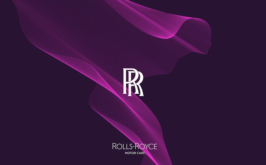
The new, more subtle and refined Wordmark is based on an original art deco drawing of the Rolls-Royce Wordmark from the 1930s. The words ‘Motor Cars’ have reduced in size, with the emphasis reverting to ‘Rolls-Royce’ and special significance has been paid to the letter ‘R’, which helps provide additional stability and prominence.
The new Wordmark celebrates glamour and style, both of which run through the brand’s DNA. It represents a significant shift from the current, more corporate, Wordmark and reflects Rolls-Royce’s famous signature lightness, sophistication and quiet confidence. All these details aim to further move the marque’s identity from the voice of a car company to a House of Luxury.
As an instantly recognisable stamp of quality, the Monogram also remains the same but replaces the Badge of Honour on collateral. All Rolls-Royce’s trademarks now have a clear and consistent rule of application and composition, giving a coherent brand voice wherever they appear.
Moving away from the previous dark-hued tones, the new colour palette is expressive, luxurious, and designed to appeal to both male and female clients. The black brand environment which previously dominated is now replaced by a dark night-like purple named ‘Purple Spirit’. This is accompanied by a series of vibrant accent colours, including fluoro pink and orange, which allows the brand to be calmer or more energetic depending on the context. A secondary colour of rose gold a forms part of the colour palette and is reserved for printed items.
The new typeface Riviera Nights stems from the same family as the marque’s previous font Gil Sans Alt but has additionally crafted and bevelled letters. Working in harmony with the language, it conveys a balance of modernity, finesse and a subtle confidence.
All the new brand elements are designed to work together to create a visual system which projects the Rolls-Royce brand in a quiet and yet impactful way—the new visual identity represents a significant step for the business, taking it beyond what is expected in the current automotive landscape. Moving away from the stereotypical masculine perception of cars, Pentagram’s new brand identity will build a powerful even more extraordinary presence for the iconic Rolls-Royce brand.