‘Color Works’
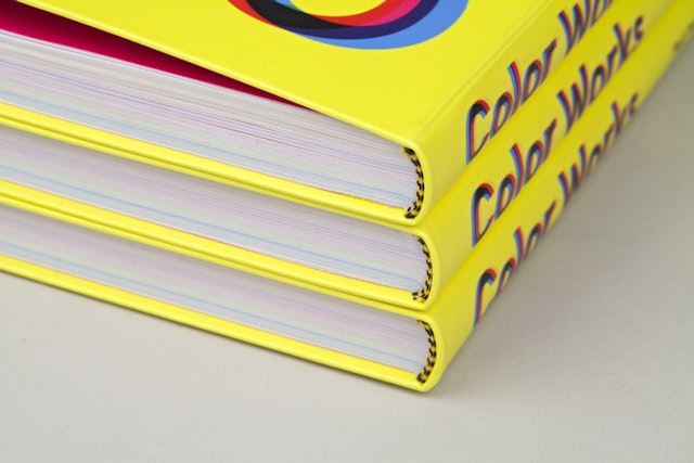
Publications — Feb 12, 2014 The new book is a comprehensive reference for using color in design.From establishing the tone of a brand to setting the mood for an environment, color is an inherent and invaluable component of graphic design—one that designers often use intuitively, without even recognizing it. Pentagram’s Eddie Opara has created a comprehensive new reference for using color in design, Color Works: An Essential Guide to Understanding and Applying Color Design Principles, out now from Rockport. Co-written with John Cantwell, the book is a highly readable primer on everything designers need to know about color, from scientific theory to cultural significance. It also features case studies by leading designers about their most colorful projects, including essays by Stefan Sagmeister, Paula Scher, Michael Rock, Brian Collins, Tony Brook, Gael Towey, karlssonwilker and Matt Pyke (Universal Everything), among others.
Part of Rockport’s “Best Practices for Graphic Designers” series, Color Works was conceived as a guidebook, rather than a rule book. Opara was approached to write the book after appearing at the Print Color Conference in 2011, where he talked about how color choice can make or break a project with a client. (The title of the presentation was “Does Color Kill?”)
Opara never really thought of himself as a color expert, and many of his designs use only black and white. “I wasn’t sure I had anything new to say about the subject,” he says. “But color is such an elemental part of graphic design, and the book made me think about at my own use of color. We all have our hang-ups and favorite colors, but how does that affect our working style? How do we communicate with color?” The book opens with "Chromatophobia", a foreword by Michael Bierut about his own fear of color. Originally written for the book, the essay was recently published on Design Observer.
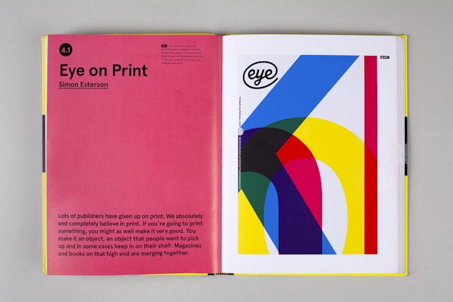
Topics covered in Color Works include color for branding and identity, wayfinding, packaging, editorial design, infographics, motion graphics and digital media. Other sections discuss color and production, new design technology for color, and the subjective aspects of color, and systems of color. The book itself uses color as an organizing principle, with each chapter appearing in a different color. Opara and his designers also developed a system of icons and numbers to cross-reference different chapters and sections throughout the text.
While researching the book, Opara looked back at Interaction of Color, Josef Albers' great classic of color theory. Albers avoided starting his book with the basics of color, opting to jump right into visual exercises demonstrating its use. Opara follows Albers’ lead and opens Color Works with a series of case studies that demonstrate the importance of color in present-day practice. The chapters are grouped by theme, ranging from the use of color to create context and build awareness to the practical concerns of accurate color reproduction. Each chapter opens with a list of eight guidelines for using color related to the topic at hand: "Always consider the context in which you are to use color," "Involve your client all the way through the color process instead of at the end," etc.
Within each chapter, a series of illustrated case studies look at iconic projects that have used color for impact. The essays are written by designers who share their first-hand experience of working with color: Stefan Sagmeister and Tony Brook on using color conceptually; Brian Collins and Michael Rock on color for branding; Paula Scher on helping Tiffany establish its own PMS color; Willy Wong of NYC & Company on using color in the master brand for New York City; Gale Towey on using color to set up themes in Martha Stewart Living magazine; and Hjalti Karlsson and Jan Wilker on using a simple palette of black and white.
“Any color is good, as long as you’re consistent,” writes Scher. “There are no ugly colors; there are only ugly colors in combination. And any color next to white is fine. If your product is linked with a color, and the product is associated with a certain level of quality, that color will be perfect forever.”
Brian Collins writes, “Color is incredibly subjective. I don’t think you see color. You feel it. It’s like music; it goes right through your system.”
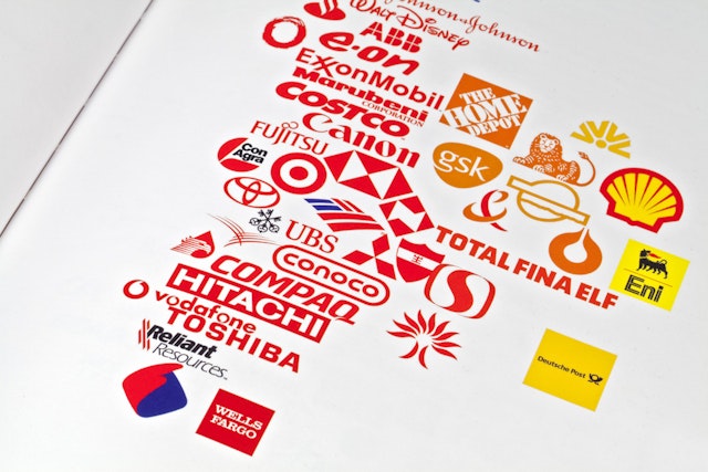
Other case studies look at brands and corporations with a colorful presence, including Pantone, IBM, Lufthansa and Mohawk Paper. A section on color for events features identities for the Olympic Games of 1972 (Munich, designed by Otl Aicher) and 2012 (London, by Wolff Olins). The craftsmanship of color is covered in an essay on the intricate currency design of the Dutch guilder, while the future of color looks ahead to Adobe Kuler, social software that allows users to customize colors and explore what other designers are doing with color.
The fundamentals of color are compiled in a final chapter called “The Foundation,” a handy guide to subjects like the color spectrum, the principles of chromatics, how the eye perceives color, the cultural significance of color, the organization of color charts, and how color combinations work. The section is illustrated with a series of charts, diagrams and infographics, some reproduced from other sources, others newly designed by Opara and his team.


