Giorgia Lupi’s Latest RAND Data Visualization Connects the Dots on Income Inequality
Preview — Aug 31, 2021A large-scale data sculpture inspired by RAND’s public policy research gives physical shape to economic data from the past four decades.

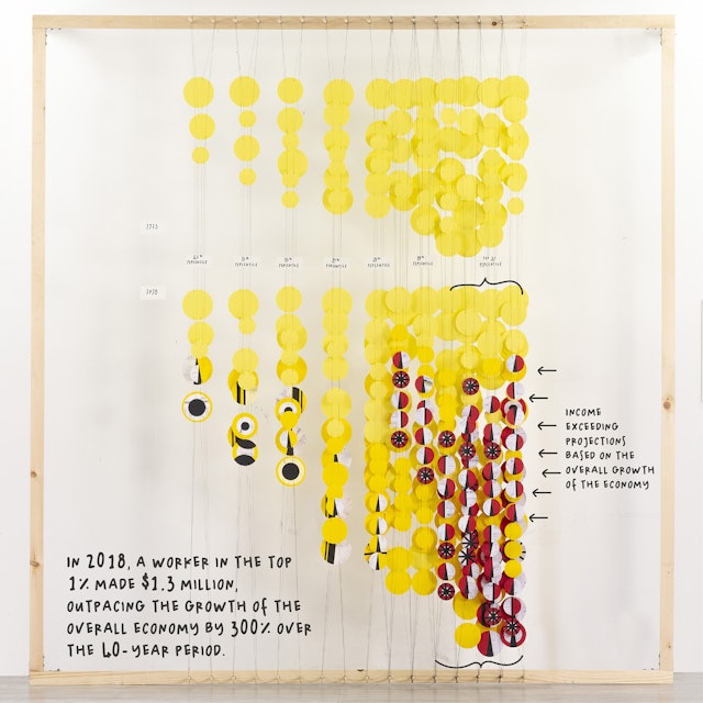
What would income distribution look like today if our incomes grew at the same rate as the economy? Pentagram’s Giorgia Lupi has continued her collaboration with RAND Corporation as their inaugural Art + Data artist-in-residence with “Connecting the Dots on Income Inequality,” a new three-dimensional installation that visualizes how Americans’ income has transformed over the past four decades. Based on new research from RAND, the large-scale data sculpture gives physical shape to the persistent inequalities that are embedded in our economic system.
This is the first time Giorgia has conceived a data visualization as a sculptural installation. The content is based on RAND’s peer-reviewed research paper entitled “Trends in Income from 1975 to 2018,” which uses an unconventional methodology for measuring income inequality—by comparing it to Gross Domestic Product (GDP).

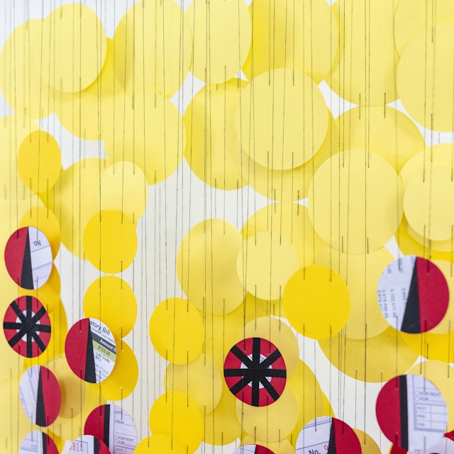

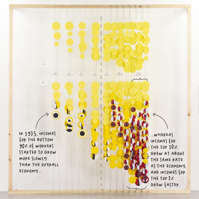
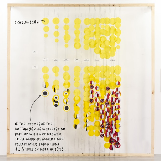
Over the past four decades, the richest workers saw income gains (adjusted for inflation) that exceeded the growth rate of the economy. Starting around 1975, incomes for the bottom 90 percent of individuals grew more slowly than the overall economy, whereas incomes for the top 10% grew about the same rate as the economy, and incomes for the top 1% grew faster. Had the bottom 90 percent kept up with GDP growth, they’d have collectively taken home $2.5 trillion more in income in 2018.
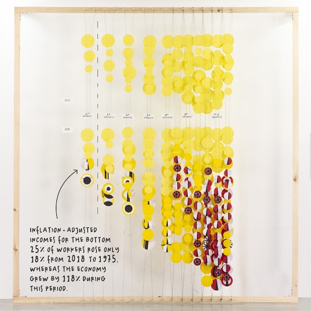
In the installation, each circle represents $10,000 in actual or potential income. The yellow circles at the top show real earned income in 1975 (inflated to 2018 dollars)—with those making the least on the far left (the bottom 25%) and those making the most on the far right (the top 1%).
The bottom half of the installation shows income in 2018. Here, the same bright yellow circles are joined by orange circles to represent income growth. Patterned red circles represent income that exceeded statistical predictions based on the overall growth of the economy—and are only on the higher-income right half of the installation. Patterned orange circles—numerous on the left side of the installation, consisting of the lowest income earners—represent “lost” income, or money they would have earned had their incomes kept up with overall income growth.

In her work, Giorgia utilizes the principles of “data humanism”—using data to uncover the human stories behind the numbers and statistics, and to challenge the idea of data as something that is impersonal and intimidating. Infographics on income inequality typically signify lost income with blank space, and percentiles are an abstract representation that can be difficult to grasp as a portrait of the real world. Giorgia wanted to explore using something physical and tangible to show this gap or absence in a new way, and that these “negative” spaces are not actually empty but represent the missing income of the many people who are not included in the growing economy.
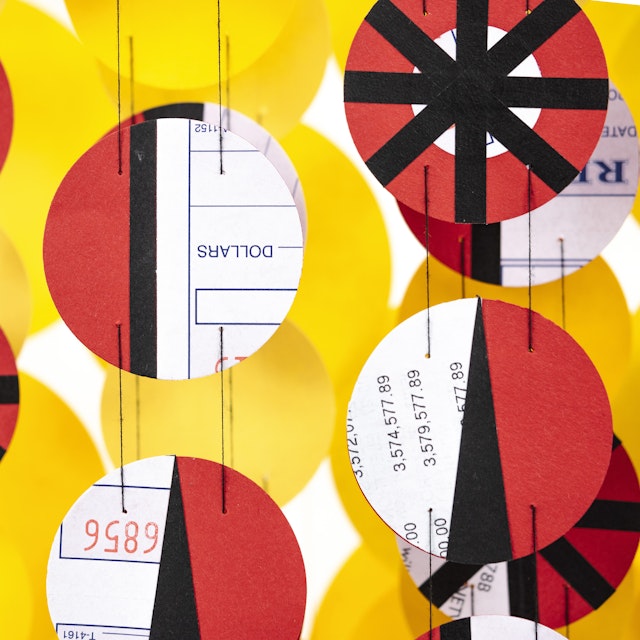
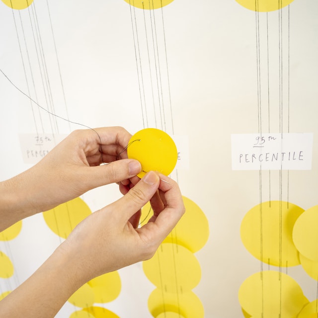
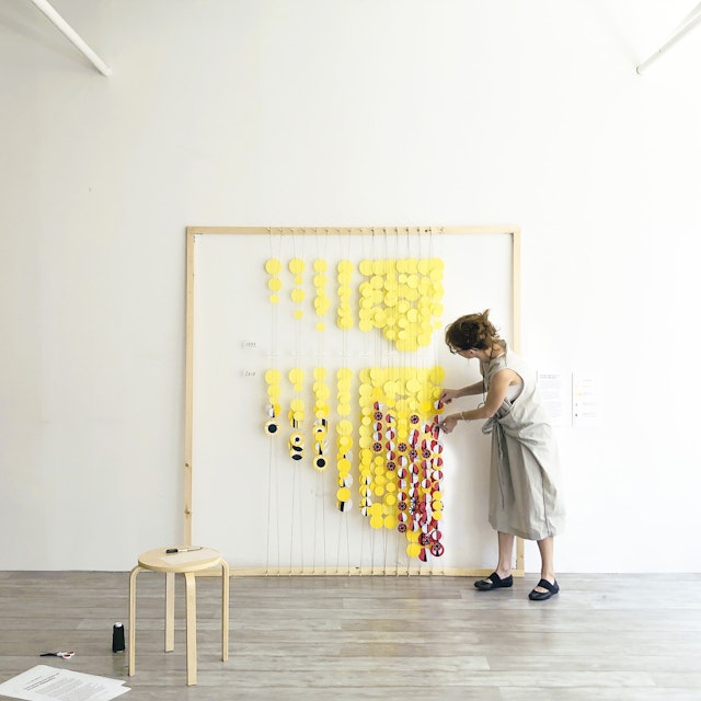
The sculpture manifests the idea of wealth and the accumulation of things with the cloud of coin-like dots that fill the six-foot-square frame. The paper discs are cut from handmade assemblages of found objects including personal checks, receipts, bank statements and other documents, and hang on three layers of string to give the piece a sense of depth and perceived mass. A legend accompanying the installation explains the concept and how to interpret the color and placement of the data.


This is Giorgia’s third visualization for the RAND Art + Data Residency, a new program of the RAND Corporation that merges the worlds of art and data to help people better understand public policy issues. RAND is a nonprofit, nonpartisan research organization that uses rigorous analysis to transform research into fact-based, actionable solutions that empower communities. Giorgia’s previous works in the series looked at mental health in the US and the “Internet of Bodies.”
The Art + Data program is curated by Debbie Millman, designer and host of the award-winning podcast “Design Matters,” and The Gordon Co, a future-focused strategy and branding agency founded by DeeDee Gordon. Each quarter, a different artist will use RAND’s public policy research to create a series of monthly visualizations aimed at building awareness around pressing issues such as healthcare, education, international affairs, energy and the environment.
Project team: Giorgia Lupi, Ting Fang Cheng, Sarah Kay Miller, Phil Cox, Jackson VanGee