The New School: Year One
Preview — Mar 30, 2016 Paula Scher writes about how her identity for The New School has come to life since its launch a year ago.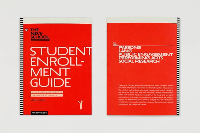
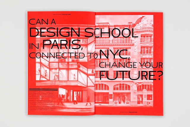
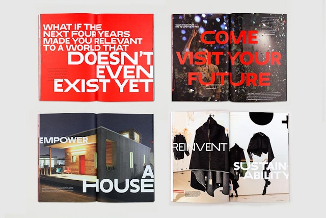
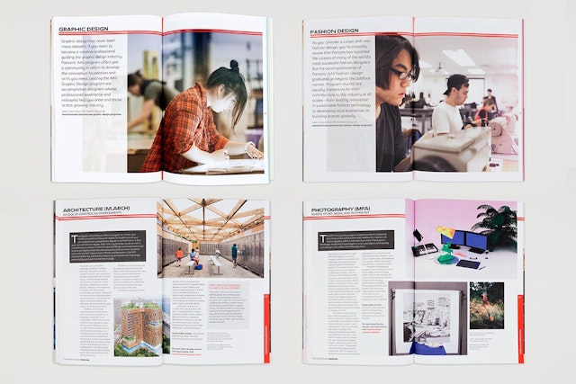
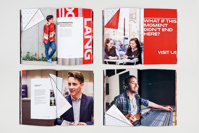
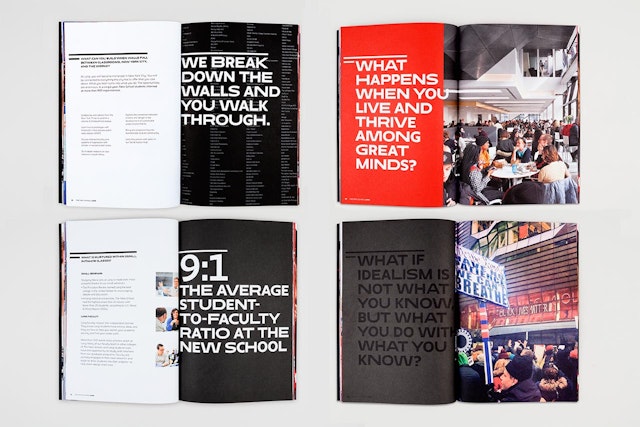
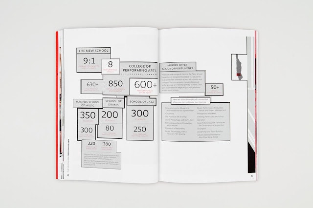
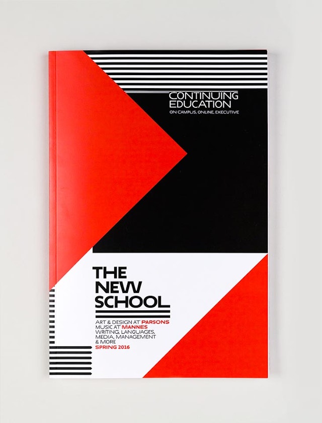
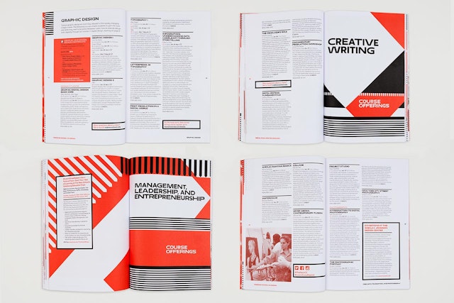
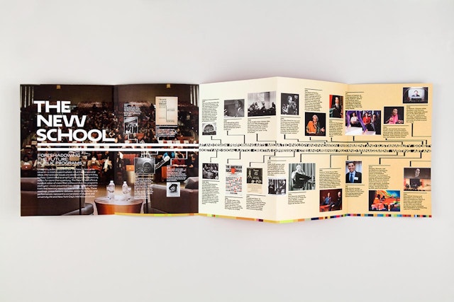
In the year following the launch, The New School in-house art department has continued to explore the possibilities of their font Neue in the creation of catalogs, magazines, invitations and sniped posters, and building out a broad new communications program. The website continues to evolve and is regularly updated. This work is presented here.
A year ago, our new identity launch was controversial. Many critics complained about the wide “W” in The New School logotype. Others claimed the logo resembled “Star Wars” type. Since that time, there have been other identity launches that have received similar aesthetic criticisms that generally have to do with some form of eccentricity in the logo type. This form of instantaneous criticism seems to define an identity as a launch of a logotype separate from the system that will communicate the entire message. It isolates a component without real context or knowledge of intent and purpose. And it separates an identity from its institution and its audience. It is akin to reviewing a three-act play when the curtain goes up.
The New School’s identity will evolve and change with the institution. It is a living, breathing organism, not a rigid, fixed rule. Other weights of the typeface Neue will be added and different opportunities to extend and enlarge the system will be explored. The in-house art department and the students now own the system. Pentagram will begin to create the permanent signage, but the institution itself is still evolving everyday, and the identity will evolve with it.
Consider this work the end of Act One. We are looking forward to seeing Act Two.


