The Public Theater 2014-2015 Campaign
Preview — Sep 03, 2014 The iconic institution gets a new slant for the 2014-2015 season.
Pentagram's Paula Scher puts a new slant on her iconic identity for the Public Theater in the campaign for the institution's 2014-2015 season, launching this month. Designed with Kirstin Huber, Senior Graphic Designer at the Public, promotions for the upcoming slate of productions use skewed typography for a dynamic take on the theater's signature look. The campaign marks the 20th anniversary of Scher's continuing collaboration with the Public.
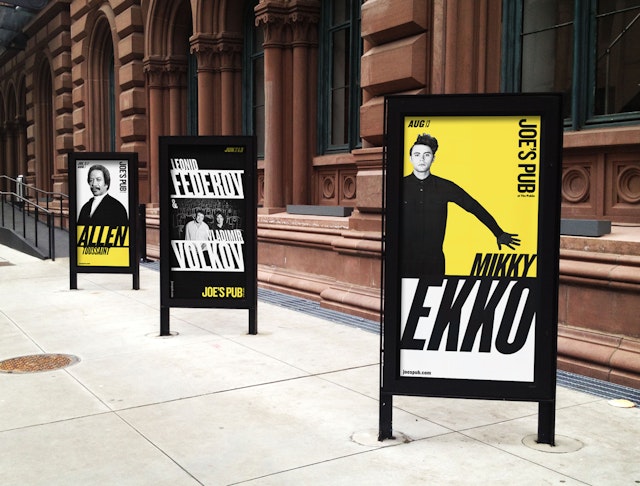
The new approach was first introduced in the campaign for this summer’s edition of Shakespeare in the Park. Set in Knockout, the font of the Public identity, the season typography skews right or left in alternating bands or plays off strong photography. The campaign updates the classic pop look of the Public Theater graphics, which incorporate photographic images against flat color backgrounds, this time in an arresting palette of black, white and yellow.
The graphics makes a dramatic impression on the street outside the Public, where the campaign has been installed in poster boxes that flank the theater's entrance, as well on matching banners on the restored façade. The campaign can also be seen in a season brochure, in print advertisements in major publications, and on the Public’s redesigned website.