
Designers imagined a history for the Ablixa brand and wanted to introduce a human element to the identity, so people could relate to how it made them feel.


The program has all the hallmarks of big pharma branding, including a scarily upbeat logo that appears everywhere in the film.


Feeling tired, depressed or not like yourself? Perhaps you’d like to try Ablixa, the wonder drug at the center of "Side Effects," the 2013 film directed by Steven Soderbergh and written by Scott Z. Burns. In the film, a psychological thriller, Emily Taylor (played by Rooney Mara) is a depressive who is prescribed Ablixa by Jude Law’s Dr. Jonathan Banks, with deadly results. The movie also stars Channing Tatum and Catherine Zeta-Jones.
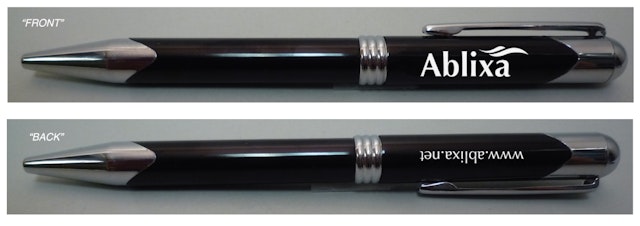
The fictional drug Ablixa plays a pivotal role in the film, and the filmmakers turned to Pentagram’s Emily Oberman, a friend of Burns, to create a realistic identity and branding for the anti-depressant. Oberman and team developed a program that has all the hallmarks of big pharma branding, including an scarily upbeat logo that appears everywhere in the film; pill packaging, marketing literature, a website and promotional items like mugs and pens; and a commercial for the drug, narrated by Oberman herself in its online version. Pentagram’s New York office briefly appears in the film as Mara’s workplace, where her character Emily sits at Emily Oberman’s desk. (Spooky!)
In his review of "Side Effects," A.O. Scott of The New York Times gives the ad a rave: “The embedded commercial is a perfect parody of something that has become very familiar in recent years: a vague and seductive montage of sad and happy scenes accompanied by new-agey music and, interrupting the inspiring sales pitch, a sotto voce recitation of warnings and possible complications.” The Ablixa identity is so authentic it merited a critique on Brand New, where many commenters thought they were looking at an actual brand.
Because of the important role it plays in the story, Ablixa had to look like a convincing pharmaceutical product with a vaguely sinister undertone. The designers created branding that is a compendium of many of the clichés that define the product category.
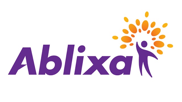
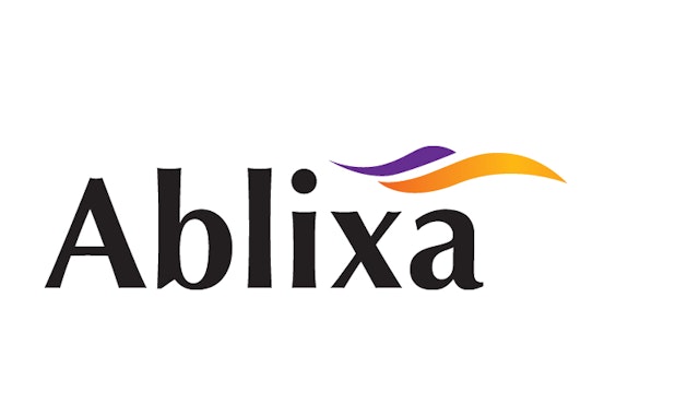
The identity included a redesign; during production, the filmmakers had created a placeholder logo that served as a starting point. (The redesign of the logo was considered as a possible plot point in the film.) The Pentagram designers imagined a history for the Ablixa brand and wanted to introduce a human element to the identity, so people could relate to how it made them feel. Having never designed a pharmaceutical logo before, the team did research into what makes a successful logo for an anti-depressant and found that some representation of the human form and symbol or sign of improvement or safety was often combined with typography that hinted at strength and a speedy recovery.
The resulting identity conveys the sense of overwrought optimism that we’ve come to expect from multinational corporations that are trying too hard. The logo is set in an aggressive, customized Futura Bold Italic, paired with a happy humanoid figure with a sunburst “crown” that illustrates the feeling of security and newfound joy that surrounds the patient. The shape of the pill is used to create the sunburst around the figure, and this feel-good “halo” also appears around patients in the TV commercial. The designers kept the purple and orange colors of the “original” identity to maintain continuity across the rebrand.
Office
- New York
Partner
Project team
- Jonathan Correira
- David Balsamello
Collaborators
- Erica Gorochow, animator
