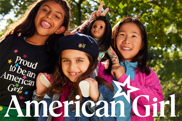
The new identity and brand strategy draw on American Girl’s own rich history to build a more premium and cohesive experience of the brand.


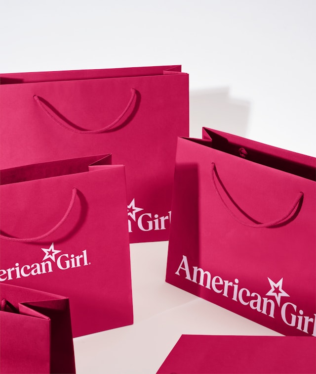
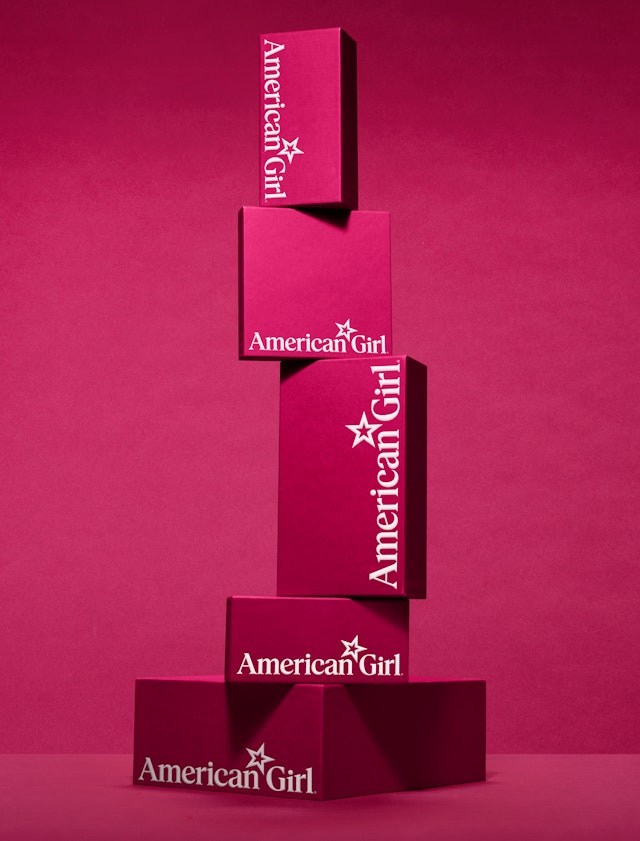
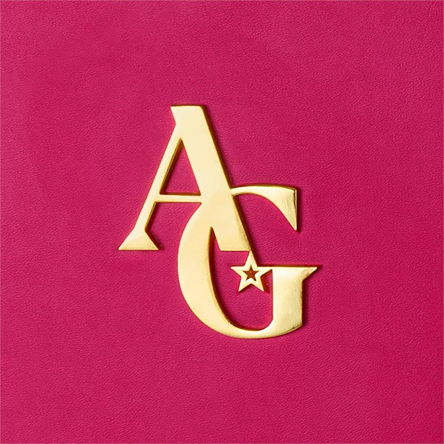
The updated wordmark is simultaneously nostalgic and modern, with stronger typography that is more powerful and confident for the girls of today.
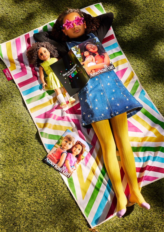
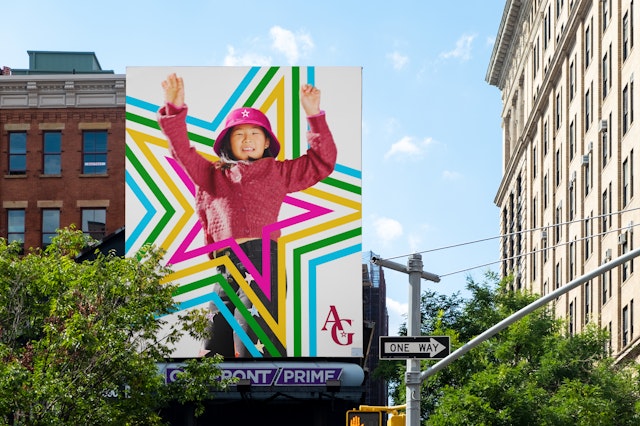
Historical patterns inspired by the original doll collection join the other updated brand elements to create a flexible visual language that can be endlessly reinvented.
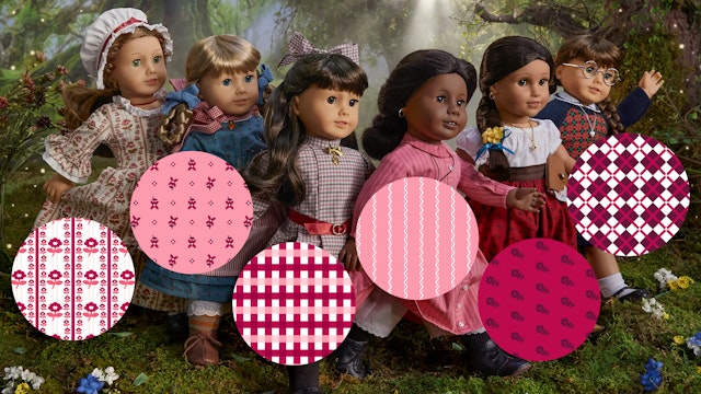
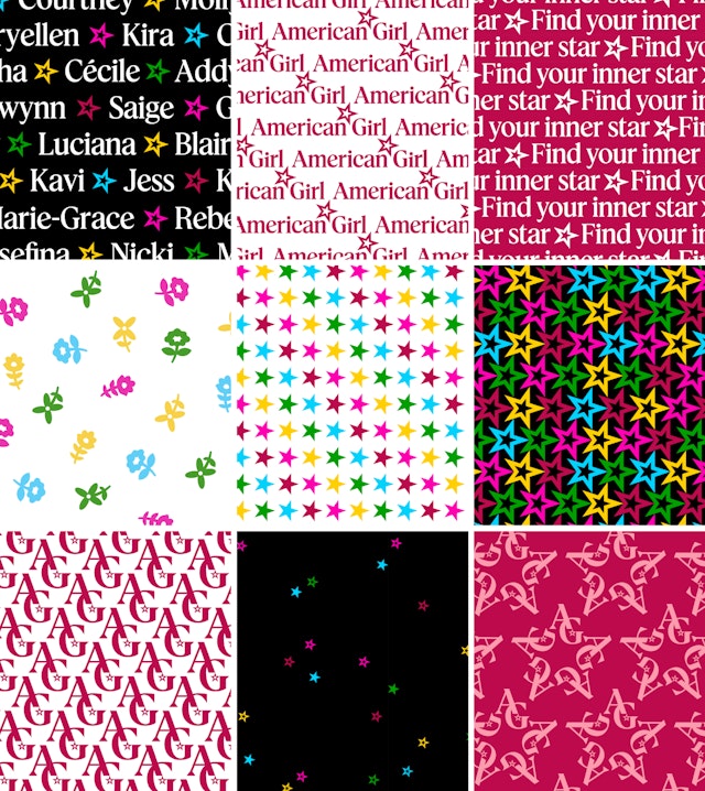



American Girl is known for its signature berry color, and the update establishes a richer, brighter berry that will give the brand its own ‘Tiffany Blue.’
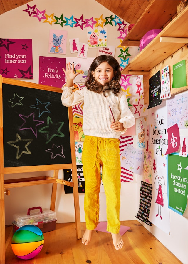

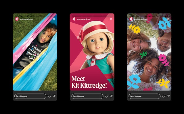
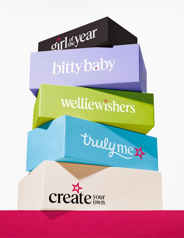
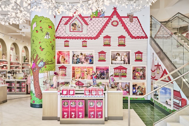
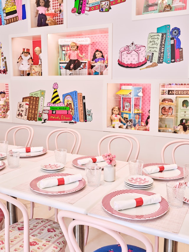
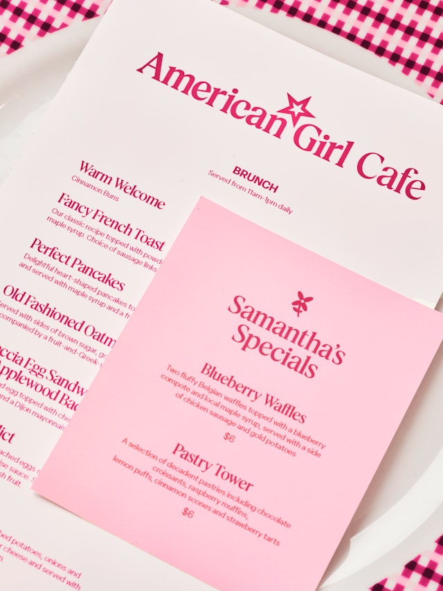
The refreshed identity extends to all touchpoints of the brand, from shopping bags, doll boxes and other custom packaging to books, catalogues, the American Girl website and social media, and art direction for store interiors.





Certain brands from our childhood are so beloved that they are foundational to our lives, helping to shape who we become. American Girl is one of these rare guiding stars. Originally created by Pleasant T. Rowland in 1986 and now part of Mattel, the iconic line of 18-inch historical dolls and their accompanying books have inspired millions of girls to grow up with courage, confidence, and strength of character.
Pentagram has developed a new visual identity and brand strategy for American Girl that draws on the company’s own rich history to build a more premium and cohesive experience of the brand. The framework encompasses a new wordmark, bespoke typeface, expanded color palette, packaging, environmental graphics and an array of historically inspired patterns, glyphs and other graphic elements to create a distinctively ownable, playful and modern system. The brand positioning, brand voice and messaging recenter storytelling to authentically speak to a new generation of girls and share the “Exceptional Story of Girlhood.”
The Pentagram team collaborated closely on the project with the leadership at American Girl, including President Jamie Cygielman, Creative Executive Kristina Duncan, Creative Advisor Nancy Arnold and Creative Director Yen Nguyen. The evolution represents the first significant refresh of the brand since it launched almost four decades ago. American Girl is now a legacy toy brand that families love and trust, but as it grew over the years and new product lines were introduced to reach a wider age range, the overall impact was diminished. At the same time, the doll category that American Girl helped establish became more crowded with competing brands. The company needed to rediscover the essence of the brand and revitalize its strengths.
The moment was right for a rebrand; the dolls’ original millennial fans are now becoming parents themselves, and American Girl has seen a resurgence in its pop-culture profile—in references ranging from “Saturday Night Live” and online memes, to a serious cultural history and think pieces in The New York Times, The New Yorker and The Paris Review.
Storytelling is what makes American Girl completely unique from every other doll on the market––even from her Mattel sister Barbie. The books encourage girls to read by making each doll the lead character in her own engaging tale set in a different period of US history, such as pioneer girl Kirsten Larson on the frontier in 1850s Minnesota and spirited Molly McIntire on the US homefront during World War II. What started with the stories of the dolls has expanded to represent the multifaceted experience of how wonderful, magical and challenging growing up really is.
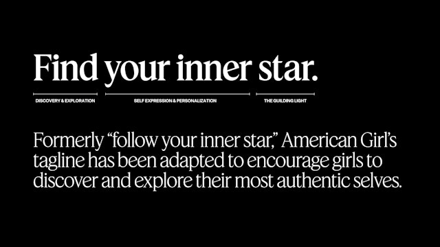
The Pentagram team immersed themselves in the rich visual history of American Girl. After conducting a comprehensive audit, they developed a brand strategy that sets AG apart by combining its premium, elevated quality with the special spot it occupies in girls’ lives, positioning it as uniquely telling the “Exceptional Story of Girlhood.” A new brand tagline, “Find your inner star,” supports a spirit of independence and self-reliance.
This new sense of purpose is infused into an updated wordmark that is simultaneously nostalgic and modern. Stronger, thicker typography gives the logo a bolder presence that is more powerful and confident for the girls of today. The star has been moved from its position in front of the previous logo to a spot between the two words, visually echoing the new tagline and messaging that it was inside them all along. A new monogram version also places the star within.
A subtle spin on the star also helps tell the brand story. The iconic symbol has been redrawn and the angle has been adjusted slightly to 18 degrees, a nod to the 18” tall dolls. This upward slant becomes a part of the letterforms of the logo, with customized typography that incorporates the angled shapes and points of the star. The two lowercase “i”s in the logo, one big and one little, also tell the story of a girl and her doll.
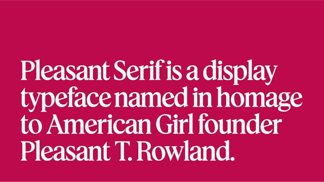
The typography of the new wordmark extends to a proprietary typeface—named Pleasant Serif in homage to American Girl’s founder—with the 18-degree star angle applied to crossbars and wedge serifs. Pentagram worked with Commercial Type to evolve Feature Display into a purposeful, elegant serif with proportions similar to the original logo. Supporting type is set in the sans Elza (by Blackletra). The fonts were intentionally selected to reference the friendly and outgoing look of American Girl in the 1990s, when the brand hit its stride as a phenomenon.
The assertive logo is matched by a bold approach to color. Since the beginning, American Girl’s branding has been recognizable for its berry hue, but the color has fluctuated across countless variations. The rebrand establishes a consistent signature berry that will become AG’s own “Tiffany Blue.” Named Pleasant Berry, the brand color is richer and brighter, for an elevated and premium look, and extends to a larger palette that the designers have dubbed the “Berry Patch”—shades, tints and tones that range from Cream to Blackberry. These classic colors are accompanied by a secondary palette of core brights, a fresh, contemporary take on four hues—sky blue, green, yellow and hot pink—also inspired by the AG branding of the 1990s.
Historical patterns inspired by the original doll collection join the other updated brand elements to build a flexible visual language that can be endlessly reinvented. The versatile star can repeat or radiate to make its own patterns, or be used as a window or portal for images. Traditional graphic elements like borders look back to the past, but in a way that feels unmistakably like American Girl. The brand’s signature silhouette of a girl reading has been expanded into a series that is more inclusive, as well as icons of several of the historical dolls and other period ephemera.
American Girl’s focus on the power of individuality is highlighted with a new photography direction that feels more real and authentic, showing girls living their lives. Contemporary illustrations by Joana Avillez put a new spin on the meticulously detailed look of the brand’s past hand-drawn style, familiar from collectible “grin pins,” posters and the American Girl books and magazine––now incorporating hidden stars as Easter eggs for fans.
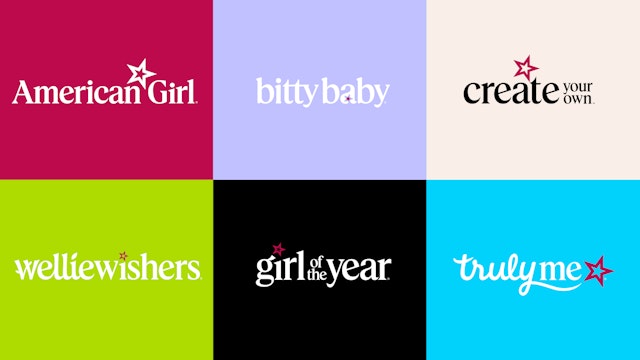
Identities for American Girl sub-brands—Truly Me, Bitty Baby, WellieWishers, the annual Girl of the Year, and Create Your Own, the most premium line—have also been updated to tie them into the parent system. The type of each is styled in a way that nods to their past logos and differentiating brand features, but integrates the new star.
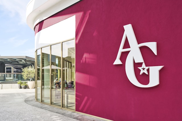
The refreshed identity extends to all touchpoints of the brand, from shopping bags, doll boxes and other custom packaging to books, catalogues, the American Girl website and social media, and art direction for store interiors. The branding comes together in the immersive play experiences at the popular American Girl stores, including the new Los Angeles flagship that opened in September 2023. Pentagram developed a comprehensive consumer products guide for a consistently confident look and feel as American Girl continues to grow and inspire a new generation of modern girls.
The Pentagram team was made up of true American Girl superfans—many of whom still have their dolls from childhood—and the project offered us an unforgettable opportunity to help shape the world of a brand we love.
Office
- New York
Partner
Project team
- Laura Berglund
- Elizabeth McMann
- Katherine Killeffer
- Meredith Zerby
- Anastasia Kharchenko
- Beatriz Congar
Collaborators
- Joana Avillez, illustrator
- Madeline Tolle, photography
- Claudia DiMaio, photography
- Guillermo Cano, photography
