

The choice of sans serif allows for the broadest range of interpretations and inclusivity, appropriate for an organization that is meant to represent a large community of design professionals in the 21st century.


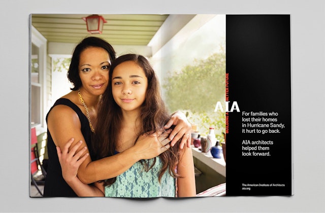


The American Institute of Architects is the country's largest professional association of design professionals. Nearing its 160th year and facing challenges familiar to many professional organizations (the global economic downturn, the revolutionary effect of technology, an ever-more-diverse potential membership base), the AIA undertook a sweeping repositioning process, intended to reinforce the relevance of the AIA for members and the general public alike. Pentagram was selected as design consultants to support the communications process, developing a distinctive brand identity and a new proprietary typeface, AIArchitype.
The designers worked closely with the AIA's Chief Executive Officer Robert Ivy and the organization's national leadership on the project, as well as with consultants LaPlaca Cohen. Following a comprehensive research process that polled both internal and external audiences, benchmarked competitors, and examined the challenges facing the organization, Pentagram began to create graphic elements that could be used to mark the "new AIA." A custom designed font unifies all the repositioning communications, both online and in print.
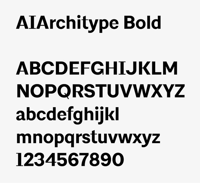
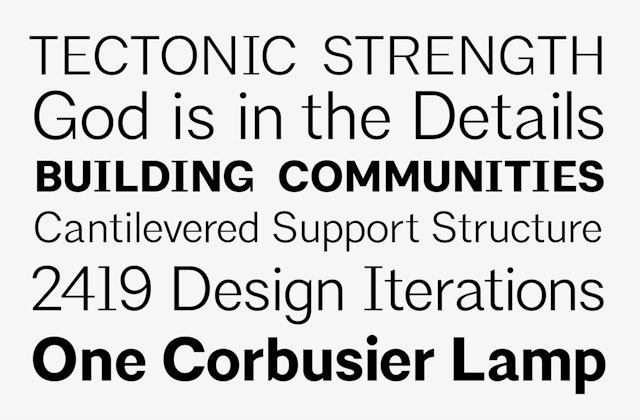
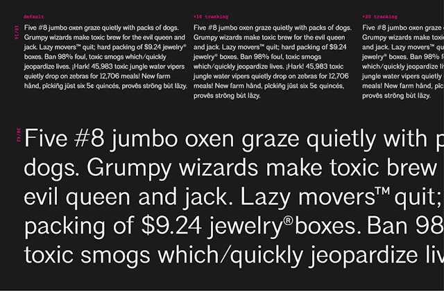
The custom font, AIArchitype, was designed by Pentagram and drawn by type designer Jeremy Mickel. Crafted from a hybrid of two classic sans serif fonts, Akzidenz Grotesk and Trade Gothic, it is intended to combine neutrality and distinctiveness. The choice of sans serif allows for the broadest range of interpretations and inclusivity, appropriate for an organization that is meant to represent a large community of design professionals in the 21st century. At the same time, the typeface has a distinctive capital I, which sits in the middle of the AIA monogram, and suggests a Doric column. The narrow serifs on the I carry through to many other horizontal typographic elements, such as the bar on the letters E and F. The program retains the AIA's established color palette of black and red.
More important than fonts and colors is a new approach to communicating the organization's goals and value. The communication plan reflects the AIA's multiple audiences. For members, a video manifesto makes the case for membership by acknowledging architecture's ultimate goal—to build a better world—and reminding its members that this is necessarily a collective activity. At its conclusion, the new font is applied to an animated treatment of the logo of the AIA wordmark that reveals the "We" within the "I" of the organization's acronym.
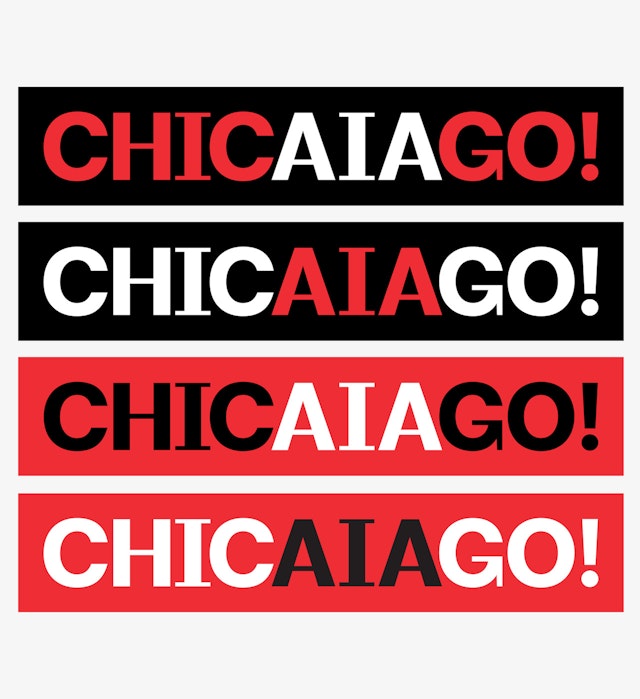
Advertising has been created to remind the general public that it's people, not buildings, that are the focus of an architect's work. And Pentagram's graphics for the 2014 convention echo the event's theme, “Design with Purpose,” and reinforce the allure of the location with sly references to Chicago's master planner Daniel Burnham, who famously said, “Make no little plans. They lack the magic to stir men's souls.”
Office
- New York
