


The identity centers on a distinctive letter ‘B,’ with simple geometry inspired by the shape of a ticket, that dynamically scales and stretches.

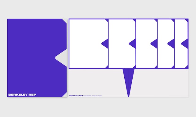

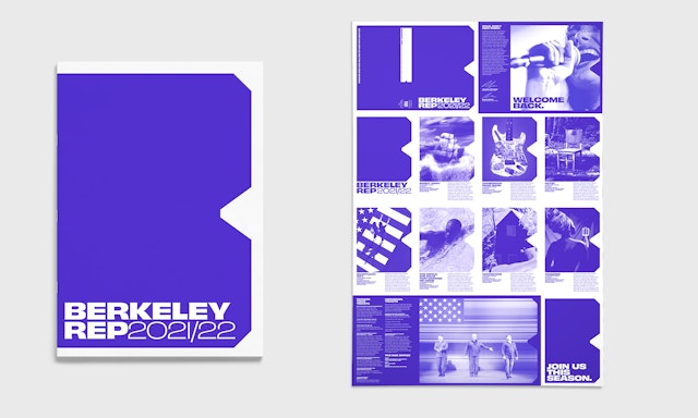

The logo is the basis for a system that connects affiliated identities, making them instantly recognizable as part of Berkeley Rep.




The Berkeley Repertory Theatre in Berkeley, California, is one of the leading regional theaters in the US and internationally renowned for creating ambitious theater that entertains and challenges its audiences. Pentagram has designed a new brand identity for Berkeley Rep that establishes a bold and contemporary visual language for the theater in line with its programming and reputation. The identity centers on a distinctive letter “B,” with simple geometry inspired by the shape of a ticket, that dynamically extends across a range of brand expressions.
Pentagram collaborated closely on the project with leadership at Berkeley Rep. The nonprofit has been a home for emerging and established artists since 1968 and is a past Tony Award winner for Outstanding Regional Theater. Among its many notable productions are the Pulitzer Prize winning play “Fairview,” and the musicals “Passing Strange,” “American Idiot,” “Ain’t Too Proud,” and “Paradise Square,” which is moving to Broadway in 2022. The company has two theaters and a campus in West Berkeley and is home to a nationally recognized School of Theatre.
The organization needed a cohesive identity that would put Berkeley Rep front and center and promote the institution as a whole, along with its individual productions. The new logo is flexible and responsive, easily adapting to everything from posters, promotional campaigns and advertising to the website, social media and digital tickets.
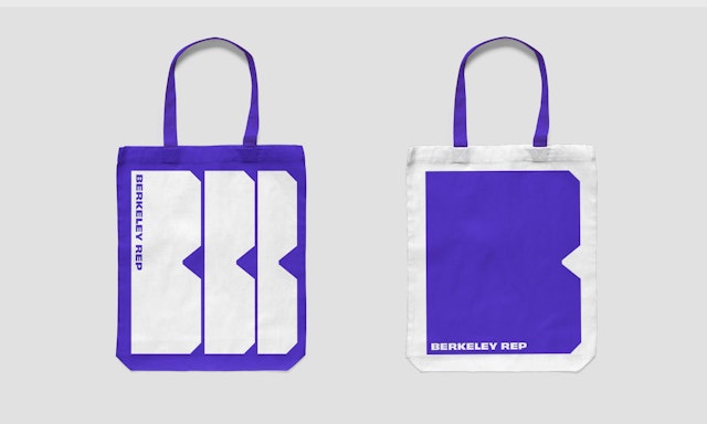
The “B” is carefully styled and structured to scale and stretch without losing its legibility as an icon. The dynamic volume reinforces the idea of Berkeley Rep as a multifaceted space for performance and theater as an immersive experience for audiences. The logo can extend across the website homepage or the top of letterhead, or rise vertically to fill the frame of a poster. It can also be used as a container shape or window for imagery from productions, or appear in graphic patterns.
The logo is the basis for a system that connects affiliated identities such as the School of Theatre, The Ground Floor and the Ovation Gala, making them instantly recognizable as part of Berkeley Rep. Each is represented with its own letter, with the notch and chiseled corners of the “B” carried throughout.
The identity appears in a striking shade of “Berkeley blue.” Primary typography is set in Obviously, a multi-purpose sans serif (designed by Oh no Type Co.) with a range of widths that echo the versatility of the logo.
