
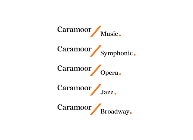


The slanted line also suggests a baton and can be used as a graphic divider, setting up sub-brands for different types of programming at Caramoor.

Located in Katonah, NY, 50 miles north of New York City, the Caramoor Center for Music and the Arts offers performances by world-class musicians in the spectacular setting of a historic Italianate villa and its gardens. Best known for its summer Music Festival, Caramoor presents year-round concerts in classical music, opera, jazz, and other musical forms, as well as an arts museum and educational programming. Pentagram has designed an elegant new identity for Caramoor that is inspired by the institution’s unique setting and history and the forms of musical notation.
Built in 1929, Caramoor was the estate of Walter and Lucie Rosen, who used it as a summer home and country retreat and hosted legendary musical evenings on the grounds. (The estate is named for Caroline Moore Hoyt, the property’s original owner and a family friend.) Listed on National Register of Historic Places, the Rosen House at Caramoor is a beautiful Mediterranean-style villa that incorporates entire historic rooms from European palaces and manors and is situated in a series of picturesque gardens. As their concerts grew in popularity, the Rosens opened them to the public, establishing the Caramoor International Music Festival in 1945.
Caramoor is now a prestigious center for the performing arts that stages concerts ranging from classical music, opera, chamber music and jazz to world music, American roots music, Broadway and pop. Its 90-acre campus features a variety of performance spaces, including the Music Room of the Rosen House, the Spanish Courtyard and the 500-seat Venetian Theater, built in 1958.
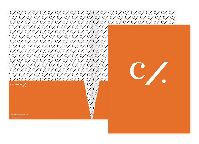
The designers have created a modern identity for Caramoor that conveys its importance as an institution. The simple, graceful forms of the identity are inspired by musical notation. The “C” resembles the symbol for common time, while the slanted line and dot are found in the mark for a musical simile, or segue. The slanted line also suggests a baton and can be used as a graphic divider, setting up sub-brands for different types of programming at Caramoor.
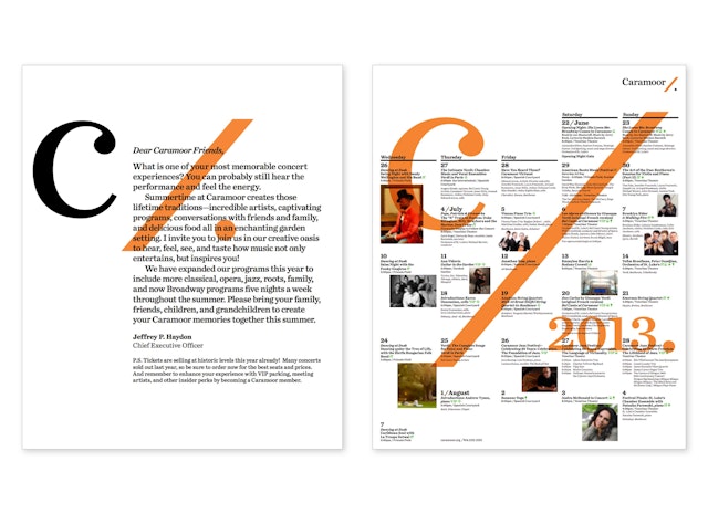
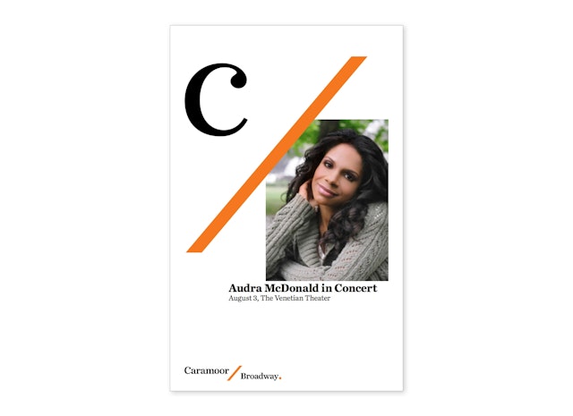
In print and online applications, the identity can be layered with typography and images to create a sense of depth and texture that suggests a kind of musical polyphony, or different parts coming together. The forms of the identity can also be arranged in patterns. Typography is set in Chronicle Text.
Office
- New York
