

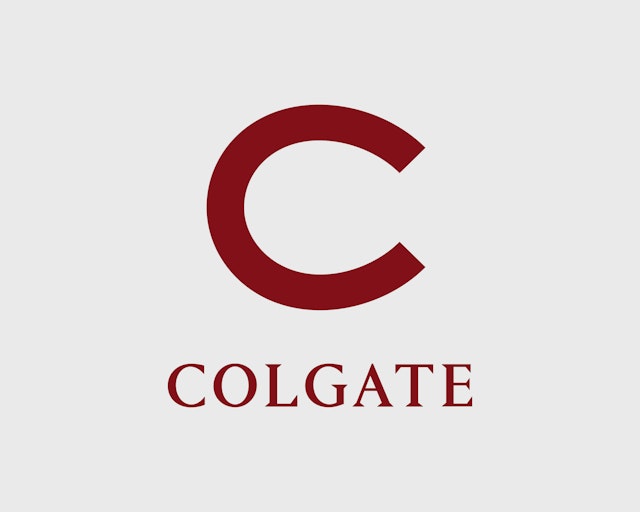


The identity draws on Colgate’s heritage to create a modern system that reinforces the university’s bold, forward-thinking direction.
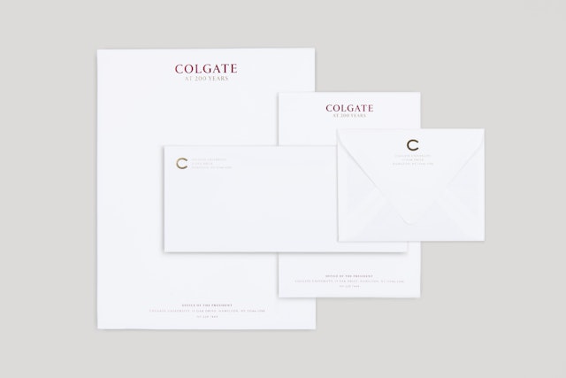



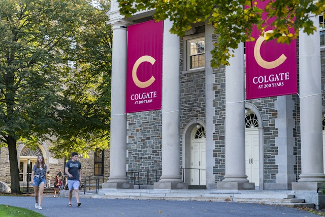





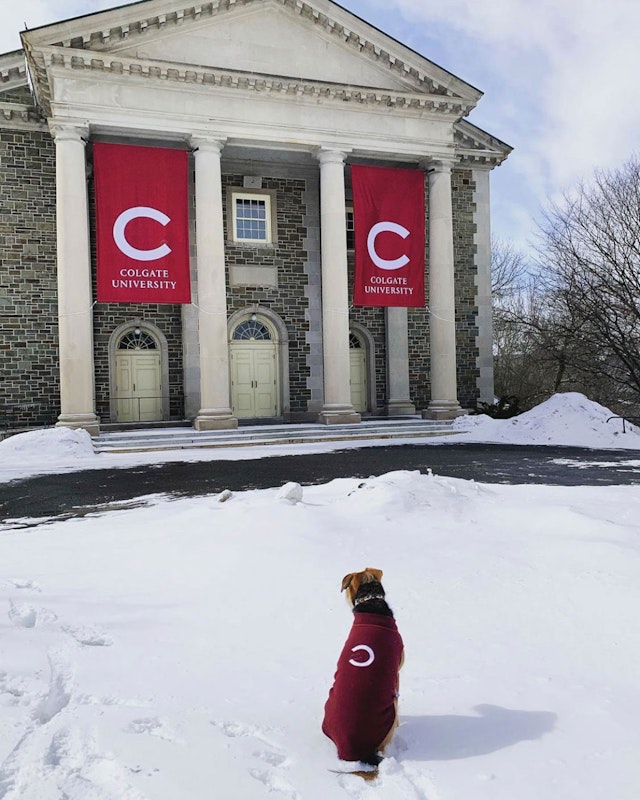
The distinctive ‘C’ lettermark makes an impact across various scales and contexts, from publications to athletics uniforms and banners.






Colgate University is a prestigious private liberal arts college located in Hamilton, New York. Founded in 1819, the school is one of the finest undergraduate institutions in the U.S., offering the quintessential college experience with a rigorous academic program, world-class faculty and Division 1 athletics on one of the most beautiful campuses in the country.
Pentagram designed a new institutional identity for Colgate that draws on the extraordinary heritage of the university to create a modern system that reflects its bold, forward-thinking direction. The program centers on a distinctive monogram “C” inspired by the school’s history and first launched with branding that celebrated the university’s bicentennial in 2019.
The Pentagram designers collaborated closely on the project with President Brian W. Casey and the communications team at the university. Colgate wanted to use the occasion of the bicentennial to connect with students, alumni, faculty and the community at large and to communicate its ambitions for the future. Following the anniversary, the system would be adopted as the new institutional identity.
The visual refresh was accompanied by a verbal creative strategy, developed with Ben Feller at Mercury, that highlights the qualities that set Colgate apart. These are outlined in a new positioning statement: “The school of first choice for students who seek rigorous classes, passionate faculty, a campus of enduring beauty, and the assurance that they will learn to thrive in work and life.”
This positioning helped guide the look and feel of the branding, which links Colgate’s time-honored history with the vibrancy of the student experience, and the friendly, intimate feel of the campus with the vast field of studies offered. The designers developed a graphic toolkit of core elements that give the University’s in-house design team a high degree of creative flexibility. The guidelines specify approaches to illustration and photography, leaning into the natural beauty of the campus and the overall style being contemporary yet grounded in 200 years of history.
The primary mark is based on a bold letter “C” originally printed on the 1904 edition of the Salmagundi, the Colgate yearbook that has been published since 1883 (the title means “smorgasbord”). Researching the school’s heritage, the designers also found the “C” on sports jerseys from the 1930s-1940s. Despite being created over a century ago, the letterform is remarkably modern in design, providing a bridge between past and future. The mark functions across scales, working well as a monogram at smaller sizes while still making an impact when used large on athletic uniforms and banners.
The Colgate wordmark is set in the typeface Portrait (designed by Berton Hasebe at Commercial Type), a chiseled serif based on French Renaissance proportions. The logotype appears in all uppercase, a change from the previous logo that gives the mark strength, gravitas and confidence. The identity’s primary typeface is Messina (designed by Luzi Type Foundry), used in both its Serif and Sans versions for a typographic voice that spans from classic to contemporary.
The color palette was extended and a bright maple red added to Colgate’s official color of maroon to provide a jolt of energy to key applications. Gold was introduced for bicentenary materials.
Nestled on a tree-covered hillside, Colgate is known for the scenic beauty of its classic college campus in the heart of Central New York. This is shown off in an official illustration of the Colgate landscape rendered as a traditional black-and-white engraving. Originally drawn by Steven Noble for the school’s bicentennial, the image depicts the natural and architectural features and scale of the campus and ties into a greater use of illustration across the identity.
The striking naturalism of the engraving is complemented by new guidelines for the art direction of photography that feels authentic and true-to-life, and that captures the energy of students and faculty and the diverse fields of study the school has to offer.
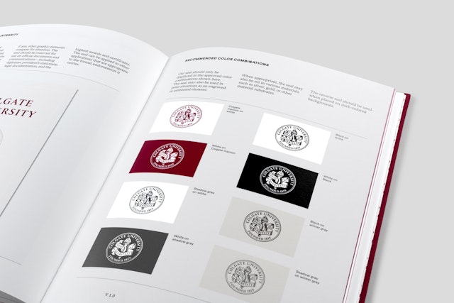
The campus etching also echoes the look of Colgate’s long-standing presidential seal. The designers redrew this symbol, refining it slightly to optimize it for modern reproduction and digital contexts. To retain the classic quality of the school’s earlier seals, the team commissioned the English printmaker Chris Wormell to render the update using a traditional wood engraving technique.
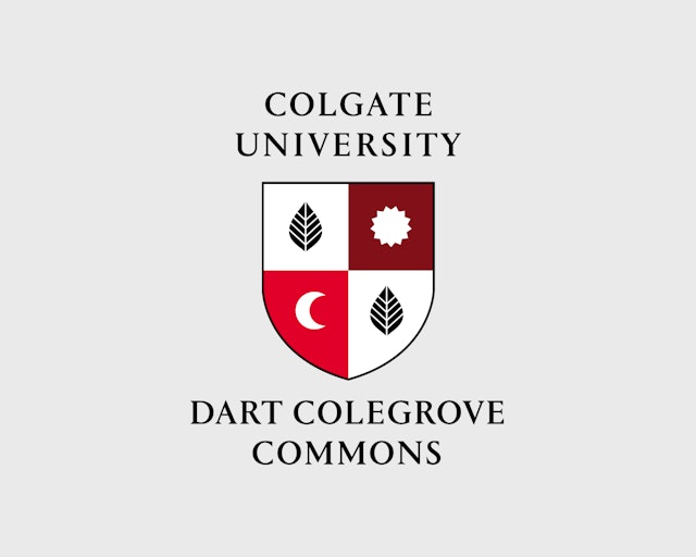
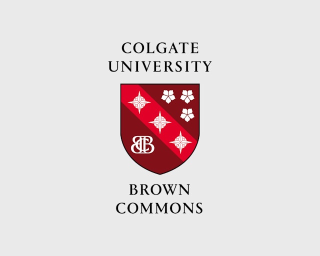
To strengthen students’ connection with the school, the team created shields for Colgate’s four Residential Commons, the communities within which incoming students live for their first two years and with which they continue to affiliate throughout their four years on campus. Each crest features iconography that visually represents the individual the commons is named after and symbolizes their lives as exemplary figureheads of the school, encased within a heraldic family shield shape.
Office
- New York
Partner
Project team
- Jenny Hung
- Shigeto Akiyama
Collaborators
- Ben Feller, Mercury, strategist
