Cote combines the flavors and ambience of Korean barbecue with those of the classic American chophouse.
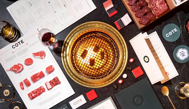

The branding strikes a balance between elegant and cheeky, contributing to the convivial atmosphere.


Gogijib or go home at Cote, New York’s first Korean steakhouse and one of Eater and GQ’s Best New Restaurants in America. Located in the Flatiron District, the hotspot was founded by restaurateur Simon Kim and combines the flavors and ambience of Korean barbecue with those of the classic American chophouse. Pentagram created the brand identity, messaging, website, and environmental graphics for Cote―which, like the restaurant, synthesize the hallmarks of two traditions into a bold and addictively playful experience.
Kim, who previously ran the Michelin-starred Piora in the West Village, conceived Cote as a place for serious cuisine with a chic yet witty, lively atmosphere, including great cocktails and an extensive wine cellar. The name “Cote” is a Korean word that can mean flower or bloom, and is also a play on French terms like côte de beouf and Côtes du Rhône. The food is overseen by executive chef David Shim, formerly of M. Wells Steakhouse, and features meticulously sourced, steakhouse-quality meats like wagyu and Black Angus, finished in the restaurant’s own in-house dry-aging room. Diners can cook their dry-aged sirloins and marinated short ribs at the brass smokeless grills inset in every table, with tasty Korean accompaniments like fresh banchan, bibimbap and kimchi stew. Cote received its Michelin star in the first five months, and was a semifinalist for Best New Restaurant in the 2018 James Beard Awards.
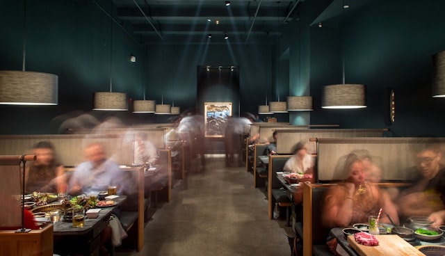
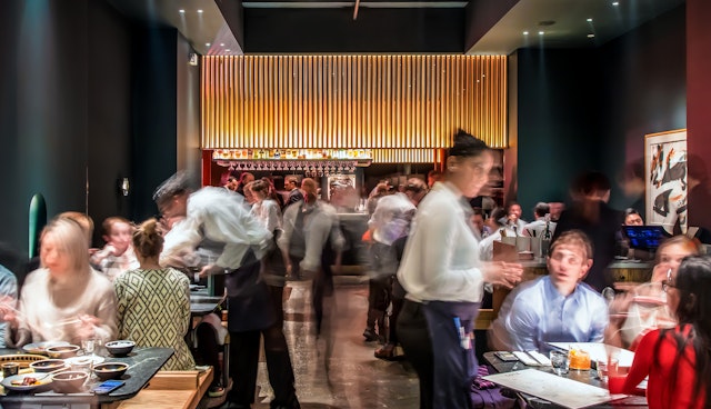
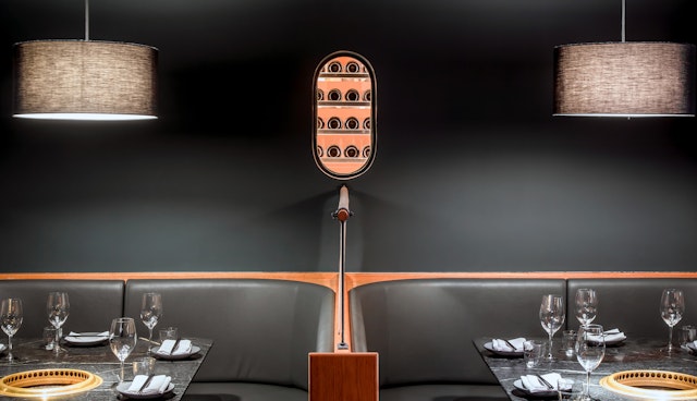
The restaurant design by MNDPC Architects is dark, sleek and moody, with a palette of earthy slate grey and bottle green offset by brass details, the bright reds of the Korean butcher cases, and the striking blood-red light that spills out of the restaurant’s aging room. The vibrant food pops against the dark, and the branding follows suit, with an intense, powerful red as the primary color.
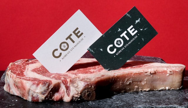
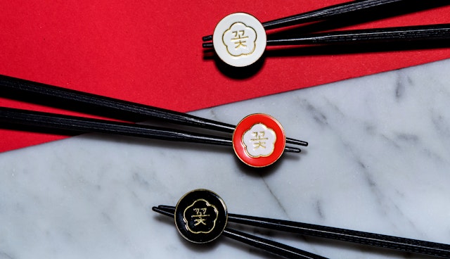
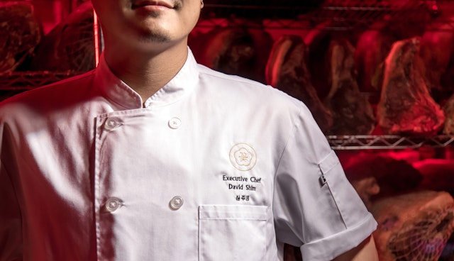
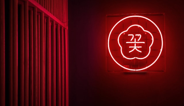
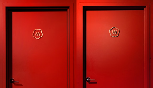
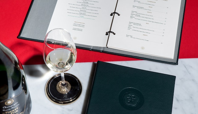
Pentagram’s branding strikes a balance between elegant and cheeky, contributing to the convivial atmosphere. The identity centers on a flower-like symbol that contains the Korean character for “cote” (familiar from Korean flower shops) nestled in the center of the “O” of the custom “Cote” wordmark. The bold, simple logo appears throughout the space: in eye-catching neon in the dining room; stitched in gold on Chef Shim’s uniform; etched onto long-stemmed glassware; molded into custom brass coasters; and on color-coded enamel lapel pins for staff.
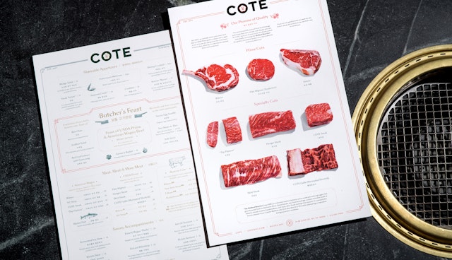
Print menus are oversized in the style of the classic steakhouse or brasserie, with graphics that combine icons and illustrations from vintage American menus and decorative borders from Korean design. The various cuts of meat are showcased on the back of the menu in mouth-watering high-contrast photographs. The playful look extends to the website, the homepage of which previews the Cote experience with a “you are there” film of meat in mid-grill. Typography throughout is set in the serif Sang Bleu (designed by the Swiss Typefaces foundry).
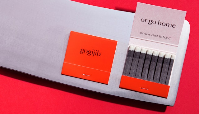
The Pentagram team developed messaging that keys into the restaurant’s smart NYC sensibility: diners receive an “Edu-COTE-ion” as they “Meet the meat”; “Gogijib or go home,” a play on the term for Korean barbecue, appears on matchbooks; and the restaurant’s lower-level lounge/speakeasy, which the team also branded, is appropriately named Undercote.
Working with the architects, the Pentagram team created environmental graphics and other elements of the interior design. The glowing neon signs add to the restaurant’s dramatic lighting. Close-up photographs of the texture of steak have been posterized and blown-up into mural-size wall-coverings that visually echo the marble floor. Patrons can perch on a city park bench in the lounge. Outside, “Cote” is hand-painted, in grand steakhouse style, in gold across the restaurant’s front windows.
Office
- New York
Partner
Project team
- Todd Goldstein
- Christina Hogan
- Lorenzo Fanton
- Jonathan Correira
- Anna Meixler
