
The new logo gives Dashlane its own distinctive monogram ‘D’ made of dashes that visually resonate with the name.
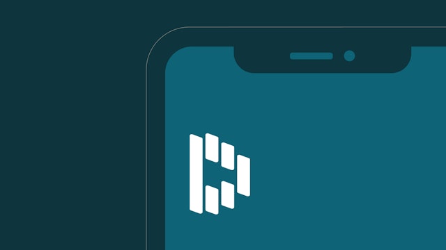


The dashes serve as building blocks for the versatile system, evoking mobile screens, autofilling form fields, and lanes on the information superhighway.

The branding plays with the idea of revealing and concealing, and that even when you can’t see it, Dashlane is there.
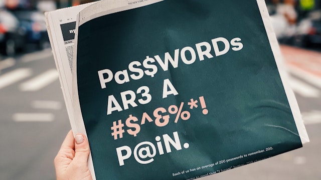
Moving around the internet has gotten more complicated as people now negotiate hundreds of password-protected sites and apps in their daily lives. Dashlane is a personal identity and password manager that allows users to quickly and securely input key credentials like passwords, contact and billing information without the frustration of trying to remember all of them. Pentagram has developed a new brand identity framework for Dashlane that captures its speed, flexibility and ease of use. The identity centers around a distinctive “Dashlane D” formed of dash-like shapes, part of a visual language of concealing and revealing. The project encompasses brand strategy and positioning, messaging and digital design.
Pentagram worked closely on the project with the Dashlane leadership, including Chief Marketing Officer Joy Howard. The company was founded in 2009 with the foresight that security-related congestion on the internet would become a problem and a good password management system was necessary to keep things moving along. (Hence the name “Dashlane.”) A decade later the issue has only gotten more urgent, as security concerns have moved beyond e-commerce and complex passwords, changed ever more frequently, are now integral to every aspect of people’s lives, including their healthcare, home and finances.
Dashlane wanted to raise its profile as a consumer brand and make itself more accessible to a general audience. At a time when Big Tech has largely failed at––or actively subverted–– the protection of consumers’ private data, Dashlane felt its identity looked too much like a tech brand. The new framework shifts the focus to lifestyle. Dashlane’s password manager is designed to be seamlessly integrated into its users’ daily lives, ideal for this moment of minimized tech. The branding highlights Dashlane as a life essential, a product that allows its users to focus on other, more important things. The new identity is warmer and more human, conveying safety and trustworthiness, and the messaging shows how the product helps its users and creates a sense of security that is important to well-being.
“We wanted a clean, flexible system that reflects the clarity of our commitment to fix the UX of the internet,” says Howard. “We help our customers reveal and conceal themselves and their data online; that idea turns into motion in our new identity system.”
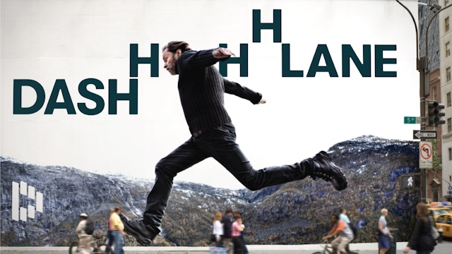
Dashlane also wanted an identity that would stand out in a category overrun with symbols like shields, keys and locks. The previous logo featured an impala leaping through a shield to convey speed and security. The impala is a fast animal, but the symbol was often mistaken for a deer—usually thought of as an obstacle in the road.
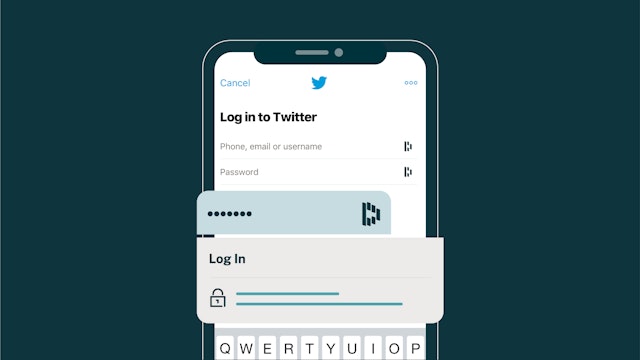
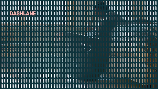
The new logo gives Dashlane its own distinctive “D” made of dashes that visually resonate with the name. The shapes, nicknamed “AroundRects” (after the iOS icons), suggest the shape of mobile phones and other screens, dashes and lanes on a highway, and when rotated, the autofilling form fields on the web that are the most literal usage of the product.
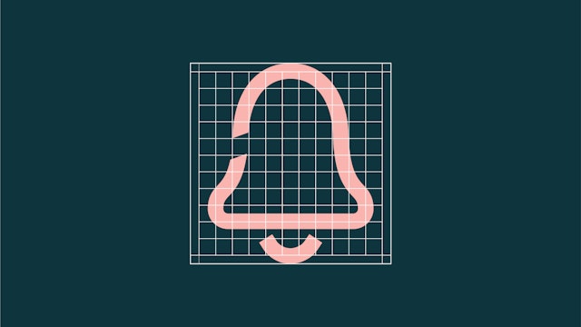
Rounding the corners of the flat planes gives them a dimensionality that is revealed in motion. Each element can be rotated, acting in unison or on its own. When animated, the logo suggests a system seamlessly working in synch. The dashes can be flipped, playing with the idea of revealing and concealing, and the idea that even when you can’t see it, Dashlane is there.
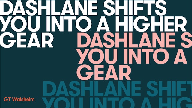
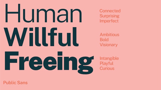
The designers moved the typography away from technology towards something friendlier and more human. The Dashlane wordmark is set in GT Walsheim, strong in all caps but customized with rounded letterforms that echo the AroundRects shapes of the logo. Secondary typography is set in the neutral, open-source Public Sans.
Like the dashes, the “H” of the wordmark also doubles as a graphic element that can be used to create patterns and animations that open and close like locks and gates.
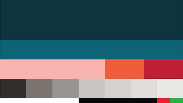
The branding introduces a more contemporary color palette that is fresh but low-key, with a subdued presence that, like Dashlane, doesn’t get in the way. The traffic-inspired colors include a blue-green that mixes the green of "go" with security blue, and red and orange are used for security alerts.
Office
- New York
Partner
Project team
- Ken Deegan
- Paul Yoon
- Mary Kate Henry
- Lucy Chen
- Dana Reginiano
- Saundra Marcel
- Frank LaRocca
- Sasha Chertok
