
The colorful graphics and custom typography capture the brand attributes of fun, action, play, celebration, silliness and joy.


An age-appropriate approach transitions the graphics from cute illustrations for babies to more ‘grown up’ use of patterns for older kids.

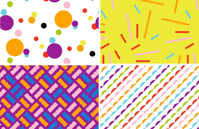
The branding refines the iconic Fisher-Price identity and expands it to a customized kit of parts that offers flexibility for a variety of contexts.





Fisher-Price is one of the world’s leading toy companies, defining the category in infant and preschool toys and playing an important role in childhood for almost a century, creating everything from “bump to bus.” Pentagram has collaborated with Fisher-Price on a refresh of its brand identity that highlights a return to a playful sense of fun. The system draws on the brand’s extraordinary heritage to build a complete visual language, and includes a custom typeface, messaging, art direction, and merchandising.
Pentagram worked closely on the project with leadership at Fisher-Price, including Chuck Scothon, Senior Vice President and General Manager; Joel Smith, Vice President, Brand Creative; Kelly Biernat, Senior Manager Global Brand Marketing; and Jody Gavin, Manager Global Brand Marketing. Founded in 1930 and headquartered in East Aurora, New York, Fisher-Price has been a favorite for generations of kids and parents with classic toys like Little People play sets, the Corn Popper, and the Chatter Telephone, among many others, and popular contemporary lines like Linkimals, Wonder Makers, Power Wheels, and Laugh & Learn.
The refresh coincides with a new brand strategy developed by Wieden+Kennedy that takes the company back to its roots as a toymaker and looks at the role of toys and play in children’s lives today. With the update, Fisher-Price wanted to be less prescriptive about child development, and in the words of its new mission statement, “put the fun back into functional” and the “play back into playtime.” This dynamic point of view is neatly summed up in a new tagline, “Let’s be kids.”
The new branding by Pentagram refines the visual identity and expands it to a customized kit of parts that gives Fisher-Price the flexibility to function consistently in a variety of environments. The exuberant use of colorful graphics and unconventional typography captures the brand attributes of fun, action, play, celebration, silliness and joy.
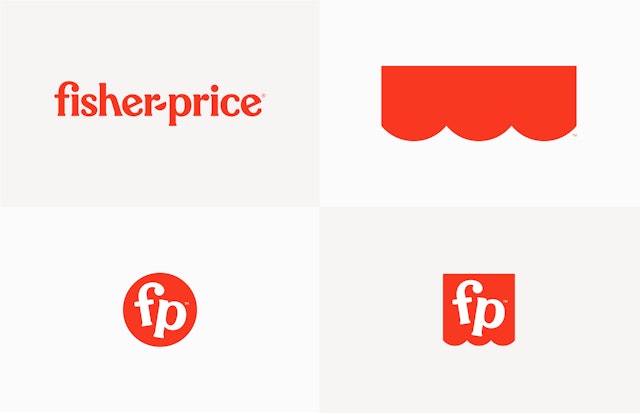
The refreshed identity centers on the bright red “awning,” the iconic mark with scalloped edges that holds the company name. The updated logo simplifies the awning to three semicircles (from the previous logo’s four) and uses its clean, simple geometry as the basis for an expanded visual language. (Internally, the retooled awning also symbolizes the three founders of the company—Herman Fisher, Irving Price and Helen Schelle, as well as the intersection of parents plus kids.) The logotype has been redrawn in all lowercase, with letterforms that are slightly more refined than original but still quirky. The hyphen between the names is now a semicircle, echoing the scalloped edge as well as the smiles on the faces of the Little People.
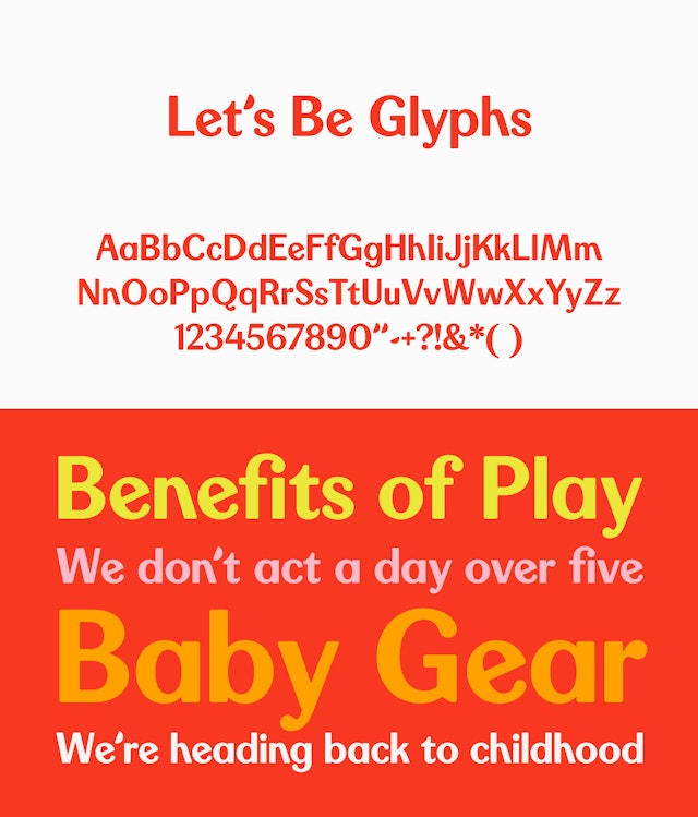
The Pentagram team researched early advertising and packaging in the company archives and saw that the original proprietary typeface for Fisher-Price, which was based on Windsor, was consistently used for everything, creating a smart, cheerful typographic tone of voice for the brand. The new wordmark influenced a full proprietary typeface called Let’s Be Glyphs, a semi sans serif that nods to Fisher-Price’s original proprietary typeface and the letterforms of the original logotype, and a playful alternate, Let’s Be Glyphs Bouncy, with rotated characters and an uneven baseline, both designed by Pentagram and finessed by type designer Jeremy Mickel. Quotation marks and apostrophes appear as semicircles. Secondary type is set in the clean and modern sans serif Maax.
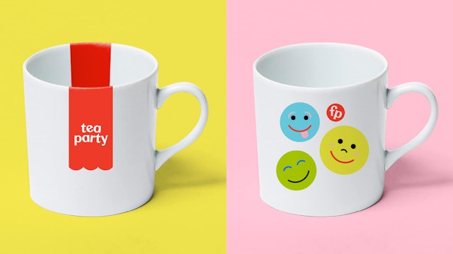
The primary logo is joined by two monograms, a circular “bubble” and an abbreviated version of the awning called the “flag tag,” both with a redrawn lowercase “FP.” In applications, the red awning can be extended to fit the tagline or other copy (a device the designers refer to as the “red carpet”). By itself, the awning can be used as a simple graphic icon that can be placed anywhere—attached to the typography of the tagline, hidden in promotional photography, or used in packaging and store displays—instantly flagging it as Fisher-Price.
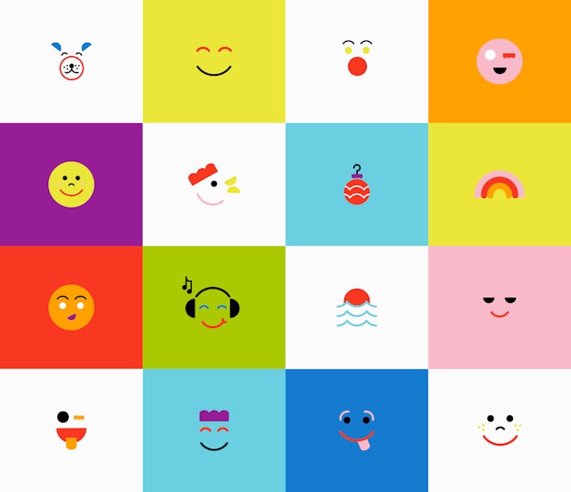
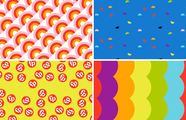
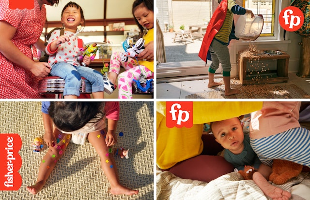
The graphic elements can be combined into patterns and used to build “Play-moji,” emoji-like illustrations inspired by the Little People faces on toys. The age-appropriate approach transitions from cute illustrations for babies to more “grown up” use of patterns for older kids. The joyful look and feel is carried throughout the branding, including print and digital advertising and retail merchandising. Pentagram established new guidelines for the art direction of photography that emphasizes playfulness, imagination and kids interacting with their families. Working closely with the Fisher-Price team, the designers art directed the first lifestyle shoot using the new guidelines, photographed by David Robert Elliott in Buffalo, New York, where the company is located.
The new messaging focuses on making an emotional connection and recreating the feeling consumers had when they were playing with toys as children, and to feel okay to keep playing with them now and forever—which is as long as Fisher-Price will be around.
Office
- New York
Partner
Project team
- Laura Berglund
- Timothy Cohan
- Mira Khandpur
- Greg Morrison
- Lisa Grant
