
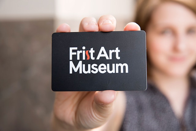
The team decided on the name Frist Art Museum with the catchy acronym ‘FAM,’ perfect for an institution that prides itself on being family friendly.


The goal was to give the museum a modern identity that is simple, confident and has staying power but also pays tribute to the institution’s Art Deco roots.


The letter ‘s’ in ‘Frist’ resembles the snake-like, Art Deco letter ‘s’ of the museum’s original logotype.
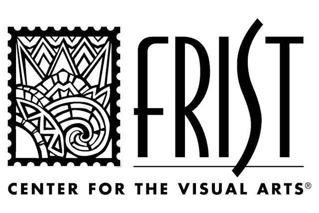

The newly named Frist Art Museum, formerly The Frist Center for the Visual Arts, has been Nashville’s main art museum destination since the institution opened its doors in a former U.S. Post office in 2001. Pentagram’s Austin office worked with director Susan Edwards, her team and the Frist’s executive board to rename the museum and to design a brand identity that reflects the new moniker. The previous name, wordy and indirect, was originally adopted in an attempt to communicate the family friendly, community-oriented ethos of the place. The resulting name, although well intentioned, ended up being awkward and a bit confusing. The description, “Center for the Visual Arts,” could be misconstrued to be a performance hall or a workshop and the word “Frist,” the name of a prominent Nashville family who is a major patron of the museum, wasn’t immediately recognizable to the public.
The Pentagram team initially recommended the names Nashville Museum of Art or Nashville Art Museum since those valuable brand names, in a booming city with growing international name recognition, hadn’t been taken yet. During the process Pentagram suggested the addition of a secondary descriptor, The Nashville Art Museum: At the Frist Center, in order to keep the Frist family name in the mix and to brand the museum’s home, a 1930s era Federal Style building, as a center where several other entities―a café, gift shop and an interactive science space called Martin ArtQuest, cohabitate.
In the end the team decided on the name Frist Art Museum with the catchy acronym “FAM,” perfect for an institution that prides itself on being family friendly. Since adopting the new, clearer title last April the museum has doubled its daily visitor attendance based solely on the name change alone.
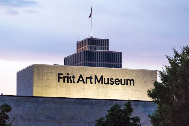
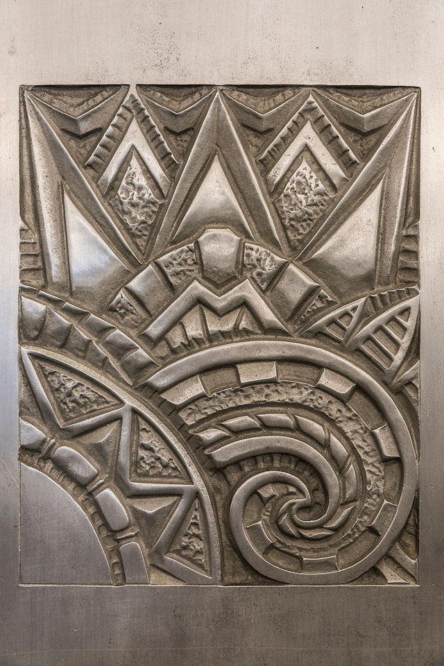
When the post office was built in 1934 the Art Deco style was still in vogue. The U.S. Postal Service hired Marr & Holman architects to design the building who in turn commissioned some of the best artists and craftsmen of the day to create the elaborate Art Deco décor that remains a distinctive signature of the museum today. When the Frist moved into the building the large rooms that had formerly housed the post office’s bulky mail sorting machinery became galleries, but the museum preserved the Art Deco designs found on the building’s facade and in the public spaces inside.
The original identity adopted by the Frist Center for the Visual Arts in 2001 featured a mark that was a line drawing of one of the elaborate Art Deco tiles found in the building. The mark was locked-up with the word “Frist” set in all-caps in a slender vintage 30s font. The Art Deco style letter “S” in the word took the form of an elongated snake. That original word mark was affixed to the front façade, above what was previously the main entrance to the building, and on the back of the building, which has now been designated as the primary entrance.
At some point the Frist identity was updated and the Art Deco style logo was dropped. The new logotype, which consisted of the words “The Frist” set all-caps in a generic san serif typeface and reversed out of a black rectangle, was an attempt to modernize the museum’s identity and to emphasize the catchier handle, “The Frist,” over the wordy descriptor, “Center for the Visual Arts.” It did look more modern than the previous Art Deco iteration but it lacked personality.
Even though the museum had adopted a new identity the previous Art Deco style identity remained affixed to the exterior of the building. It was still there when the Pentagram team was approached about working with the Frist to develop a new name and identity.
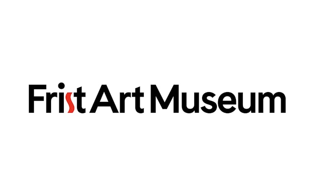
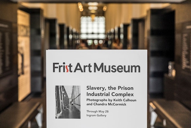
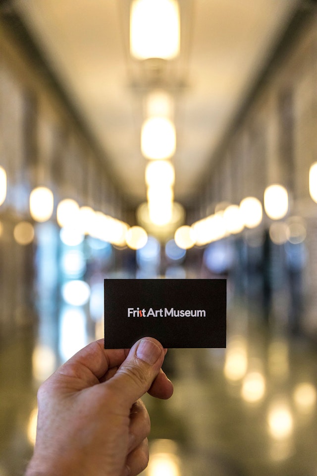
Realizing the significance of the museum’s Art Deco heritage the Pentagram team created a new logotype featuring the words “Frist Art Museum,” set in a friendlier upper and lowercase in a contemporary san-serif typeface called Cádiz, except for the letter “s” in “Frist” which resembles the snake-like, Art Deco letter “s” of the museum’s original logotype. The distinctive s-curve form also shows up in the original Art Deco décor throughout the building.
The logotype is reproduced in black except for the Art Deco letter “s” which is highlighted in red–cadmium red. Cadmium red, a warm yellow/orange shade that originated as a vibrant paint pigment, has been a favorite of artists for generations. The legendary contemporary artist Donald Judd loved the color and used it often in his work. Cadmium red had an outward clarity, but also a personal psycho-sociological meaning for Judd. In an interview with John Coplans in 1971, Judd stated, “red, other than a gray of that value, seems to be the color that makes an object sharp and defines its contours and angles.” Given the new “Art Museum’s” proclivity to feature contemporary art, a nod to Judd’s favorite color seemed like a good way to go for the Frist.
At the end of the day, the goal was to give the museum a modern identity that is simple, confident, and has staying power―that will still feel fresh and undated in ten years―but also pays tribute to the institution’s Art Deco roots.
Two new permanent signs just went up on the building recently and the old signs came down. Times are changing quickly in the Country Music Capital of the World but the new Frist Art Museum identity looks like it could strike the right note for a long time to come.