The refresh introduces a modern take on The Hartford stag, the symbol that was first introduced in 1875 and is now synonymous with the brand.

The positioning highlights the attributes of trust, strength and stability, but with a visual language that is streamlined and contemporary.

The design moves the stag to the front of the mark, where the majestic pose shows him protectively looking over his herd and gazing confidently into the future, signaling the innovation and forward progression of the company.


Other components of the system are also derived from the brand’s heritage, but in a modern way: The 12 points of the stag’s antlers become a graphic motif highlighted in two additional logos.


The brand color is a rich claret — an evolution of a hue seen in the previous identity, and a color that has been associated with The Hartford for much of its history.


For more than 200 years, The Hartford has embodied the strength, stability and resilience that consumers expect from a leading insurance company. These qualities are represented by the stag, The Hartford’s symbol that has been the inspiration of the company’s logo since the 19th century and is now synonymous with the brand. Pentagram has developed a new brand identity for The Hartford that builds on this extraordinary legacy to evolve the identity for the changing world we live in today and demonstrates the company’s heritage and modernity.
“As we embrace an ambitious growth-and-innovation strategy centered on our customers and their changing needs, our brand must evolve with the business,” said The Hartford’s Chairman and CEO Christopher Swift. “The new brand celebrates The Hartford’s strength, built on centuries of trust from the businesses, workers, and people we support every day. The modern design points to our bold future, inspired by innovation and a relentless focus on our customers.”
Pentagram worked on the branding in close collaboration with leadership at The Hartford. The update is part of an overall refresh that spans brand positioning, tagline, identity and communications, developed in collaboration with The Hartford’s creative AOR, the Minneapolis-based independent agency Solve. The redesign was launched at the New York Stock Exchange on Feb. 6, 2025, to celebrate the 30th anniversary of the company's listing.
The Hartford wanted to develop a brand strategy that would resonate with today’s consumers and emphasize agility, clarity and connection. For Pentagram, the challenge was using the company’s heritage to help inform the future. The positioning highlights the attributes of trust, strength and stability, but with a visual language that is streamlined and contemporary.
Based in its namesake city in Connecticut, The Hartford is a leader in property and casualty insurance, employee benefits and mutual funds. It started in 1810 as a fire insurance company. Still in its early days, the company had a defining moment during the 1835 Great Fire of New York that destroyed much of the Financial District, resulting in the closure of many insurance companies that could not pay their claims. By contrast, The Hartford’s president delivered on the promise to pay claims for all of the company’s customers. The Hartford also provided the first insurance policy for an institution of higher education — Yale University — and later provided protection for president-elect Lincoln’s home in Illinois, as well as the Hoover Dam and the Golden Gate Bridge.
Insurance is complex, and another goal for the update was to make the identity feel clear and accessible, to signal that the brand is friendly and easy to use for consumers. It needed to appeal to a wide range of audiences and generations, from insurance decision makers and distribution partners, to investors and analysts, to customers and media outlets. The Hartford has a tremendous amount of trust in the industry, and it was important for the brand to project this trust and reliability.
“Our modernized brand is a representation of who we are as an insurance leader and how we demonstrate to customers, through our actions, that we prioritize their needs and uphold our commitments,” said The Hartford’s Chief Marketing and Communications Officer Claire Burns. “This is a valuable opportunity to create lasting impressions and deepen relationships with customers, employees and the world at large.”
The earliest use on record of The Hartford’s stag logo is the 1861 policy issued to Abraham Lincoln. The logo was likely inspired by the seal of the city of Hartford (which in turn borrowed from the city’s namesake in Hertford, England). The new design reflects the grandeur of “The Monarch of the Glen,” a painting completed in 1851 by Sir Edwin Landseer, which has been an inspiration for The Hartford’s logo since 1875. This modern representation showcases the stag looking over his herd and gazing confidently into the future.
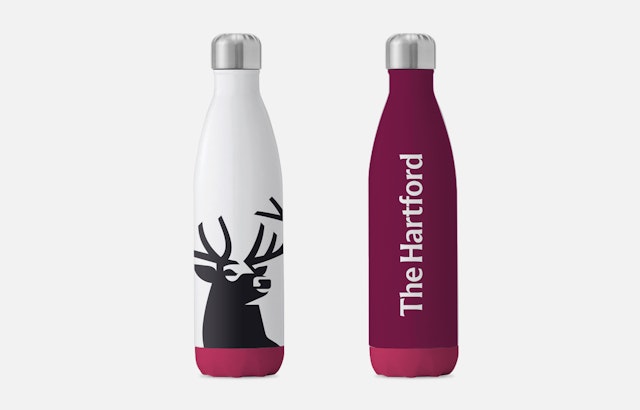
The stag remains the centerpiece of The Hartford’s identity, but in a more dynamic way. For the designers, the goal was to bring the stag to life and signal that the brand is full of possibility. In the past it has been treated as a mostly static asset, evolving almost imperceptibly. The update modernizes the symbol into a simplified silhouette with dimensional details that improves legibility across different scales and both digital and physical contexts.
The new logo appears in black — strong, bold and elegantly simple. The design moves the stag to the front of the mark, where the majestic pose shows him protectively looking over his herd and gazing confidently into the future, signaling the innovation and forward progression of the company. The wordmark has been shifted from all caps of the previous identity to a more approachable upper and lower case, still retaining a sense of gravitas.
The previous branding elements, including the stag, were used in rigid ways that aimed for visual consistency but ultimately felt constrained. With the rebrand, the designers wanted to treat the components more dynamically, permitting a broader, more diverse range of expression without sacrificing rigor or coherence.
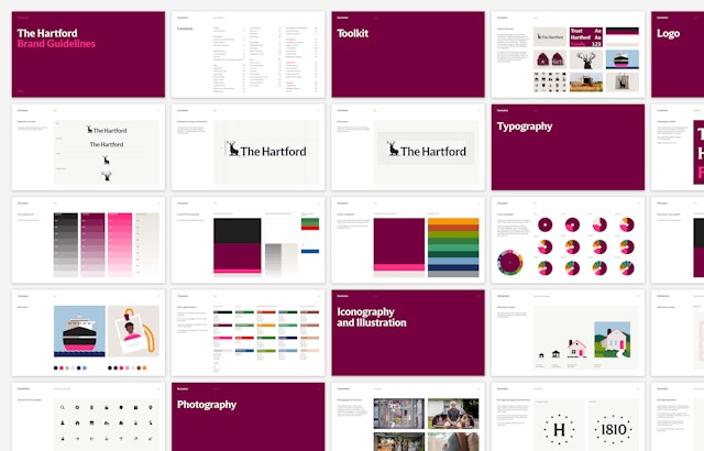
Other components of the system are also derived from the company’s graphic heritage, but in a modern way. This includes a bespoke typeface, Trust Hartford, a customized cut of Trust (originally designed by Jeremy Mickel) that is based on lettering on US coins. (The font coincidentally had the perfect name, given the brand strategy.) Adjustments were made to increase readability of several characters and numerals.
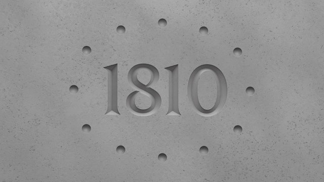
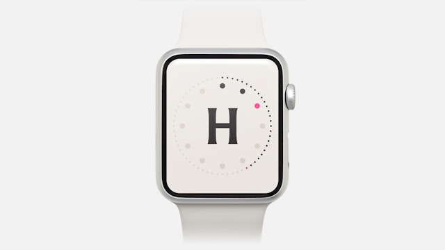
The Hartford stag is specifically a Royal Stag, a red deer with 12 points across its antlers (six per antler). The number 12 is now highlighted in two additional logos that pair 12 circles with the letter “H” in a monogram and with the date 1810 in a new heritage mark that looks engraved. The brand color is a rich claret — an evolution of a hue seen in the previous identity, and a color that has been associated with The Hartford for much of its history. A neon flash of fuchsia adds a bright contemporary accent.
A new direction for photography emphasizes clear, direct images that telegraph the brand’s commitment to openness and transparency. This approach also carries over to an illustration style that is visually simple and straightforward. The Pentagram team developed an extensive library of original icons and illustrations that can be used across the brand’s numerous communications and touchpoints.
Office
- New York
Partner
Project team
- Michael Bierut, consulting strategy partner
- Shigeto Akiyama
- Britt Cobb
- Antonio Nogueira
- Anna LaGrone
- Sewon Bae
- Brett Hilton
- Ben Law