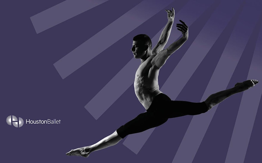


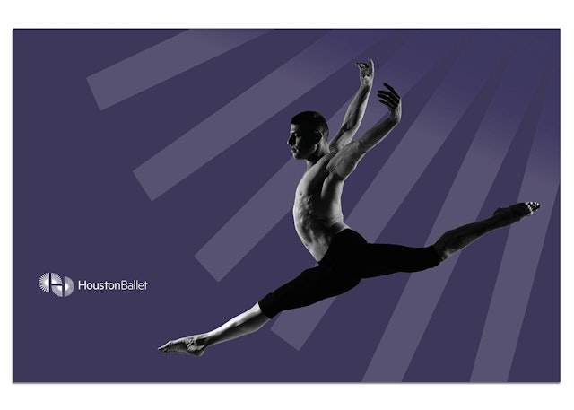
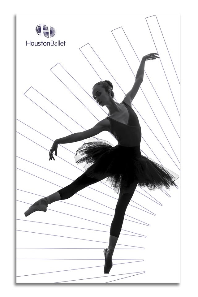
The new mark implies motion, suggesting the graceful kineticism of the dancers.

Pentagram has designed a new logo and identity for Houston Ballet. The reworked identity system is the first step in a process of rebranding the company (founded in 1955) as it has evolved over the decades. This marks the most dramatic change in Houston Ballet’s look and feel since 1985.
Houston Ballet, America’s fifth largest ballet company, is an international powerhouse with an ensemble of 57 dancers and an academy housed in a modern, state-of-the-art facility. Houston Ballet has toured extensively throughout the world including appearances in London at Sadler’s Wells in London, at the Bolshoi Theater in Moscow, at Theatre des Champs Elysees in Paris, in six cities in Spain, in Montreal and Ottawa, at the Kennedy Center in Washington, D.C., and at City Center and the Joyce Theater in New York. In 1995, Houston Ballet was the first full American ballet company invited by the Chinese government to tour the People’s Republic of China.
The acclaimed Australian choreographer Stanton Welch serves as Artistic Director of Houston Ballet. Since joining the company in 2003 he has raised the level of Houston Ballet’s classical technique and commissioned many new works from prominent dance makers. Welch, who has created ballets for many of the world’s leading companies, has choreographed 18 works especially for Houston Ballet.
“Houston Ballet has evolved over the years into a strong identity with a worldwide presence,” says Welch. “We need a logo that reflects the exciting work we do and portrays the current state of the company. I feel this new logo is an invigorating next step in our evolution as a company and I look forward to its implementation and use.”
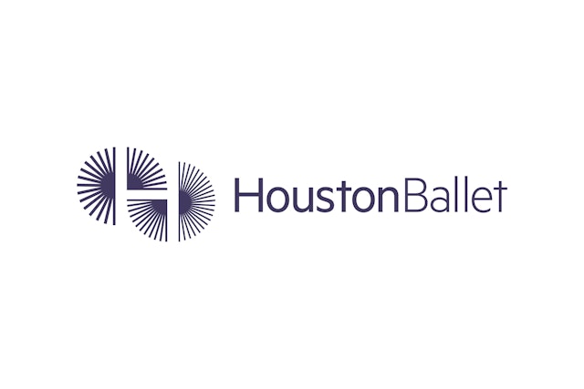
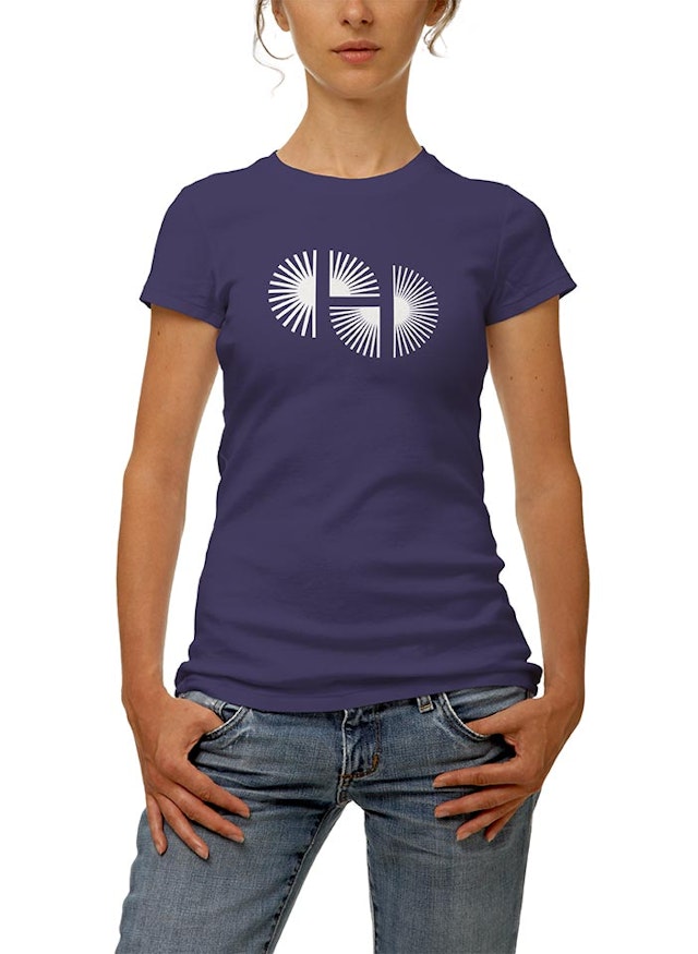
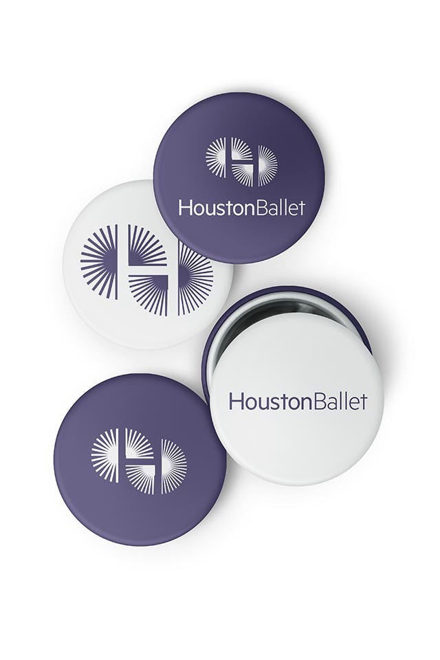
The Houston Ballet had used a nondescript logotype over the years and didn’t have a recognizable mark, so the Pentagram team made a distinctive logo a priority. The new mark appears to revolve in a circular pattern going from fast to faster and bolder to lighter as it moves from left to right. This kinetic motion gives the visual impression of a dynamic set of spinning wheels (or flapping wings) gaining speed and power as they roll across the page. A cap letter “H,” for Houston, is revealed in the negative space.
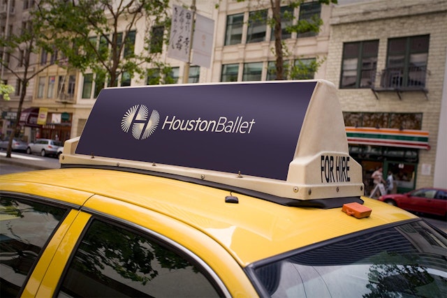
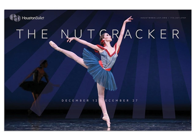
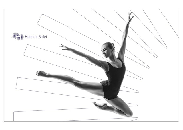
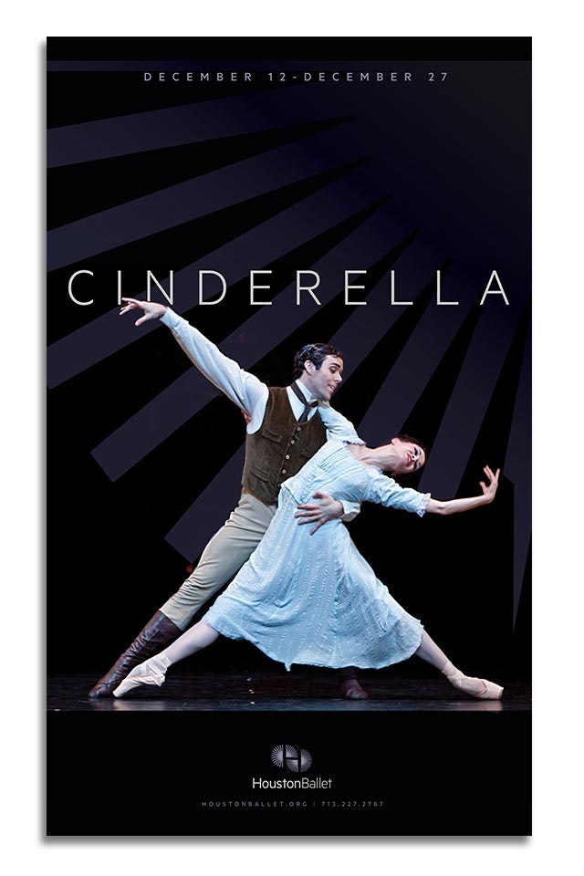
In addition, the Pentagram team developed a system that uses segments of the logo’s radiating wheels as graphic devices in ads, banners, print collateral and other applications of the new identity. In that way the mark functions as an identifier across the spectrum of promotional materials and becomes an additional branding tool for the ballet.
The new wordmark, set in Metric, runs the words “Houston” and “Ballet” together, symbolically fusing the company to its namesake city. The word “Houston,” which is the defining element of the two words, is bold faced so the letterforms go from bolder to less bold, echoing the thicker to lighter, bolder to thinner configuration of the new icon. A new color palette is built around a distinctive dark purple color reminiscent of the purplish-blue tints of the glass and steel skyscrapers that makeup the contemporary metropolis of Houston.
Office
- Austin
