

The designers created an italicized “H” that became a directional arrow that could be used as a vehicle to begin the videos and would suggest taking the ‘next step.’


Pentagram designed the identity for Howcast, the popular how-to video site. Howcast hosts a library of over 100,000 short instructional videos—everything from how to type faster on your iPhone to how to survive a bear attack—and its videos received over 20 million plays in June alone.
So how do you design a logo for Howcast? The designers created an italicized “H” that became a directional arrow that could be used as a vehicle to begin the videos and would suggest taking the “next step.” The style of this “H” was used as a guide in designing all the other icons. The form of the "H" was adapted into a chevron that is used in the video graphics, where it indicates steps or appears behind titles. For its part, the unusual “H” also instructs viewers that they can expect a little irreverence in the videos, many of which are humorous and creatively use animation and props to convey useful information.
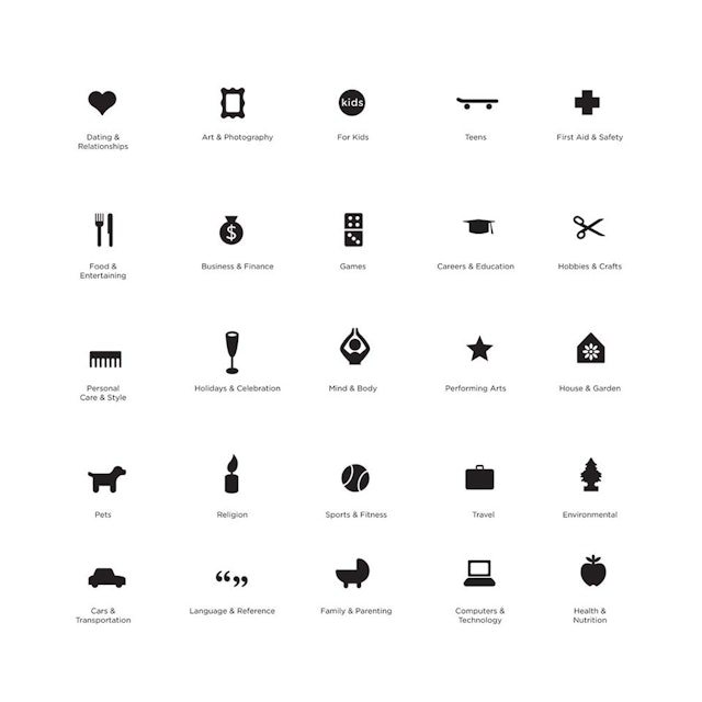
The team also designed a series of icons for the various categories of videos: First Aid & Safety, Food & Drink, Sex & Relationships, Crafts & Hobbies, etc. The identity was prominently featured in an iPhone spot, helping Howcast’s free iPhone app become one of the most popular, with over 500,000 downloads to date.
Office
- New York
