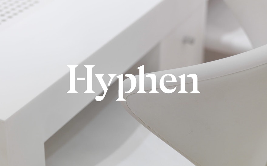
Pentagram were tasked with devising a visual identity that communicates the newly named practice's brand personality.
The joining-crosshair from the letter ‘H’ – which resembles a grammatical hyphen – was extracted by Pentagram and used to develop a creative unit.

A bespoke stencilled-alphabet was created by applying this unit to the Gza typeface.
Hyphen is a global architectural practice that was established in 1980, opening its first office in Winchester. Originally named Househam Henderson, the firm started to expand during the early nineties and now boasts seven offices in cities across Europe and Latin America.
Whilst it employs over 130 people who speak 24 different languages between them, the practice remains independently owned—with expansion occurring organically over a period of years. This, coupled with the firm’s commitment to a horizontal management structure, has fostered a distinctive global organisational culture: with collaboration, flexibility and diversity at its core.
In order to reflect the collective character of the global business, the firm rebranded in late 2017. Pentagram were tasked with devising a visual identity that communicates the newly named practice's brand personality.
Pentagram extracted the joining-crosshair from the letter ‘H’ and used its form—which resembles a grammatical hyphen—to develop a creative unit. Pentagram applied this conjunctive unit to the Gza typeface, developing a bespoke stencilled-alphabet that is used for the firm’s modern serif wordmark.
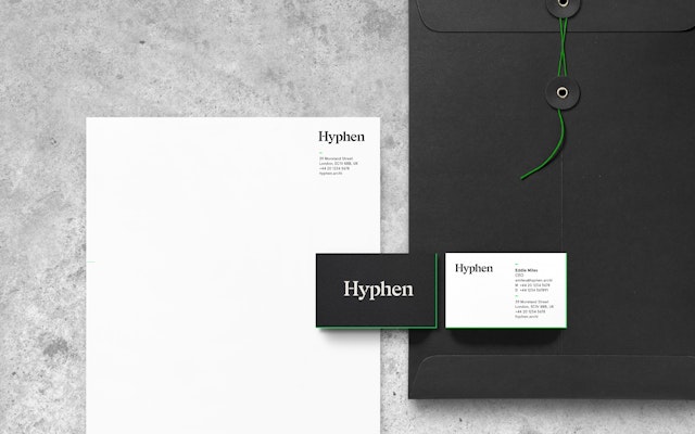
The identity has a stripped back, predominantly monochrome look and feel. Neon green has been applied sparingly, used as an accent colour that draws attention to key points across Hyphen's website and promotional collateral, also designed by Pentagram.
The website utilises the stencilled-alphabet for page headings, as well as the hyphen-inspired creative unit for its scroll bars and headers—marrying the firm's overall identity with a functional and informative user experience.
Office
- London