Rooted in Austen’s history and the fabric of the house itself, the new brand identity was created to better represent the character, aims and ambitions of Jane Austen’s House Museum.


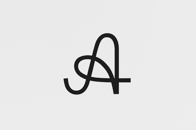
The new mark was inspired by the hand- drawn character ‘A’ which appears in a letter written by Austen to her niece Anna in 1815.

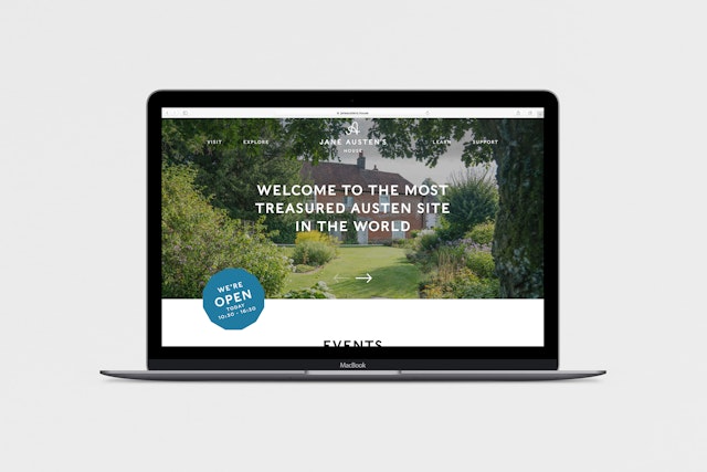


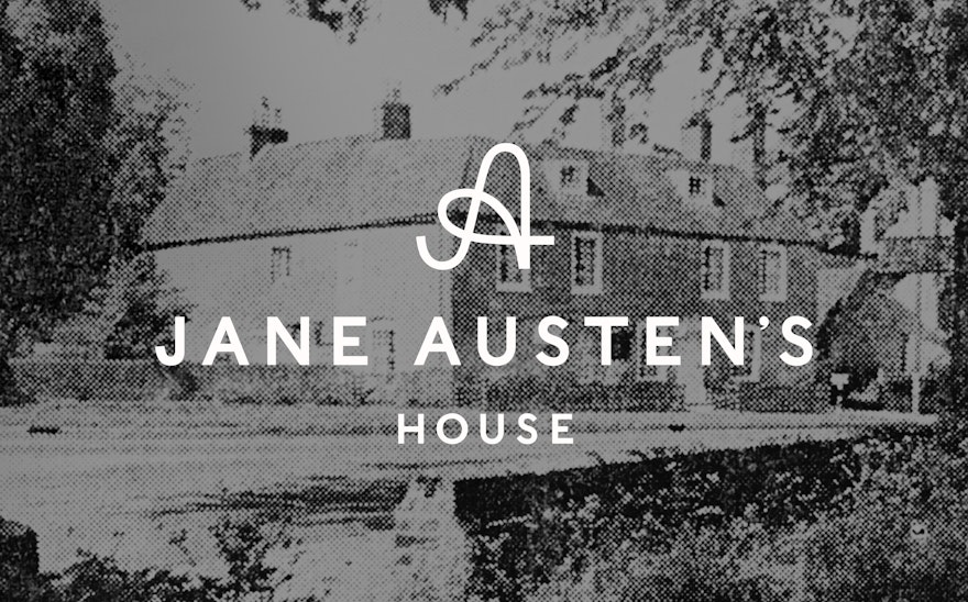
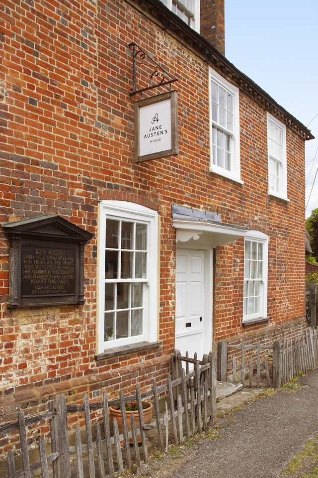
Pentagram has created a new brand identity for Jane Austen’s House Museum, the 17th century house in Hampshire where the novelist lived for the last eight years of her life. The house was on her brother’s Chawton Estate and was where she wrote her major works: Sense and Sensibility, Pride and Prejudice, Mansfield Park, Emma, Northanger Abbey and Persuasion. It holds a particular fascination for fans of the much-loved writer, attracting tens of thousands of visitors every year.
Rooted in Austen’s history and the fabric of the house itself, the new brand identity was created to better represent the character, aims and ambitions of Jane Austen’s House Museum.
Reflecting the fact that the house is not a museum in the most traditional sense, the design team streamlined its name to ‘Jane Austen’s House’. In an effort to try and avoid the now-cliched iconography too often associated with Austen and the various ‘Jane Austen experiences’, the design team looked to the space itself for inspiration. The House contains many personal effects belonging to Austen and her family, including Austen’s jewellery, first editions of her books, furniture, textiles and the desk at which she wrote so many of her much loved novels.
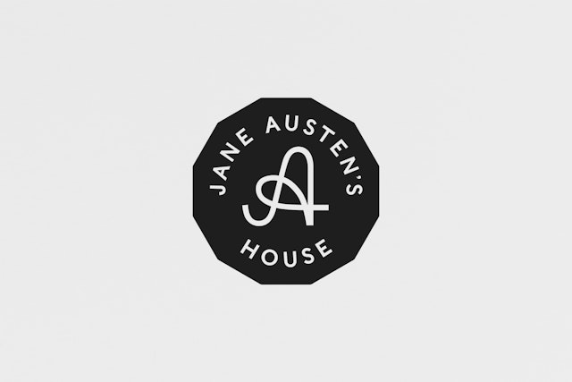
The new mark was inspired by the hand-drawn character ‘A’ which appears in a letter written by Austen to her niece Anna in 1815. The design team created an elegant, stylised monogram combining the letters ‘J’ and ‘A’, which gives the identity a modern, but decorative feel.
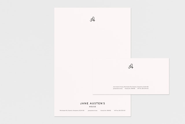
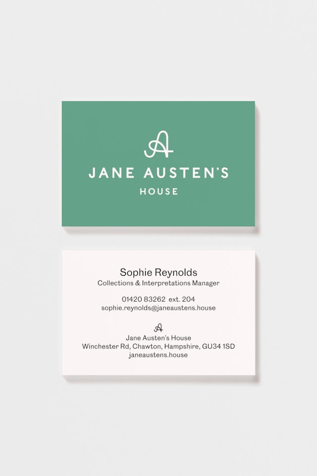
The identity uses two typefaces, Caslons Egyptian for the headlines and Caslon Doric for body copy. Caslons Egyptian is an updated version of ‘Two Lines English Egyptian’, the first commercially available sans-serif typeface which was released in 1816, a year before Austen’s death. Caslon Doric is Commercial Type’s modern take on the classic sans serif, and shares the same historical references as the headline font.
Despite looking surprisingly modern, the new colour palette was taken from original wallpaper samples found in the house and from the materials used in its construction. Austen’s distinctive twelve-sided writing table forms the inspiration for a neat twelve-sided stamp. The new identity has been designed to appear across all the House’s collateral, in print and online, for signage and across the design team’s proposed range of merchandise. This will include a series of coloured typographic tote bags featuring a selection of readers’ favourite Jane Austen quotes.
Despite writing about the foibles of early 19th-century society, Jane Austen continues to capture the imaginations of new generations of readers. Pentagram’s new identity provides a modern interpretation of a very well known literary figure, while respecting the incredible heritage of her house and celebrating her most enduring appeal.