

The unique circular form became iconic over the years, and the refreshed identity has preserved and extended it by making the graphically heavy, round element a part of the identity system as a whole.


In 2013, Pentagram revisited our classic identity for Jazz at Lincoln Center, the country's premier institution for jazz performance, updating it to riff on the current logo while expanding it into custom typography for the institution.
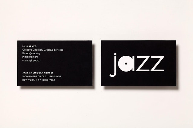
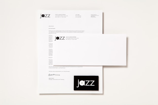
The refreshed identity simplifies the original wordmark to make it more contemporary. The original identity accompanied Jazz at Lincoln Center’s 2004 move into its home at the Time Warner Center on Columbus Circle, several blocks away from Lincoln Center proper. Now that Jazz is recognized as a major cultural institution in its own right, the update clears away the “at Lincoln Center” and leaves the organization as exactly what it is: Jazz.
Jazz Artistic Director Wynton Marsalis and Creative Director Luis Bravo approached Pentagram earlier this year about refreshing the identity. The 2004 identity was designed to help put Jazz on the map at its new location and didn’t look like anything else at the time. The organization and identity are now well established with audiences, and Marsalis and Bravo felt the time was right for a change.
The 2003 logo featured a circular disk that resembled a record for the “a” in Jazz, but with a square dot in the middle of the letter. When the team was designing the logo, they had initially asked Marsalis to define jazz and he said that it was "syncopation." The unique circular form became iconic over the years, and the refreshed identity has preserved and extended it by making the graphically heavy, round element a part of the identity system as a whole. The circular form has been expanded into a new typeface for the institution, as well as graphic patterns used in applications.
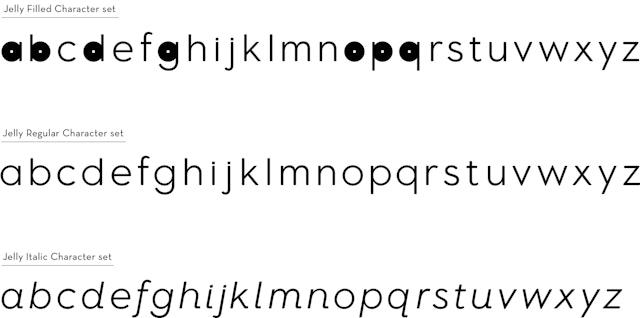
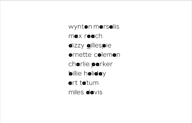
The original Jazz logo was designed in Eagle Light and accompanied by Neutraface 2 as the secondary font. For the new identity, the designers redrew the existing logo using Neutraface, rounded the square dot in the “a,” and made the letterforms slightly heavier. They then modified Neutraface 2 (originally designed by House Industries) to create a full alphabet with the circular forms of the round letters all filled in. The full alphabet has been digitized and kerned by the typeface designer Jeremy Mickel as a custom font for the institution. The new typeface is appropriately named Jelly Roll, after the legendary jazz pianist Jelly Roll Morton. (Neutraface 2 continues to be used as a text font.)
In applications of the identity, the distinctive circular forms of the typography playfully punctuate the graphics like musical notes, creating a kind of visual rhythm that is unmistakably Jazz. The circles can be used in many different ways to become the basis of a flexible graphic system for the institution. The unique typography appears in Jazz promotions and on the website, and will eventually be applied to environmental graphics at the theater.
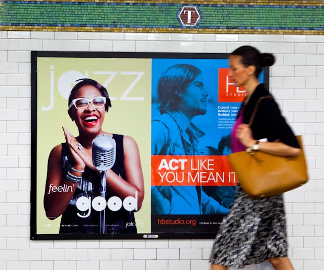
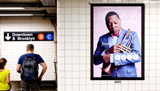
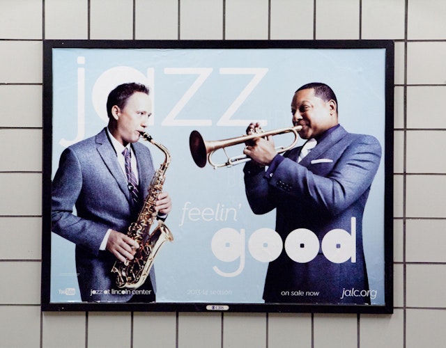
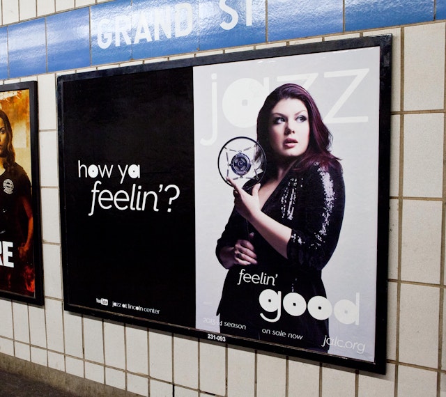
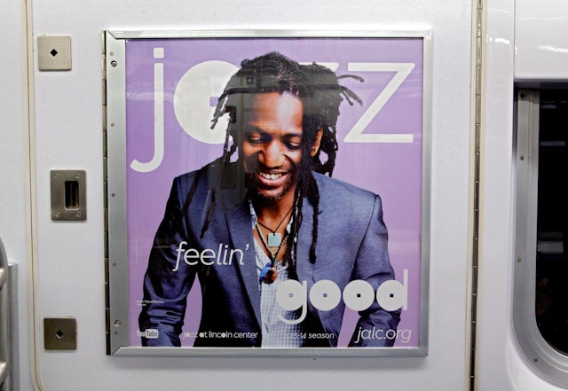
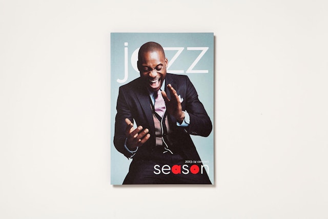
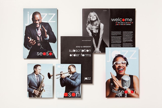
The new identity has been introduced in a colorful campaign designed by Luis Bravo for the 2013-2014 season. Brochures, advertisements and other promotions feature a series of lively, unguarded portraits of jazz musicians including Wynton Marsalis, Jane Monheit and Cécile McLorin Salvant. In the street campaign, the images are paired with the tagline “How you feelin,’” set in Jelly Roll. Engaging and accessible, the campaign conveys the vitality and spirit of Jazz as an institution.
Client
Jazz at Lincoln CenterSector
- Entertainment
- Arts & Culture
Discipline
- Brand Identity
- Campaigns
Office
- New York
