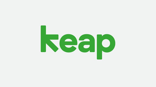

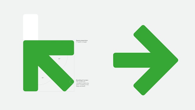
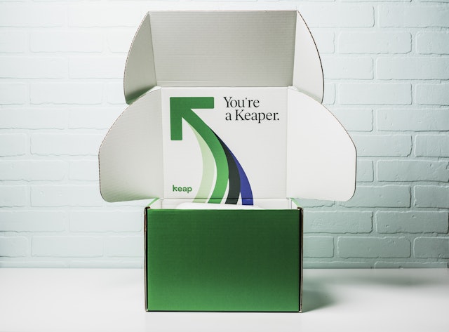
Built into the geometry of the wordmark is a hidden arrow, an apt symbol for what Keap does.



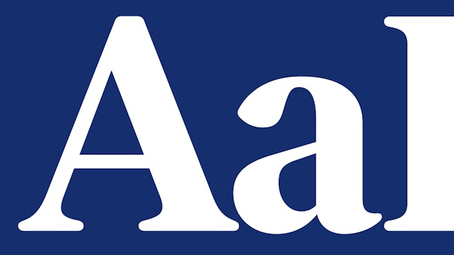
The primary typeface is Ivar Soft, a custom font with a warm, approachable feel, important for small businesses.


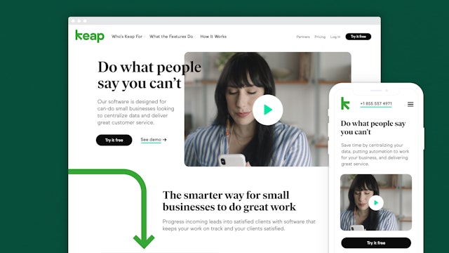
The Keap arrow comes to life in a secondary graphic language inspired by flowcharts, diagrams and decision trees.
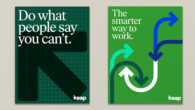

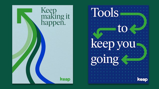
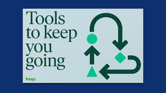
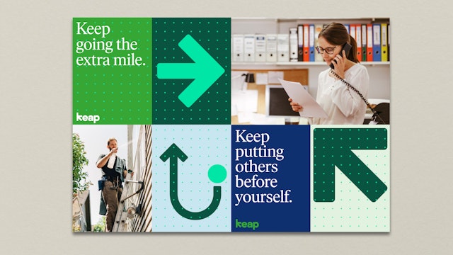
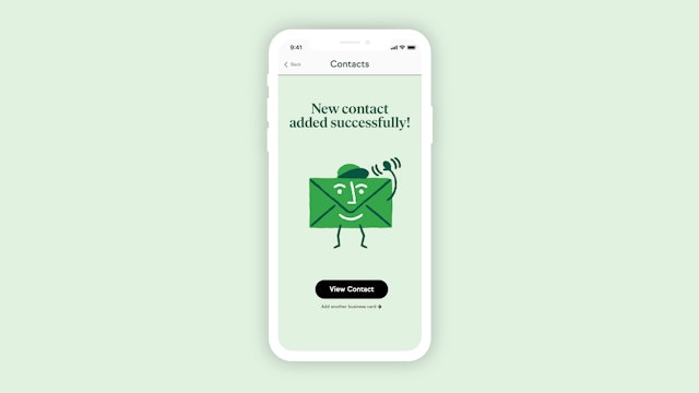
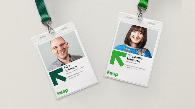
The new brand imagery includes lively illustrations by the studio LaTigre and photography that features real people in the environments where they actually work.



Running a small business can be a chaotic experience, from working in multiple systems to keeping tabs on many customers and communication streams. Keap, formerly Infusionsoft, specializes in CRM (customer relationship management) and marketing automation software that helps small businesses manage their customers and operations―booking appointments, sending proposals and invoices, and collecting payments―all in one place.
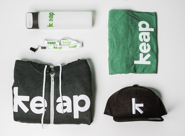
Pentagram has developed a new brand identity for Keap, including its new name, that captures the platform’s ease of use and powerful capabilities. Built into the geometry of the wordmark is a hidden arrow, an apt symbol for what Keap does. The identity is part of a comprehensive system that includes brand architecture, messaging and tone of voice, typography, color, graphic language, motion, photo and video art direction, and environmental graphics.
Pentagram worked closely with leadership at Keap to develop the identity. Founded in 2001 and headquartered in Chandler, Arizona, with offices in San Francisco and Atlanta, Keap has pioneered the CRM and marketing automation category for small business (think 2 to 20 employees) and today serves more than 200,000 small business users globally. The rebrand accompanies the launch of a new product, also called Keap, that is the industry’s first smart client management software built specifically for small businesses in the home, personal and professional service industries.
With the new identity, Keap wanted to set itself apart from other CRM platforms by emphasizing its ubiquity and accessibility―the branding had to be relatable and work everywhere, not just in marketing hotspots like Brooklyn, Portland and Los Angeles. Keap users tend to be “Main Street” business owners who are most concerned with having something that works, rather than being clever or funny. Keap sought to appear approachable and human, key to small business.
The Keap wordmark is bold, simple and friendly. The arrow instantly conveys how Keap helps its users: connecting, streamlining, organizing, and bringing order to their work. The symbol can be used to visually represent movement and flow, indicate a direction or sequence, or illustrate a path of movement through complex systems.
The new name Keap represents the perseverance small businesses put in each day to keep going, keep serving and keep growing. Short and memorable, it suggests creating order and providing service. (The company’s flagship product, Infusionsoft, is now known as Infusionsoft by Keap.) Along with the name, Pentagram worked on brand messaging that is simple, straightforward and easy to follow, just like the software.
The primary typeface is Ivar Soft, a custom version of the graceful and sturdy serif Ivar Headline (designed by Letters from Sweden) that nods to the Times New Roman so many small business owners work with every day. The typeface has been rounded for warmth, friendliness and a more contemporary feel, and can easily scale up or down without losing legibility. Secondary type is set in Sul Sans, a geometric sans serif that helps readability in the Keap interface, and Sul Mono, a monospace font that is useful for UI design (both designed by R-Typography).
The identity also introduces a more refined color palette. Green has traditionally been part of Keap’s brand, signifying growth and the entrepreneurial spirit, and setting the company apart from the standard blue within the category. The new Keap green combines well with a dark green, bright blue and lighter tones for backgrounds.
The Keap arrow comes to life in a secondary graphic language inspired by flowcharts, diagrams and decision trees, used in brand expressions like promotional collateral, advertising and motion graphics. A set of custom icons were built on the same grid as the arrow, echoing its geometry.
The icons are accompanied by playful spot illustrations by the Milan-based studio LaTigre. The Pentagram team also worked to develop new guidelines for photography and video. The lively, flexible style encourages custom photo shoots with real people in the environments where they actually work every day, conveying their pride of ownership.
Office
- New York
Partner
Project team
- Andrea Trabucco-Campos
- Ho Seok Lee
Collaborators
- Robin Haueter, strategist
