Kids Eat in Color understands that systemic discrimination impacts nutrition and they have committed themselves to work towards social equity.


The goal of the new identity was to reflect this community and establish that Kids Eat in Color is an organization comprised of healthcare professionals who are knowledgeable, trustworthy and non-judgmental.


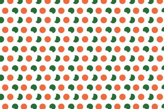
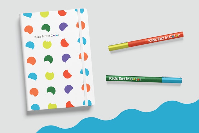
A set of bite marks from the logotype can be used on their own in patterns and applications or serve as graphic tools for social media. They also lend themselves to amusing, kid-friendly “crunchy” animations.


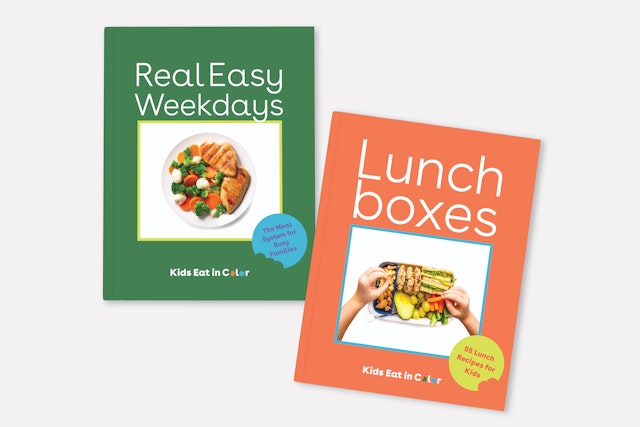
Pentagram’s Austin office has developed a comprehensive new brand identity system for Kids Eat in Color, a parenting and educational healthcare resource with a mission to provide support and guidance to help kids eat better through evidence-based nutrition and feeding practices.
Trying to get children to eat healthier, or to eat at all, is a parenting challenge as old as the invention of the fork and spoon. Kids Eat in Color understands that systemic discrimination impacts nutrition and they have committed themselves to work towards social equity. They reject the idea of “bad food,” and recognize that different dietary methods work for different people.
Kids Eat in Color was founded by Jennifer Anderson, a mom and registered dietician who has gained a loyal, enthusiastic online following of parents seeking a welcoming community to uplift and support one another. The goal of the new identity was to reflect this community and establish that Kids Eat in Color is an organization comprised of healthcare professionals who are knowledgeable, trustworthy and non-judgmental. This combination of professionalism and approachability was a key guidepost for Pentagram’s branding process. The design team felt it was important to avoid worn out visual clichés that Kids Eat in Color had previously explored that lacked nuance and personality such as rainbows, carrots, crayon lettering, and utensils. This provided a unique challenge that led the team to explore more abstract concepts and develop ways to distinguish the brand as friendly, reputable and food-conscious.
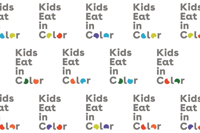
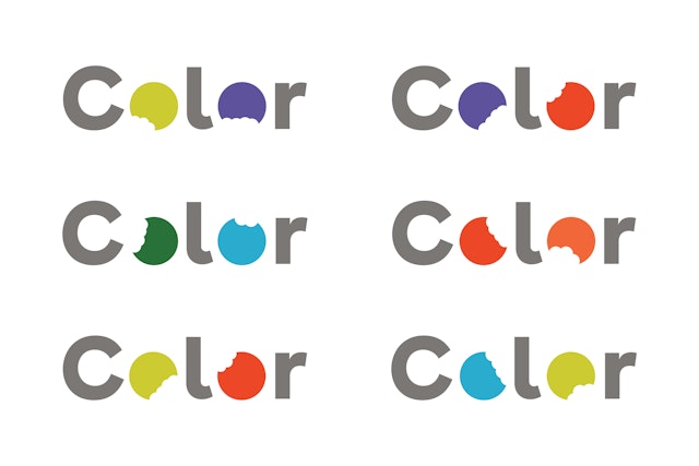
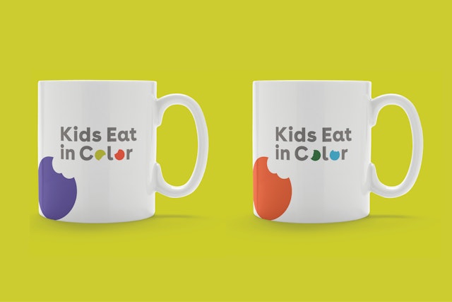
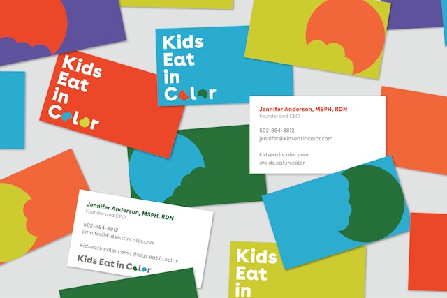
The design team took advantage of the Os in the Kids Eat in Color name and turned them into fun, conceptual representations of food, or colorful “healthy” cookies with bites taken out of them. This imagery avoids employing overused child-centric graphics while still adding a touch of playfulness. It also reinforces the idea that there are no right or wrong foods, highlighting Kids Eat in Color’s emphasis on food-positivity. A set of bite marks from the logotype can be used on their own in patterns and applications or serve as graphic tools for social media. They also lend themselves to amusing, kid-friendly “crunchy” animations.
For the remainder of the wordmark, the design team chose a clean, contemporary sans serif typeface, Buenos Aires by Luzi Type, that features organic letterforms that don’t feel overly corporate or clinical. The letters are printed in a middle-tone gray hue which allows the colorful cookies to be the heroes in the wordmark stack.
The updated color scheme diverts from the expected rainbow palette, usually composed of primary colors, and instead utilizes unique shades inspired by actual foods, like the purple in an onion or the orange in a cantaloupe.
With this completely updated brand identity system, not only can kids eat in color, they can eat in style too.