The London Design Festival has become a dynamic and cultural force, and it was important that the 2019 campaign captured that feeling.


The abbreviated typographic treatment used throughout the campaign gives it an engaging and intriguing direction.


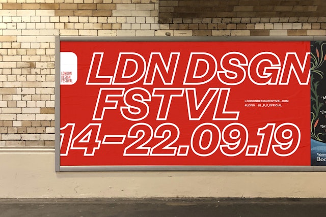
Celebrating London as the design capital of the world, the London Design Festival takes place every September. Over nine days, hundreds of exhibitions and installations, alongside a wide-ranging programme of events, take place in the ten different design districts across the city.
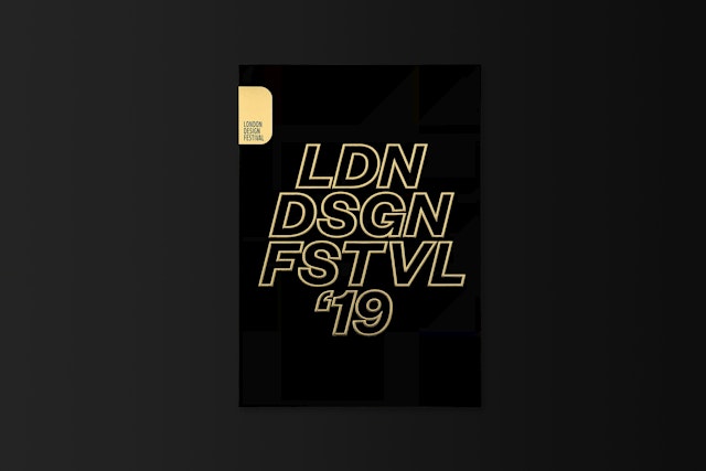
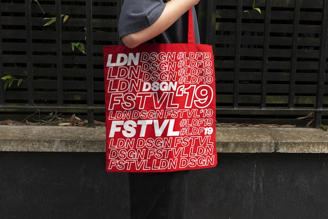
Pentagram has designed the London Design Festival identity for the thirteenth consecutive year, creating posters, signage, merchandise and advertising as well as the extensive 240-page printed festival guide. Working closely with Festival Director Ben Evans and Chairman Sir John Sorrell, the team’s aim was to develop a campaign that would be instantly recognisable, cutting through the visual chaos that exists in London's crowded visual landscape.
The London Design Festival has become a dynamic and cultural force, and it was important that the 2019 campaign captured that feeling. This was achieved through the use of a visually strong italic typographic direction, which creates a distinctive signature for this year’s identity.
Both solid and inline versions of the typeface are used together to give contrast, and the abbreviated typographic treatment used throughout the campaign gives it an engaging and intriguing direction.
As with all previous London Design Festival identities, a signature colour palette of red and white was employed, as this has become one of the Festival’s strongest and most recognisable assets.
Office
- London
Partner
Project team
- Emma Hickey
- Emily De Vale
- Emilia Kalyvides
- Kimberley Langham


