
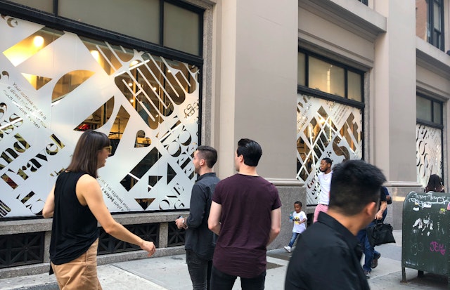
The manifesto typography evokes different voices and the active, social and mindful nature of the lululemon community.
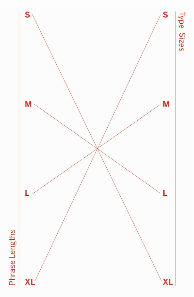


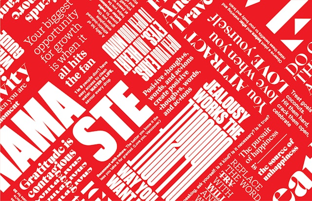
The type is arranged in a modular structure and used expressively to illustrate the words and statements.
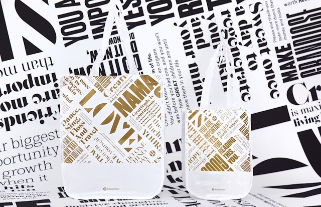


The redesigned manifesto goes beyond the bags to function as a visual language across the brand.



lululemon athletica is one of the world’s leading activewear brands, defining the athleisure category with its high-performance, yoga-inspired technical athletic apparel for women and men. The company goes beyond retail to function as a holistic lifestyle brand for a devoted following of consumers who apply its vision of wellness to their everyday practice of yoga, running, working out, self-care and mindfulness.
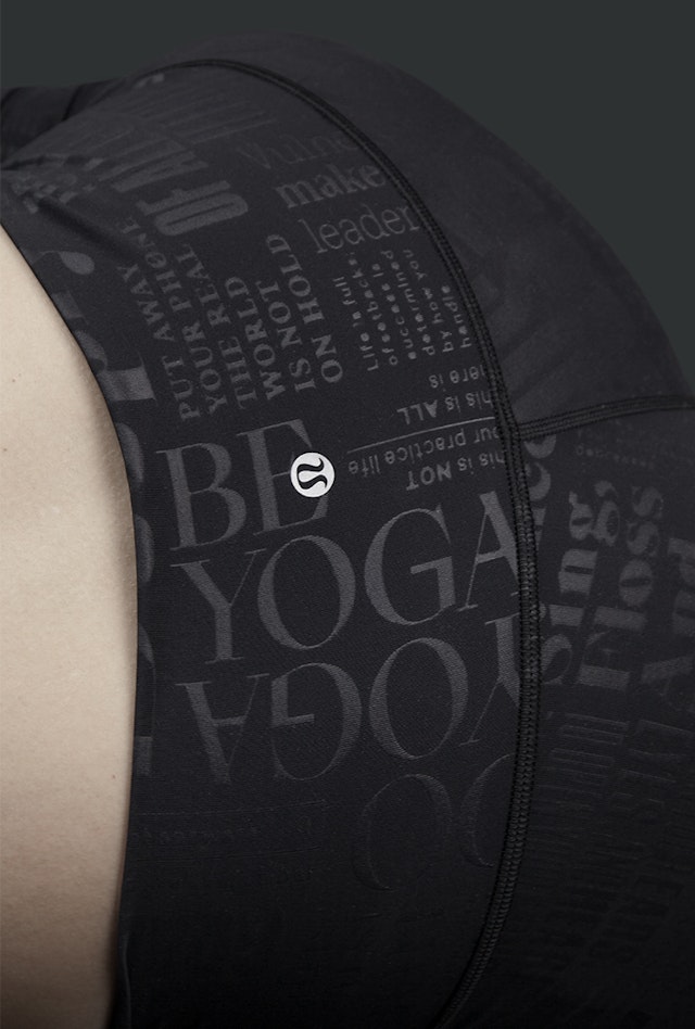
This is captured in the lululemon manifesto, a graphic representation of the brand’s core values. Pentagram developed a dynamic new version of the manifesto for lululemon’s typography-covered shopping bags and other applications, including environmental graphics for its headquarters and stores, and a special line of apparel that allows adherents to literally wrap themselves in the motivational language of the brand.
The Pentagram designers worked closely with the lululemon creative team led by Rémi Paringaux on the project, the first in a series of collaborations with the retailer. The manifesto is an integral part of lululemon’s brand and reflects its roots in design. Founded by Chip Wilson in Vancouver in 1998, the company started as a clothing design studio by day and a yoga studio by night before launching its first store in 2000. The update was loosely timed to lululemon’s 20th anniversary and part of a reassessment of its branding as it has grown to 460 stores worldwide.
The brand has remarkable loyalty among its supporters, and the manifesto helps outline its foundational thoughts and beliefs in a smart, playful way that makes its community feel special. The statements range from the practical (“Sweat once a day to regenerate your skin and your mind”) to the aspirational (“Do one thing a day that scares you”). The messaging has also been updated to incorporate phrases that touch on current trends (“Put away your phone the real world is not on hold,” “The most important answers will never be found in a search bar.”)
The red and black bags featuring the original manifesto had become highly recognizable over the years, on a par with the iconic bags of retailers like Bloomingdale’s and Saks. Thanks to their durability, the bags have remained in circulation and reused as totes that acted as beacons for the brand. The bags sporting the new design have quickly joined their ranks, with highly visible typography that stands out on the street and shares lululemon’s culture with a wider audience.
The pattern presents the motivational statements in a typographic patchwork that evokes different voices and the active, social and mindful nature of the lululemon community. The designers developed a modular structure that tiles the type in blocks to make it more readable and uses hierarchy and scale to spotlight different maxims. Guidelines were established for the layout and arrangement of the blocks, mixing the various styles and characteristics of the fonts in a collage-like texture.
The manifesto utilizes a group of contemporary typefaces: SangBleu Empire (designed by Swiss Typefaces), Druk (Commercial Type), Messina Modern (Luzi Type) and Cut (MuirMcNeil). These are joined by the lululemon brand font Calibre (Klim Type Foundry), which appears at the smallest scale and acts as a foundation running between the bigger blocks.
The type is used expressively to illustrate the words and statements, expanding to fill more space for “Breathe deeply” and compressing for “Stress is related to 99% of all illness.” The circular lululemon logo appears at various points to punctuate the design. In a change from the previous manifesto, the angled blocks of type have been rotated further, to a full 45 degrees, for a more dynamic, energetic presence.
The redesigned manifesto goes beyond the bags to function as a visual language across the brand. The typographic pattern is used for graphic murals at the corporate headquarters in Vancouver and window displays in lululemon stores around the world. Individual statements are pulled out and repurposed as motivational slogans in videos and brand animations for social media. Mail order shipping boxes open to reveal the pattern on their interiors. And for the brand’s most passionate fans, the manifesto is featured on a line of limited edition apparel—which quickly sold out—that allows them to wear it as they embrace their practice of well-being.
Office
- New York
Partner
Project team
- Brankica Harvey
- Ken Deegan
- Pedro Mendes
- Xinle Huang
