The new identity takes emphasis away from the supersized ampersand that had previously dominated visuals, shifting the focus to the whole Mills & Boon name—which is where the brand equity lies.
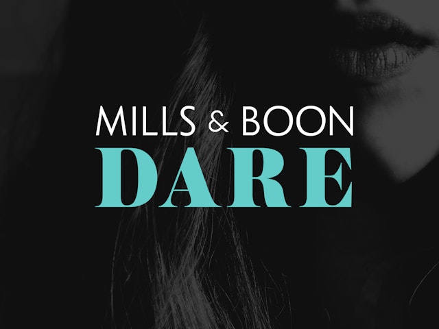

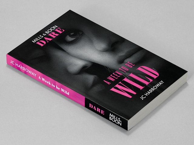
The graphic system and resulting style guide use a combination of tight crops and filters for the imagery, alongside considered typography and flexible colour palettes.
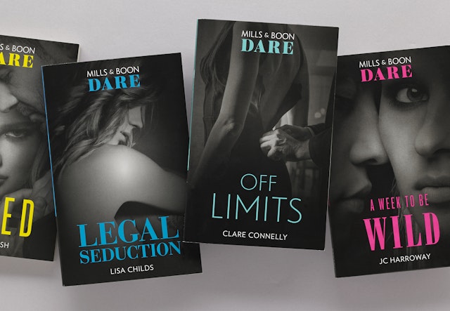
As well as the overarching brand, Pentagram worked with Mills & Boon to streamline its series model, developing directional concepts that serve as a standard for its in-house team.


The aspirational Modern series borrows from the aesthetic of style magazines, delivering a contemporary elegance that places the focus on characters.
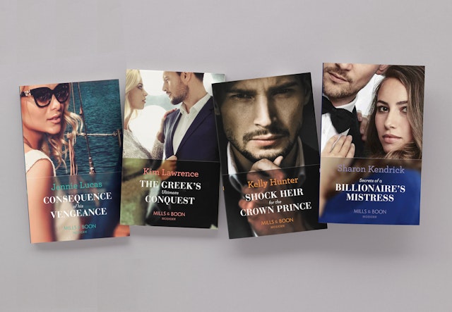
The resulting covers allow readers to project their own fantasies onto the Mills & Boon promise, and are more appealing in a today’s retail environment.

Founded by Gerald Rusgrove Mills and Charles Boon in 1908, Mills & Boon is a prolific British publisher of romance fiction. Publishing 120 new titles each month, Mills & Boon’s uplifting romances guarantee an instant escape to fantasy worlds, and the heart-warming reassurance of ‘happily ever after'.
As well as the traditional author-led model of publishing, Mills & Boon publish a wide range of theme-led series that are comprised of manuscripts from multiple authors, spanning the spectrum of romantic publishing. Its books are available via traditional retailers, as well as a long-running and successful book subscription service.
While the subscription arm of the business is extremely profitable for Mills & Boon, its consumer base is shrinking—making it imperative for the publisher to reach romance readers who regularly buy similar titles from bookshops, supermarkets and retailers.
To this end, Mills & Boon undertook the biggest consumer insight project in its history, speaking to over 1000 people across the UK. It found that potential customers viewed its content favourably and capable of satisfying their romance reading needs; but the general branding, cover design, finish and series model was a significant barrier for potential consumers.
Further to this, the Mills & Boon proposition was considered disorientating and too far removed from people’s regular book-buying experience—with the sheer quantity of series, titles and categories coming across as alienating.
Pentagram has refreshed the Mills & Boon brand, creating a new visual identity, graphic system and series concepts. Distilling insights from the consumer project, Pentagram developed the core proposition of ‘instant romantic indulgence’ alongside the brand idea of ‘the heart of romance’ to inform the refresh.
The new identity takes emphasis away from the supersized ampersand that had previously dominated visuals, shifting the focus to the whole Mills & Boon name, which is where the brand equity lies according to insights from the consumer study.
To that effect, the contemporary new brand mark reduces the scale of the ampersand and places it in the natural position between the founders’ names. The ampersand’s rose has been replaced with subtle heart-shaped geometry, a more universal signifier of romance that places the brand idea at the centre of the new mark.
A key focus while developing the identity was to create a system that could flex and scale based on the series and its subject matter. The overarching brand can live on its own strongly when required, but can also work in tandem with Mills & Boon’s diverse range of series.
Pentagram has devised a graphic system that is capable of delivering cover artwork for the publisher’s high turnover of titles—which rely on stock imagery—yet focused enough to ensure that the brand communicates its core proposition to consumers.
The system and resulting style guide use a combination of tight crops and filters for the imagery, alongside considered typography and flexible colour palettes. This removes unnecessary and trite elements from the composition, focusing instead on the characters. The resulting covers allow readers to project their own fantasies onto the Mills & Boon promise, and are more appealing in a today’s retail environment.
As well as the overarching brand, Pentagram worked with Mills & Boon to streamline its series model, developing directional concepts that serve as a standard for its in-house team. For example, the aspirational Modern series borrows from the aesthetic of style magazines, delivering a contemporary elegance that places the focus on characters. The seductive Dare series combines a bold series mark, minimal covers and sensual black and white imagery to create a subtle and provocative aesthetic.
