

Short and friendly, “Mia” imparts a sense of ownership, familiarity and affection when said aloud. And treated as a statement, it instinctively helps the community feel a sense of ownership in the institution: Mia is mine.




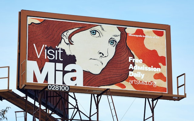
An alternate unicase “M” glyph that echoes the letter in the mark is used in display typography such as taglines, exhibition titles and sub-brands, threading a little bit of the logo through high-visibility applications like billboards, advertisements and posters.

On the eve of its 100th anniversary in 2015, the Minneapolis Institute of Art faced an interesting challenge. The world-class institution is one of the largest encyclopedic art museums in the U.S. and a local landmark, but it didn’t feel like its audiences were personally connecting with the experience of the museum.
Pentagram developed a new name, brand identity and tone of voice for the institution that helped it actively engage its community. Now known as the Minneapolis Institute of Art, or “Mia,” the museum has seen an increase in attendance, membership and fundraising. Bold, confident and friendly, the branding invites visitors to embrace the museum and truly feel that “Mia is mine.”
The designers worked closely with the museum leadership on the branding, including Director and President Kaywin Feldman, Chief Engagement Officer Kristin Prestegaard and Head of Design and Editorial Peggy Martin. After conducting an internal strategic assessment, the institution realized it wanted to fundamentally change the relationship its audiences had with its art. Admission and membership to the museum is free, which is welcoming but also makes communicating the importance of donating more pressing. At the same time, they wanted local visitors to understand that this is their museum, and to assert the institution in the city’s vibrant cultural landscape, which also includes the contemporary art-focused Walker Art Center.
“We knew who we were, we knew what set us apart, we just didn’t have the tools to visually express it,” says Prestegaard. “Pentagram gave us those tools.”
The team first looked at the museum name, which was a bit long and slightly confusing. The Minneapolis Institute of the Arts was founded in 1914 and originally consisted of a gallery and school, the Minneapolis School of Fine Arts (now the Minneapolis College of Art and Design, and no longer housed at the museum). The name included “Arts” because performing arts were originally meant to be a component, with the Minnesota Orchestra housed alongside the museum. This was never realized, and the institution was always first and foremost an art museum. (It does have an auditorium for performances.) Dropping the “s” from “Arts” was a simple way to clarify that yes, this is a place for the visual arts.
At the same time, the acronym “M-I-A” was less than ideal because it already stands for many other things. The museum’s existing logo, designed by Milton Glaser, made the acronym its focus, so it was reinforcing the awkward usage, which doesn’t exactly roll off the tongue the way “MOMA,” “LACMA” or “MOCA” do.
The team recommended that the museum take advantage of the fact that it already has a pronounceable acronym. And by happy coincidence, when said as “mee-ah,” it also actually means something. Looking at the acronym as a word, the designers realized that in cultures all over the world, “mia” has positive meanings and origins: “Mia” means “mine “ in Latin and Spanish, “my own” in Italian, “beloved” in Hebrew, and “dear” in Slavic. Just saying the word encourages a connection to the museum. Short and friendly, “Mia” imparts a sense of ownership, familiarity and affection when said aloud. And treated as a statement, it instinctively helps the community feel a sense of ownership in the institution: “Mia is mine.”
This welcoming point of view has been translated into an iconic and approachable logo that gives the soft word a strong look. The logo is designed with a mix of upper and lowercase letterforms that help signal the name should be pronounced as a word, “Mia,” rather than as the initials “M-I-A.”
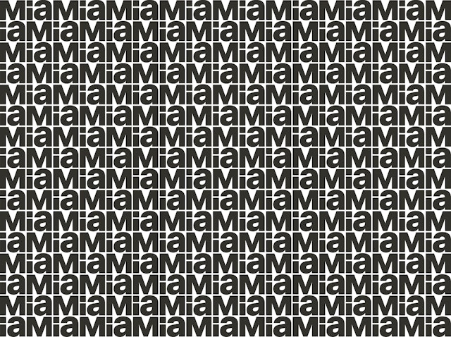
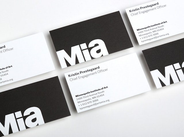
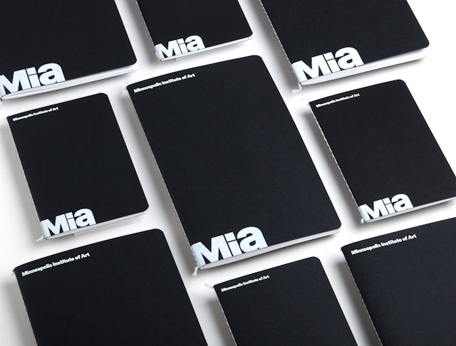
The new logo is sturdy, pragmatic, and versatile, with an inherent geometry that links it to the visual arts and makes it easy to use in applications. The width of the “M” in the mark equals the width of the “i” and “a” combined, creating a flexible building block that allows the mark to be read both horizontally or stacked vertically. The master logo pairs the mark and the wordmark, the museum’s full name, while a secondary version stacks the logo mark with the wordmark fitting snuggly between the "M" and the “i” and “a.” The mark is also used independently of the wordmark, or in a repeating pattern that reads both horizontally and vertically. The logo can sit on any kind of art, or act as a framing container. It can be tucked into a corner as a kind of endorser, but can also appear boldly on its own.
Mia Grotesk, the museum's proprietary typeface, was created in collaboration with Josh Finklea. It is a customized version of Post Grotesk that has been significantly modified to relate to the logo and give the font a stronger presence. Changes included squaring off the dots on the “i,” the terminals, and all circular punctuation, and widening the “M” and “N.” The weights of the typeface were also reconsidered, combining the book and medium weights to make a regular and adding a black weight, resulting in four custom weights—light, regular, bold and black.
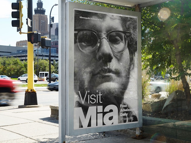
An alternate unicase “M” glyph that echoes the letter in the mark is used in display typography such as taglines, exhibition titles and sub-brands, threading a little bit of the logo through high-visibility applications like billboards, advertisements and posters. The designers also developed a system of custom icons inspired by the typeface and the unimark “M,” drawn on a grid that uses the “M” of the logo as a dimensional base.
The custom typeface gives Mia not just a mark, but also a voice. “The identity is not a logo, it’s not a color scheme, it’s not one element repeated,” says Prestegaard. “It’s a cohesive and thoughtful system. It gives us the framework and tools, but leaves us room for flexibility. That’s why it works. The more we use it, the more we love it.”
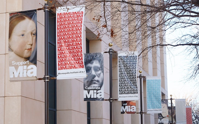
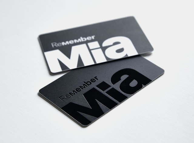
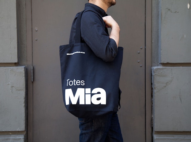
The designers also worked with the museum to develop a consistent tone of voice for its messaging, to help make it more personable, playful and welcoming. In addition to the statement “Mia Is Mine,” this includes a language system that pairs a verb with the logo in an engaging way on various applications, for example: “Visit Mia,” “Ask Mia,” “Support Mia,” and “Celebrate Mia.” “Re-Member Mia” appears on the membership card, and “Totes Mia” on the tote bag. In institutional communications, the writing speaks directly to visitors with words like “I,” “we” and “our,” to establish a personal connection. Thoughtful touches like this have helped make the branding feel like a natural extension of Mia’s mission to be a museum for everyone.
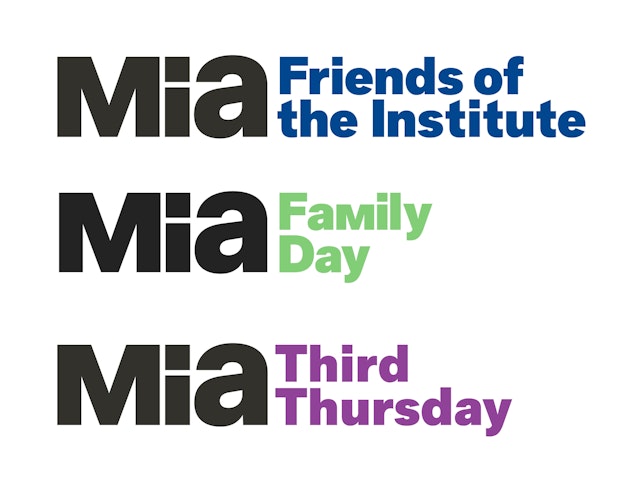
The designers expanded the identity into a full graphic language. The color palette is primarily black and white, to set off the colorful art, but a supporting secondary color palette was also developed that is color-coded for the different functions and departments of the museum: blue for discovery, maps and wayfinding; purple for events, red for giving and fundraising; beige for membership; green for community programming. Sub-brands were created for Mia programs like Family Day, Third Thursday, and more, and are used in tandem with the Mia mark.
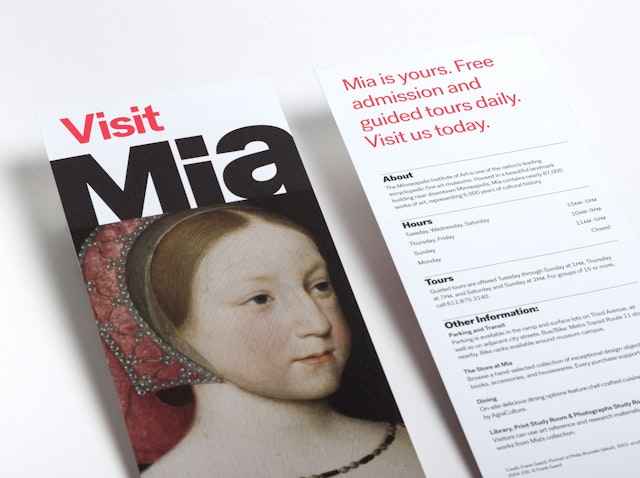
As part of the project, the team prepared comprehensive guidelines for the implementation of the identity across a variety of applications, from the signage and maps to exhibition materials, banners, staff apparel, social media, and branded merchandise for The Store at Mia. A cohesive grid system was developed for laying out the brand in applications such as promotions and publications, where the logo is always either placed in the bottom left corner of materials such as exhibition advertising and billboards, or sits above the art such as on rack cards. The mark is always anchored the left of any material and bleeds off the left edge whenever possible.
“The Minneapolis Institute of Art (Mia) is about people’s personal experience with art. We are free, we are welcoming,” says Prestegaard. “This became very clear when the staff and trustees of the museum immediately embraced the new brand. They choose to wear t-shirts every Friday that say—Mia is Mine. Because it is.”
