


The new system employs prominent use of the MoMA logo as a graphic device, dramatic cropping and juxtapositions of artwork, and a brighter color palette to create a bold, contemporary image.


Along with the many signature artworks in its collection, The Museum of Modern Art (MoMA) possesses one of the most recognizable logotypes of any cultural institution in the world. Over the years, however, the application of this identity across the museum’s broader graphics program became indistinct. In 2009 MoMA recast its identity, building on its familiar logotype to create a powerful and cohesive institutional voice. The new graphic identity was designed by Pentagram, and further developed and applied by Julia Hoffmann, who was MoMA’s Creative Director for Graphics and Advertising (and a Pentagram alumna).
While the MoMA logo is iconic, it alone is not enough to continually carry the spirit of the institution. An organized and flexible system was required that would support program material across print, web and environmental applications. The new system designed by Pentagram and Hoffmann employs prominent use of the MoMA logo as a graphic device, dramatic cropping and juxtapositions of artwork, and a brighter color palette to create a bold, contemporary image. The identity also underscores the museum's leadership role in the field of design.
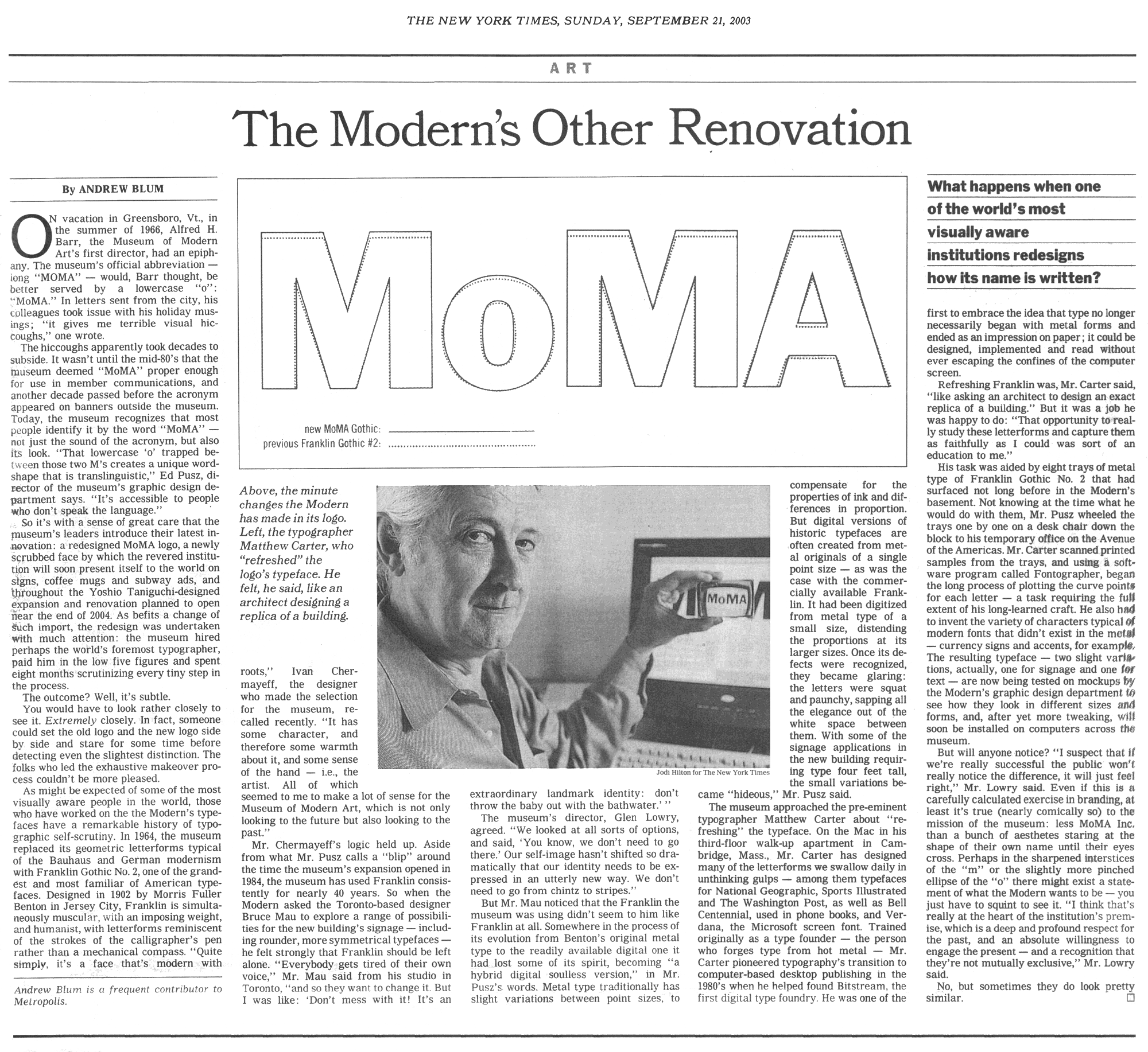
MoMA’s identity has been a landmark of institutional branding since 1964, when the museum introduced its distinctive Franklin Gothic No. 2 logotype designed by Ivan Chermayeff. In 2004 this logotype was redrawn in a new custom typeface, MoMA Gothic, created by Matthew Carter. The redesigned identity system expands on this logotype, making MoMA Gothic the principal font for all typography. More importantly, the system creates a complete methodology for the identity's application and handling across all platforms.
An appropriate scale and careful cropping were developed to make the identity more recognizable and powerful, and to create an attitude that modernizes the institution's image. A strong grid has been established for the uniform placement of elements. Images of artworks appear whole or are cropped for effect. (Prior to this, the museum did not typically crop images of artworks.) The images are paired with the logotype, which has a consistent vertical placement similar to the signage on the museum's façade. In most applications, one large image is selected as the focus, representing a current exhibition or signature work from the collection. A list of upcoming events unrelated to the featured image is organized into a text block.
When seen in multiple, as in a series of posters or banners installed on the street, the design creates patterns—of type and image, and of color and black and white—that are visually powerful and dynamic. The program has a built-in flexibility that will allow for future expansion and a variety of forms. The identity will be applied to all of MoMA’s institutional and public communications, including brochures, posters, banners, website and other materials. (Individual exhibitions will continue to have their own identities, used in exhibition graphics, catalogues and websites.)
The project was one of a series of innovative initiatives conceived by a new marketing advisory committee established by MoMA in January 2008. The committee, comprised of local advertising and design professionals advises the Museum on new avenues of communication and ways to diversify and engage with its audience. The committee was chaired by Ted Sann, MoMA honorary trustee. Other members included Doug Jaeger, The Happy Corp. Global; Paul Lavoie, TAXI Advertising; Arthur Ceria, Creativefeed; and Matt Freeman, BetaWave.
All pictured examples of the new identity were designed by Julia Hoffmann, Creative Director for Graphics and Advertising at the Museum of Modern Art at the time, and her in-house team of designers.
Office
- New York
