


The starkness of the identity is softened by its transparency and a subtle gradation of color that will include shades of blue blacks, green blacks and red blacks.


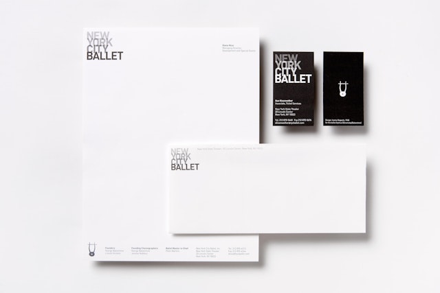
Pentagram has designed a new identity and promotional campaign for the New York City Ballet, one of the largest and most prominent dance companies in the world. The campaign, developed with Luis Bravo of the NYCB, launched in 2008 with the opening of the fall season.
Founded in 1933 by Lincoln Kirstein and choreographer George Balanchine, the New York City Ballet’s approximately 100 dancers perform a repertoire of over 150 works choreographed by Balanchine, Jerome Robbins and current Ballet Master Peter Martins. The performances, which take place at the New York State Theater at Lincoln Center, are neo-classical, but less traditional than other companies, as the company fulfills its original mission to re-imagine the principals of classical dance. The company is credited with bringing modern dance to the American public and as a result, has played a significant role in the history of twentieth century performing arts, a precedent that informs the company’s mission today as it continues to be an influential cultural force.
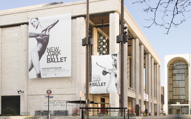
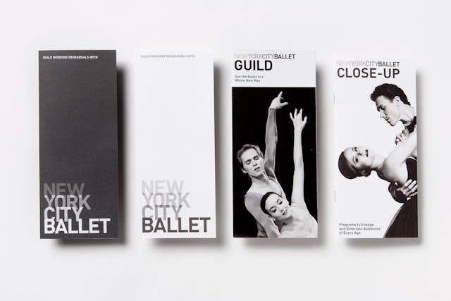
Working with Peter Martins, marketing director Tom Michel and general manager Ken Tabachnick, Pentagram has created an identity that links the company’s legacy and location to a contemporary and dramatic new aesthetic. Set in the font DIN, the logotype appears stacked and layered, like buildings staggered in the skyline, with a degree of transparency that echoes the visual texture of the cityscape. The palette is composed of black, white and silvery grays, in the way that the buildings of New York can sometimes appear. The starkness of the identity is softened by its transparency and a subtle gradation of color that will include shades of blue blacks, green blacks and red blacks.
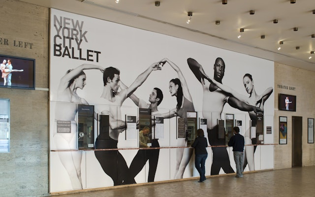
The graphics program is balanced by Nick Heavican’s arresting black and white photography. Promotionally, most dance companies typically present their performers centered in the frame, with the entire figure pictured. For the New York City Ballet, the designers cropped the images of City Ballet dancers to create more tension and drama. Cutting in and out of the frame, the dancers capture the shifting focus one experiences while watching a performance. At the same time, the dramatic layering of figures reflects the logotype and the city itself as viewers are immersed in the intense energy of the dancers, as well as the style of the city.
The new identity and graphics appear on bus shelter and subway posters all over the city, in magazines and newspapers ads, in the company’s programs and website, and in environmental graphics at the New York State Theater at Lincoln Center where the company performs.
Office
- New York
