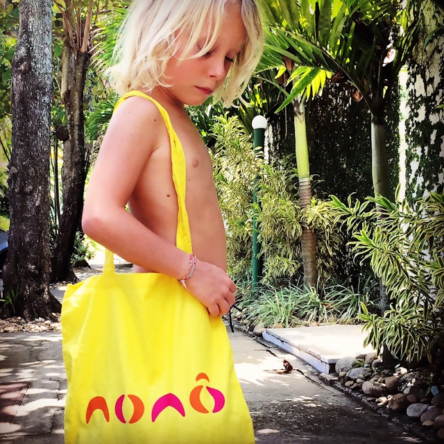
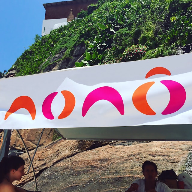
The logo is a set of rounded shapes - inspired by coconuts, waves, surfboards and Roberto Burle-Marx’s curvaceous landscapes - creating the word Nonô.


Praia da Joatinga is a beach in Rio. Only accessible by foot, the beach’s private atmosphere and reputation for waves has made it a favourite for celebrities and surfers alike. After making their descent to the shore, visitors to Praia de Joatinga get all their beach essentials - like coconut water, soft drinks, parasols and chairs - from a Barraca de Praia, a one-stop shop in the sand.
Praia da Joatinga’s secluded location means that it only has one Barraca, owned and run by Nonô and his family. Pentagram partner Marina Willer, who has a home overlooking the beach, first noticed Nonô when she was holidaying in Brazil. She would see him manning his Barraca from dawn to dusk in rain or shine, everyday. She was particularly impressed with the level of care that he gave to the beach, meticulously cleaning it up every evening - a task usually undertaken by the municipal government.
As a way to thank him for his service to the beach, Willer designed an identity for Nonô's Barraca, complete with a set of stencils and sprays for his parasols and beach chairs. The identity is a gift to Nonô and the Praia de Joatinga community, a celebration of the beach and Nonô’s dedication to it.
The logo is a set of rounded shapes - inspired by coconuts, waves, surfboards and Roberto Burle-Marx’s curvaceous landscapes - creating the word Nonô. A set of bright colours are used, to reflect Brazil’s infectious joie de vivre and to contrast with Praia de Joatinga’s surrounding greenery and sea.
Office
- London