Each cereal flavour is represented by a different character—these form a key part of the brand’s identity, interacting with each other, keeping pets and joining together to create an extended OffLimits family.


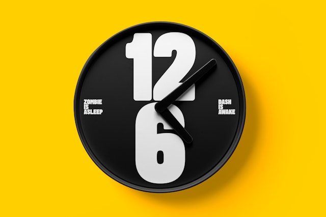
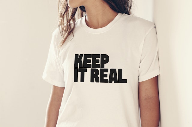

Other sleep- and breakfast-inspired items include mugs and T-shirts with playful slogans. The newspaper-format teaser ‘Cereal Times’ also features the brand’s signature bold typography, bright colours and playful copy.
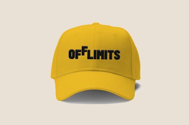

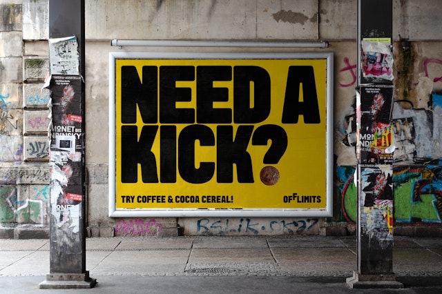
Encouraging us to ‘break the rules, starting from breakfast’, the brand language is irreverent and fun, reinforcing the cereal’s playful attitude. The packaging is colourful and bold, and very different to existing adult-orientated cereal brands.
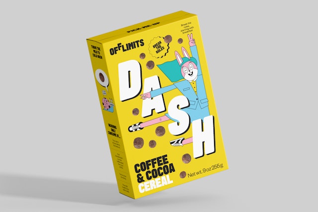

The design team have created a brand for OffLimits which perfectly suits this new cereal-with-attitude, placing it at the heart of its art- and cereal-loving community.

With different flavour-profiles designed to match your mood—according to whether your aim is to feel ‘wired’ or ‘tired’—OffLimits is a new, next-generation cereal and culture brand designed to be eaten at any time of the day. Its creator Emily Elyse Miller approached Pentagram to create both the packaging and a distinctive brand identity to perfectly embody OffLimits’ energetic and high-spirited attitude.
“I came to Pentagram with a cartoon universe of cereal characters and emotions floating in my head. explains Miller. “They extracted, organized, and created the rules for this world and the characters who live there. With Shepard Fairey’s Studio Number One on the cereal character designs, we had this surreal meeting of design perspectives, which for OffLimits, was an unstoppable force of pure defiance mixed with mindfulness.”
The identity comprises of two unique characters (the first of four) which take centre stage on the packaging, and a brand language featuring bold typography, saturated colours and an expressive tone of voice.
Each cereal flavour is represented by a different character—these form a key part of the brand’s identity, interacting with each other, keeping pets, posting on their own Instagram accounts and joining together to create an extended OffLimits family.
‘DASH’ appears on the caffeine-infused coffee and cocoa flavour and ‘ZOMBIE’ on the more mellow vanilla and pandan flavour. Both characters will feature in the various pieces of cereal-related ephemera designed by the team, which will run alongside the brand. Through these characters and their contrasting personalities, OffLimits is also on a mission to destigmatize difficult conversations about mental health. Each order contains a carefully constructed activity sheet with different stress and anxiety-relieving activities for people to work through while eating their cereal.
“The name OffLimits serves a dual purpose. It’s a playful take on the sugary treats that always seem to be out of reach when we’re young and also represents the element of defiance that’s ingrained in the brand’s DNA”, explains Emily Elyse Miller. “Right now, the system is broken, and we’re rebuilding the world we want to live in. Nothing is OffLimits!”.
The design team created a bold logo with the second ‘F’ just out of reach (or ‘off limits‘), which is accompanied by a bespoke typeface designed in collaboration with Emma Williams, and a saturated colour palette.
“The logo is insanely perfect because it creates a veil of playfulness with a deeper meaning” adds Miller. “The logo mood board was accompanied by a child reaching for the second ‘F’ just out of reach. It has this playful vibe that you might associate with the curious nature of kids. But the true rebel mindset of the brand views the ‘F’ as defiant, flipping off the traditional ways of doing things and creating a new world of its own floating out of alignment with the other characters.”
The different elements work together to create a vibrant visual language which brings the high energy brand to life. Encouraging us to ‘break the rules, starting from breakfast’, the brand language is irreverent and fun, reinforcing the cereal’s playful attitude. The packaging is colourful and bold, and very different to existing adult-orientated cereal brands. As well as the regular size boxes, the cereals are also available in special individual mini packs.
The proposed brand assets (such as sleeping masks featuring the word ‘Snooze’) were carefully selected to help bring OffLimits to life. Other sleep- and breakfast-inspired items include mugs suggesting that we ‘Break the Rules’, and T-shirts with playful slogans such as ‘Keep it Real ‘. The newspaper-format teaser ‘Cereal Times’ also features the brand’s signature bold typography, bright colours and playful copy.
Reflecting its spirited audience, the brand has established a strong online presence. Carrying on the longstanding tradition of pairing toys and cereals, the OffLimits toy store is a gamified, arcade-style online experience where guests can swap tickets collected from cereal purchases, for unique merchandise. A series of quirky animations were created by the design team for the brand to use on the website and share on social media.
Its founders were keen to create a strong community around the brand and tap into a global network of artists and influential voices. OffLimit’s digital art gallery was created as a response to worldwide gallery closures during COVID-19—aiming to support diversity and counterculture, it encourages cereal fans to support artists and school art programs by visiting its online exhibitions and shopping in its virtual gallery.
The design team have created a brand for OffLimits which perfectly suits this new cereal-with-attitude, placing it at the heart of its art- and cereal-loving community.
Office
- London
Partner
- Astrid Stavro
Project team
- Sara Martin
- Nicoletta Belardinelli
- Jake Gilbert
- Mariana Santiago
- Hyunsong Lee
