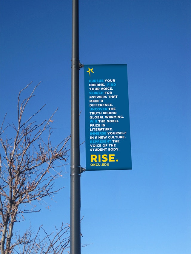
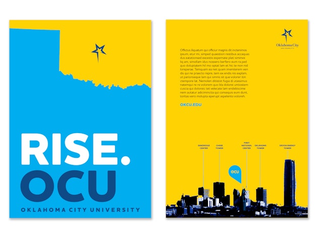


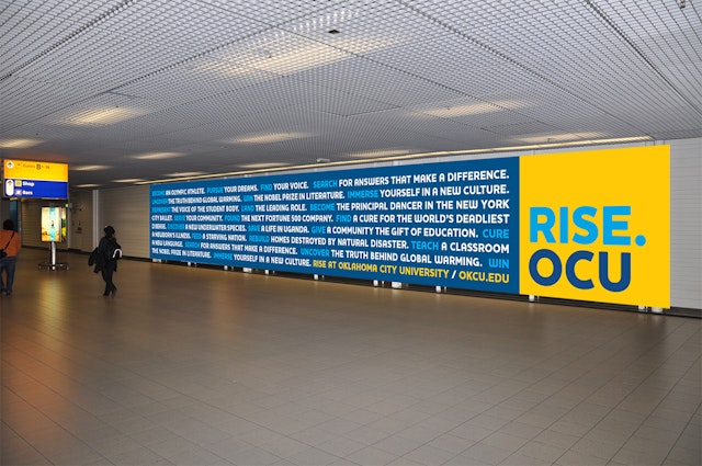
The Pentagram team also updated OCU's caps-and-small-caps wordmark with a contemporary Roman typeface called Romain, set in a more approachable upper- and lowercase, and downplayed the word ‘University’ in a smaller sized sans-serif face, called Houschka Pro, in all caps.




Pentagram completed a new identity and a rebranding of Oklahoma City University (OCU) in 2013. The private urban college, located in the Uptown District of its namesake city, is affiliated with the United Methodist Church and offers a wide variety of degrees in the liberal arts, fine arts, science and business. The only Oklahoma institution listed in the top tier of the regional, master's-level university category by U.S. News and World Report, OCU is also listed in Forbes' "Best Christian Colleges" and "100 Best College Buys."
Oklahoma City University is also known for its top-notch dance, music and theater programs and its impressive track-record of placing graduates in Broadway musicals and theatrical productions, most notably in the lineups of the Radio City Rockettes. In addition to its performing arts prowess OCU is renowned for its many beauty pageant contestants, contributing $2.2 million in educational scholarships to more than 340 pageant contestants over the last 55 years. Fondly dubbed "Miss America U" for its tradition of winning pageants, OCU boasts 24 Miss Oklahomas and holds the record for Miss America winners. A larger than life-size bronze statue portraying the school's three former Miss Americas—Jane Jayroe, Susan Powell and Shawntel Smith—stands guard at the entrance to the campus.
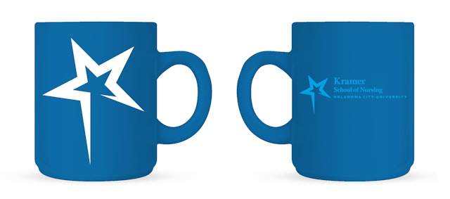
Before the redesign, OCU's primary logo featured a silhouetted likeness of the university's iconic Gold Star Tower, a 286-foot red brick tower built in 1953 to honor Methodists who died in World War II. The tower, an Oklahoma City landmark located prominently in the center of campus, is topped off with a 200-pound star positioned at the end of a long pole like a star on a Christmas tree. There are are other stars at OCU as well– star faculty and researchers, stars in the classroom, on the basketball court and star alumni in business, law and medicine.
The Pentagram team also updated OCU's caps-and-small-caps wordmark with a contemporary Roman typeface called Romain, set in a more approachable upper- and lowercase, and downplayed the word "University" in a smaller sized sans-serif face, called Houschka Pro, in all caps.
Office
- Austin
