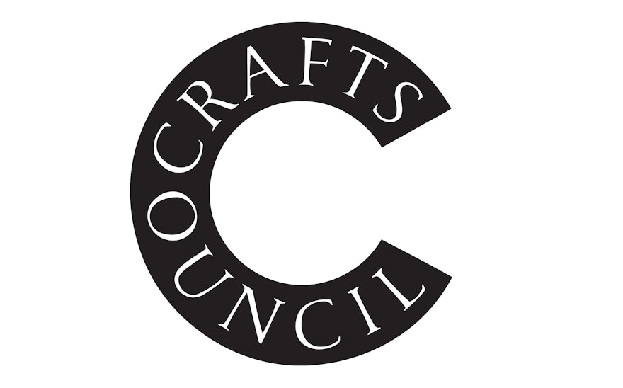
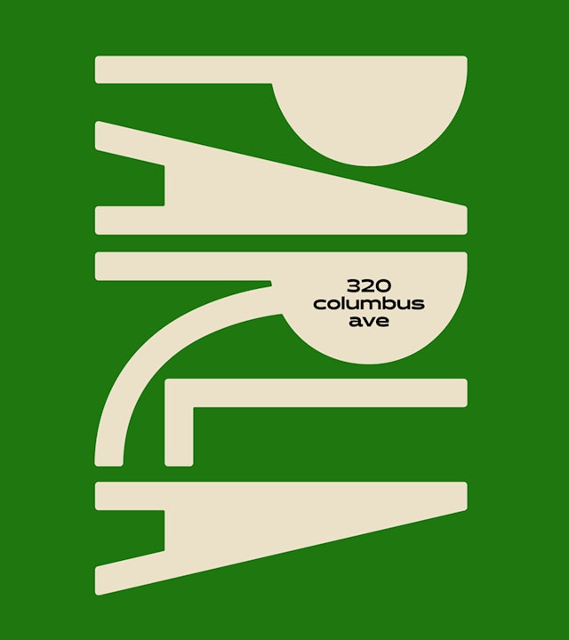
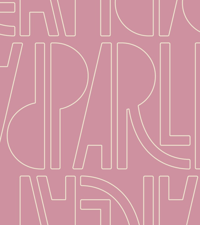
Parla’s outgoing spirit is captured in the jaunty custom type of wordmark, with tightly spaced letterforms that lean in together as though in conversation.
The logo can be used in patterns and is part of a full course of graphic elements that build out the brand.
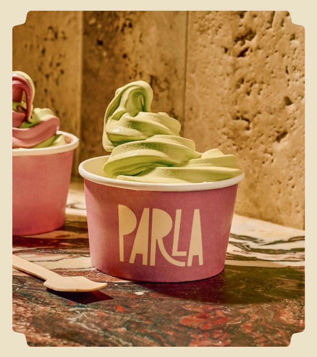
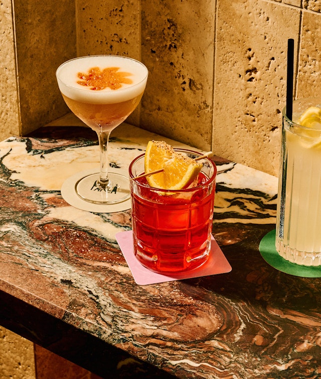
The brand palette brings together appetizing colors with names like prosciutto, arugula and truffle.
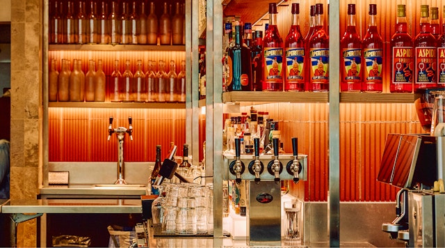
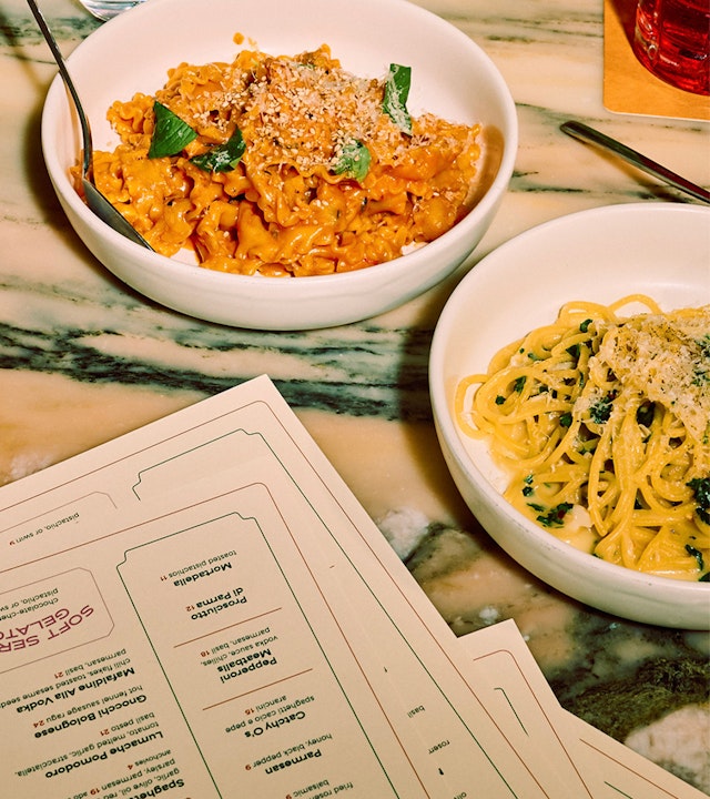
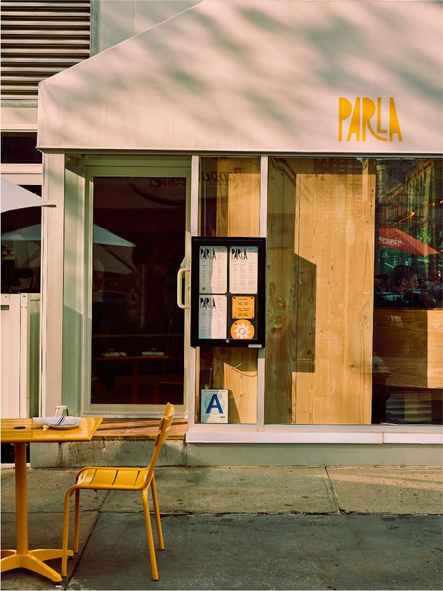
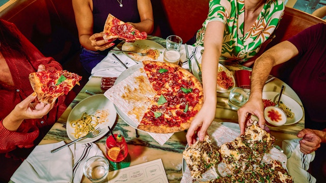
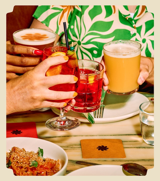
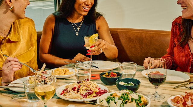
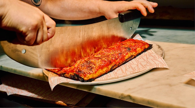
Parla is an all-day neighborhood spot to gather for lively conversation over coffee, pizza and cocktails on New York’s Upper West Side. Centered around a large communal table, the restaurant’s charming, intimate space on Columbus Avenue and West 75 Street is buzzing as it shifts from coffee and pastries in the morning to flatbreads, pizzas, pastas and drinks in the evening. Parla is a modern “cafe pizza bar” with something for everyone, combining the warm, informal camaraderie of an Italian trattoria and the laidback vibe of a New York bar or bistro.
Pentagram developed the brand identity and all collateral for the cafe, which is a new concept from Corner Table Restaurants, the group behind The Smith brasseries in New York, Washington, DC, and Chicago.
Parla is Italian for “speak,” and is also a play on saying the word “parlor” in native New Yorkese. The restaurant’s focus on warm hospitality and simple, quality ingredients is reflected in the playful visual language of the identity, which combines expressive typography and bright, saturated colors inspired by the period Italian graphics of the 1960s and 70s.
Parla’s outgoing spirit is captured in the jaunty custom wordmark, with tightly spaced letterforms that lean in as though in conversation. Brand typography is set in the geometric sans serifs Halcyon and Area Extended and Normal.
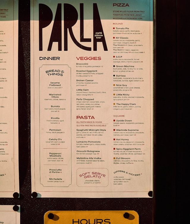
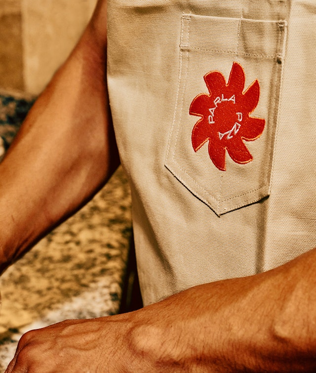
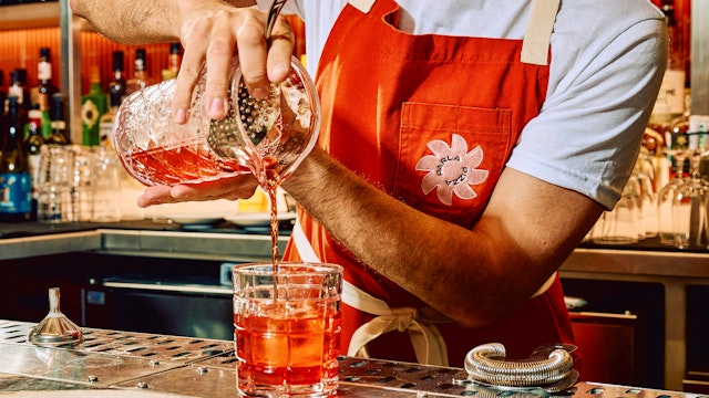
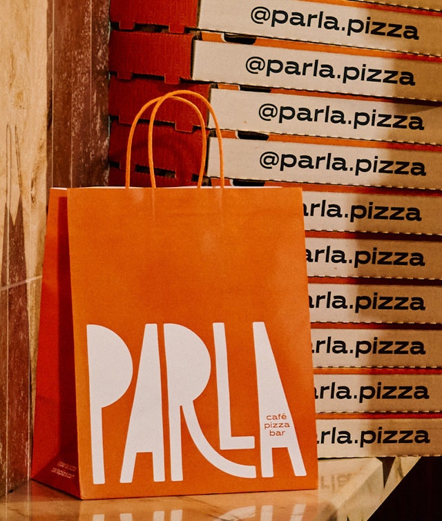
The logo can be used in patterns and is part of a full course of graphic elements that build out the brand: An icon holds a pair of “Ps” that face one another. Another symbol fans out the Parla “Ps” into a sunburst that also resembles the top of a tomato, or the folded paper wrappers used to package oranges in Italy. A round logotype puts the words “pizza” and “Parla” in rotation, playing on the name. And moving patterns of wavy stripes look just like spaghetti noodles.
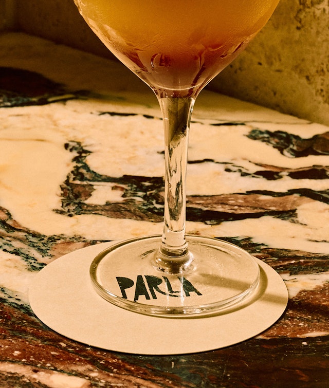
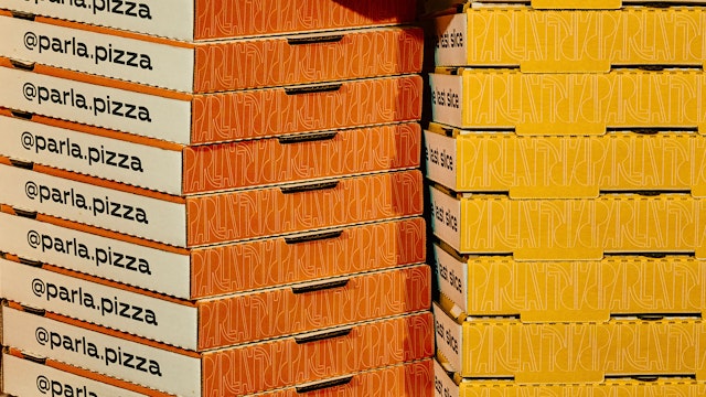
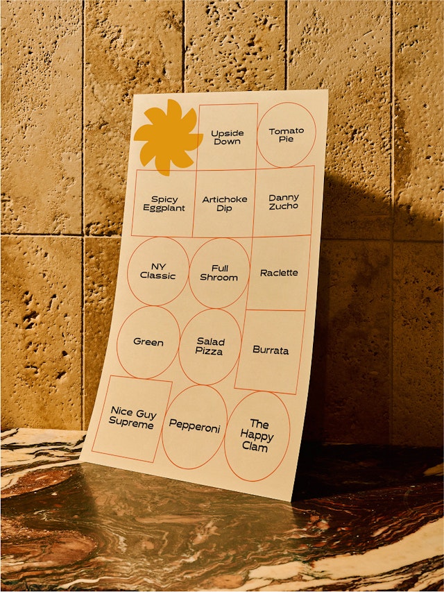
A system of simple geometric shapes reference the round and square pizzas, which are outlined in a poster that doubles as a menu and on color-coded stickers for pizza boxes, identifying varieties like the Hot Hunny, the Sonny Boy and the Pie Dye. Coasters for cocktails are also square and round.
The brand palette brings together appetizing colors with names like prosciutto, arugula and truffle. Outside, streetside tables in bright tomato orange and squash yellow announce Parla’s presence along the popular Columbus Avenue dining strip, where it has quickly become one of the neighborhood’s favorite pizza parlors, par excellence.
Office
- New York
Partner
Project team
- Mira Khandpur
- Renee Freiha
- Mira Steinzor
- Greg Morrison
- Samantha Infante
Collaborators
- Parla / Louise Palmberg, photography