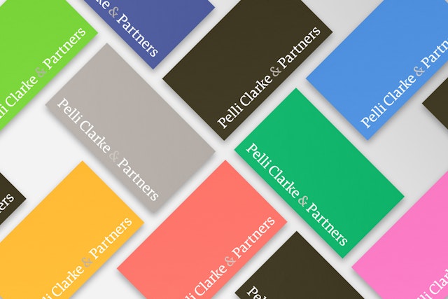
The identity reflects the firm’s rigorous, open and responsive design process with a graphic language that is accessible and inclusive.


The spirit is modernist and optimistic, with a bright, multicolor palette that is unusual for an architecture firm.

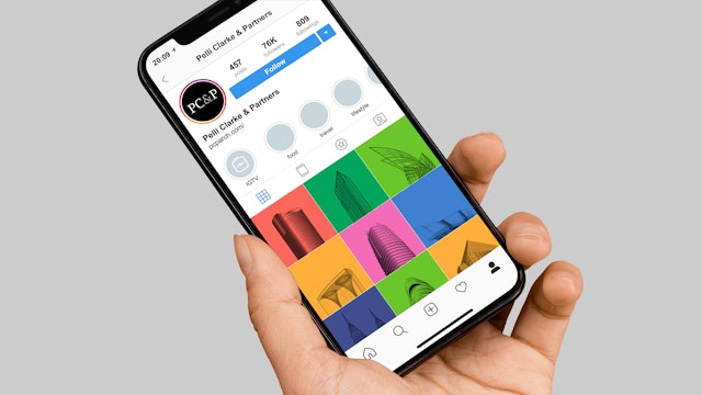
The website and communications foreground photography and video to showcase and explain the architectural projects in a rich, compelling manner.
Pelli Clarke & Partners is one of the world’s leading architecture firms, recognized for an award-winning portfolio that includes iconic buildings such as the Petronas Towers in Kuala Lumpur, the International Finance Center in Hong Kong, Pacific Design Center in Los Angeles, and Salesforce Transit Center in San Francisco. Based in New Haven and New York City, the practice brings together partner-led interdisciplinary teams of architects, designers, and technical experts to create sustainable and inspiring buildings and environments that transform communities around the globe. Pentagram has designed a vibrant new identity and website for Pelli Clarke & Partners that captures its innovative spirit and contemporary ethos.
The Pentagram team worked closely with Fred W. Clarke, Rafael Pelli and the full partnership to evolve the firm’s communications while staying true to its founding principles. The new identity coincides with a renaming of the firm to Pelli Clarke & Partners. The practice was originally established in 1977 as Cesar Pelli & Associates, and its first office in New Haven remains its flagship today. In 2000 Rafael Pelli opened the New York studio, and the name changed to Pelli Clarke Pelli Architects in 2005. When Cesar Pelli passed away in 2019, the partners were already carrying on Cesar’s vision as the next generation of leadership at the helm. The new name celebrates the dynamism of the current partnership and the collaborative culture of the firm, which has grown to include offices in Tokyo, Shanghai and Shenzhen.
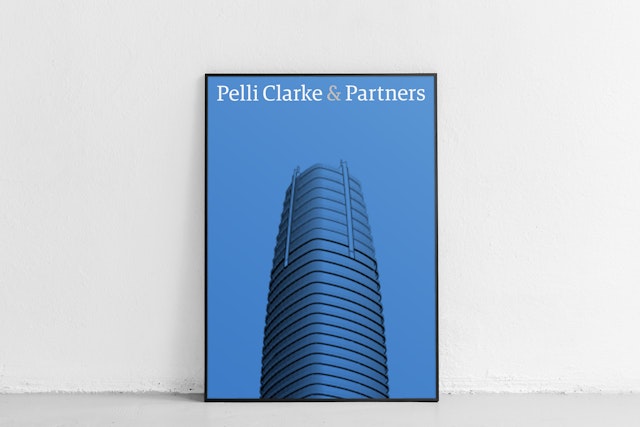
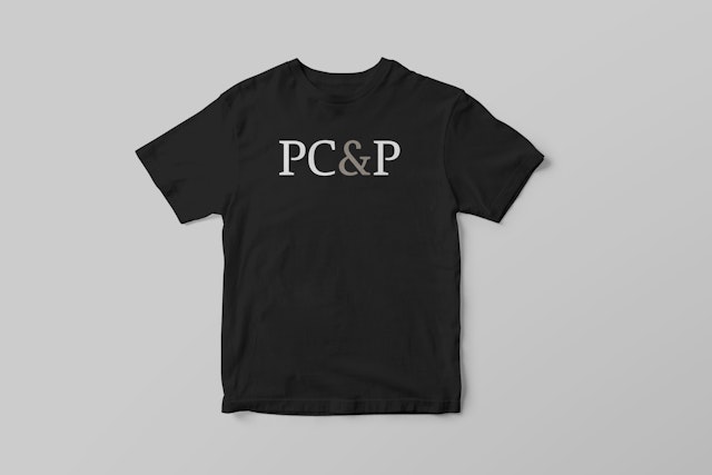
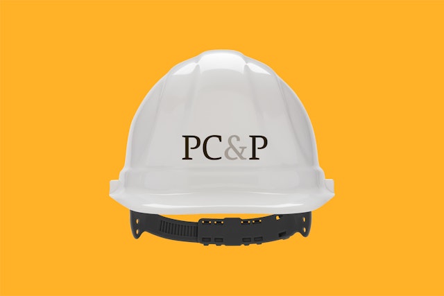
The identity reflects the firm’s rigorous, open and responsive design process with a graphic language that is accessible and inclusive. The spirit is modernist and optimistic, with a bright, multicolor palette is unusual for an architecture firm. The clean simplicity nods to the mid-century modernism of Paul Rand, the legendary graphic designer and professor at Yale in New Haven. The wordmark uses a contemporary serif font (customized from Guardian Egyptian Headline by Commercial Type) that is structural and literary. This is balanced by the supporting type set in the sans serif font Matter (by Displaay), chosen for its subtle but lively warmth.
The updated website and communications foreground photography and video to showcase and explain the architectural projects in a rich, compelling manner. Case studies are layered with images, videos, process drawings and statistics. Project types are color coded by category, highlighting the range of the firm’s portfolio. The tremendous architectural legacy of the partnership is demonstrated with an interactive timeline illustrated by icons of existing projects and those due for completion in the near future.
Office
- New York
Partner
Project team
- Shigeto Akiyama
- Austin Maurer
- Elyanna Blaser-Gould
- Margaux Saulou
- Camila Leone
Collaborators
- Chris Corby, web development
- Winnie Au, photography
- Cottage Eight Films, filmography
