

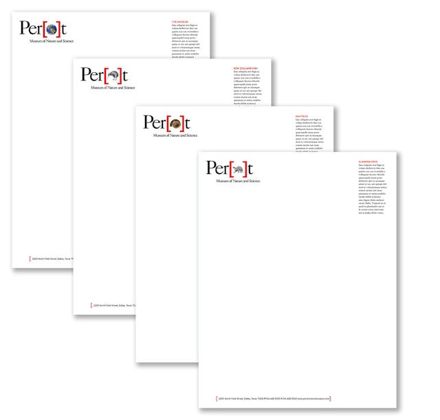
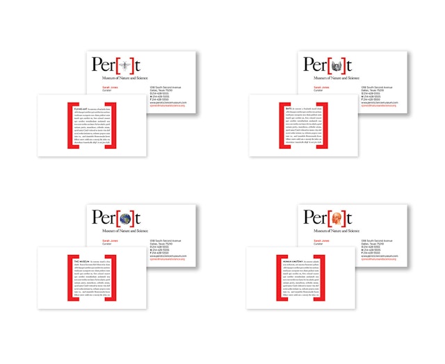
The contemporary red brackets contrast the intentionally classic and timeless wordmark set in upper- and lowercase Caslon, and are used as branding elements in other parts of the identity system as well.
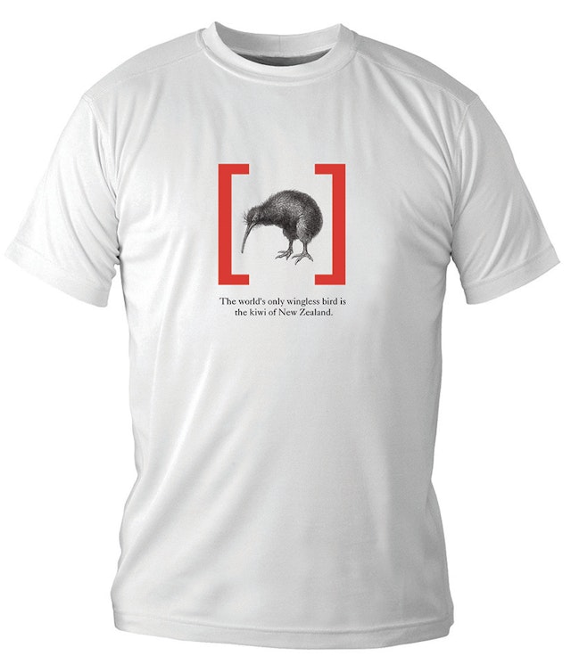

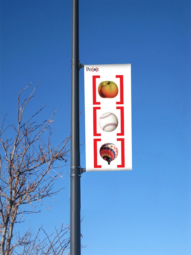
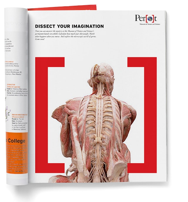
A towering pair of three-dimensional brackets were the centerpiece at a glittering press conference to unveil an innovative identity system for the Perot Museum of Nature and Science. The new identity, developed by Pentagram, uses a pair of distinctive red brackets in place of the letter "O" in the name Perot as a frame where a wide range of iconography can move in and out of the logotype over time.
"While the globe within the brackets will be the Museum's institutional mark, this is actually a dynamic logo," said Museum marketing director Beth Hook. "The Perot Museum will have the flexibility to switch out the content within the brackets and fill it with innumerable images, reflecting a multitude of science topics and an array of Museum programs, services and collections."
The Perot Museum of Nature and Science is named in honor of Margot and Ross Perot and is the result of a $50-million gift by their five children. Designed by the Pritzker Prize-winning architect Thom Mayne and his firm Morphosis, the stunning $185-million museum is a massive textured cube with a distinctive glass escalator running diagonally across its facade. The building's shape was an inspiration for the Pentagram team.
The contemporary red brackets contrast the intentionally classic and timeless wordmark set in upper- and lowercase Caslon, and are used as branding elements in other parts of the identity system as well. The museum's new website, perotmuseum.org, utilizes the brackets extensively, as will the building's signage, wayfinding and environmental graphics program designed by Pentagram. Miller previously worked with Thom Mayne on the much-awarded signage program for the new Cooper Union building in New York.
One of the challenges for the Pentagram team going in was how to develop a single identity that represented everything, or even a fraction, of what the Perot Museum will have to offer. In addition to the plethora of scientific subject matter contained within its walls the new museum will be the result of three former institutions: The Dallas Museum of Nature & Science, The Science Place, and the Dallas Children's Museum, all coming together under one flat roof. The idea of the ever-evolving iconography that can be displayed in the new logotype's red brackets is a solution to that problem.
"This is another red-letter day for the Perot Museum of Nature and Science as we unveil our new logo and brand identity," said Nicole G. Small, Perot Museum's CEO. "This novel branding approach will provide us a flexible and dynamic canvas to support not only our new Museum but all of the wonderful things we will have going on, both inside and outside the building."
Office
- Austin


