The branding uses the ‘dimple’ of the iconic Amazon smile as a catalyst to move viewers through an infinite ripple of their favorite content.



Amazon developed a brand strategy that envisions the platform as a ‘rabbit hole’ of entertainment where viewers can get lost in millions of content choices.
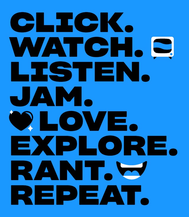
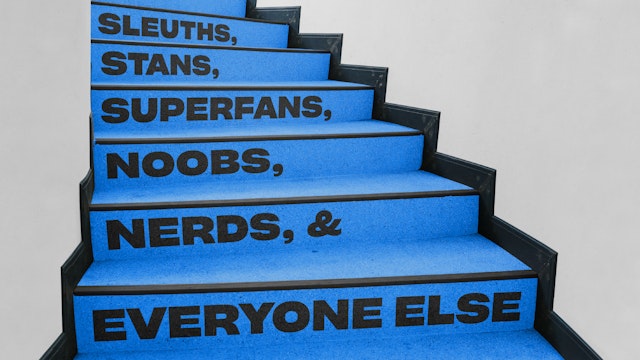

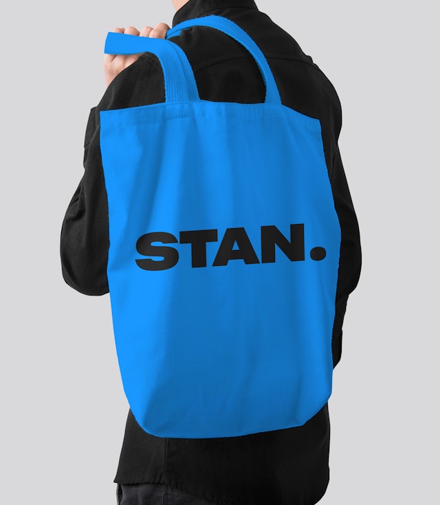

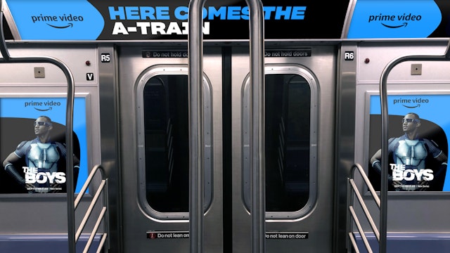
The font is designed to go with dozens of playful symbols, dubbed ‘Iconics,’ that can represent various genres…and offer yet another inside wink and nod for fans.

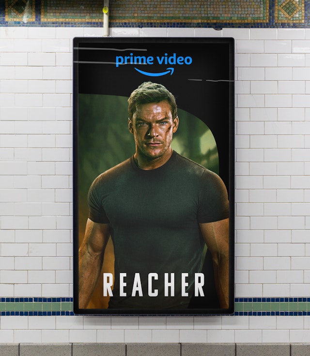
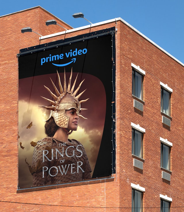
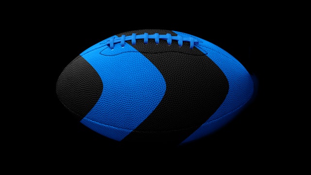
Prime Video is a hugely popular streaming service, with over 200 million subscribers––including more than half the adults in the US alone––logging in to enjoy a massive library of movies, series, sports and premium channels, with something for every fan. The content includes Prime Video’s excellent original programming, from hits like “The Marvelous Mrs. Maisel” and “The Boys,” to the blockbuster series “The Lord of the Rings: The Rings of Power,” to the weekly NFL games of “Thursday Night Football” (for which Pentagram designed the brand identity).
Pentagram’s Emily Oberman and team have developed a brand refresh for Prime Video that highlights this incredible array of entertainment and positions the streaming service as an immersive home for fandoms of all types. The branding uses the “dimple” of the iconic Amazon smile as a catalyst to move viewers through an infinite ripple of their favorite content. The identity launched alongside a redesigned experience within the Prime Video app that makes it easier for customers to find the content they love.
The Challenge
Viewers today are faced with countless streaming options from major services like Netflix, Hulu, Disney+ and AppleTV+, as well as smaller genre-based platforms. Prime Video sought a cohesive brand identity that would stand out in this increasingly crowded landscape, highlight what makes the streamer different from all the rest, and help its original programming shine. The framework had to be flexible so it could be modulated for different types of content, from action to drama to comedy to sports, and adapt to cultural nuances in various global markets. And most importantly, it had to be related to the Prime parent brand, while feeling distinctly Prime Video.
The Strategy
To build excitement and awareness about the sheer depth of variety showcased on Prime Video, Amazon developed a brand strategy that envisions the platform as a “rabbit hole” of entertainment where viewers can get lost in millions of content choices. The personality of the brand is fun, witty and smart, guiding viewers through the extraordinary range of shows and movies as they follow their personal interests and fandoms—which Prime Video understands because they’re fans too.
Pentagram, working in close collaboration with the Prime Video team, helped evolve the positioning with a comprehensive visual language that reflects a passion for entertainment and makes space for all types of stories. The framework gives Prime Video its own distinct and compelling look within Amazon, syncs up with existing Prime Video elements to create an immersive experience of the brand and balances the graphic identities of the individual programs and the Prime ecosystem.
The Solution
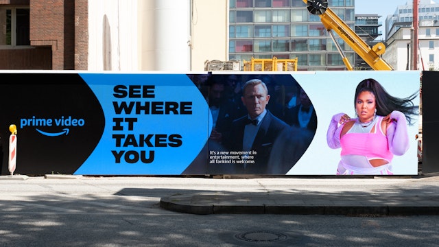
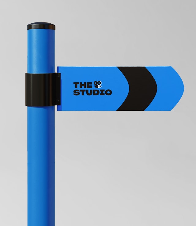
With an engaging eye for detail and a joyful sense of humor, the rebrand expresses the idea that Prime Video is extremely tuned-in and charmingly nerdy (in the best way) when it comes to entertainment. The identity uses familiar brand elements in fun and surprising ways, recasting the dimple-arrow of the Amazon smile logo into a distinct, ownable shape that conveys movement, momentum and energy as it points the way into the Prime Video rabbit hole. The curved form can be cropped into characteristic sections or used as a frame / window for imagery. The visuals are big and bold and burst through the dimple form, breaking the fourth wall in a way that interacts with the audience. The brand color is a brilliant and contemporary “Prime Blue” taken from the Prime palette.
Pentagram created a bold new proprietary typeface in collaboration with Lucas Sharp of Sharp Type. This customized version of Sharp Grotesk, called Prime Video Sharp, is strong and friendly, with multiple weights that fit in with the Prime family and support the exuberant tone of the messaging. The font is designed to go with dozens of playful symbols, dubbed “Iconics,” that can represent various genres or create a rebus-like shorthand––the fangs of a vampire, the rings of Middle Earth, a glowing magic sword, a zombie hand, a football, a ghost, a cowboy, and so on. Created by the illustrators at Patswerk, the icons also animate to interact with the typography and offer yet another inside wink and nod for fans.
The branding has a built-in flexibility to handle the wide scope of entertainment on Prime Video. Along with the assortment of Iconics, the look can be adjusted for larger tonal shifts. The designers developed two distinct visual modes, or “tunnels,” for different types of content––bold and bright in Prime Video’s signature blue for a pop culture feel, or dark and cinematic for when things get a little more serious, sophisticated and dramatic.
The concept deftly scales across everything from billboards, social media and swag, to motion graphics, TV spots and the GUI (graphical user interface) of the Prime Video player itself. Two textural animations—a cinematic 3D version by FutureDeluxe that opens original series and films, and another by Pentagram that starts and ends each promo—transform the dimple into a dimensional portal, showing viewers the endless ripple effect their journey into the world of Prime Video can have on their viewing experience. They serve as a reminder that all you have to do is dive in and see where it takes you.
Office
- New York
Partner
Project team
- Laura Berglund
- Greg Morrison
- Mira Khandpur
- Whitney Badge
- John Boran, Jr.
- Tom Grunwald
- Lisa Grant
- Jase Hueser
- Anastasia Kharchenko
- Renee Freiha
- Virginia Shannon
- Ken Deegan
- Ruben Gijselhart
Collaborators
- FutureDeluxe, 3D cinematic open
- Patswerk, icon illustration
- Zelig Sound, sound design
- Sharp Type, typography
