The brief was to bring the brand identity in line with how stakeholders envisage the company moving forward—as a modern, confident, creative and ambitious organisation in the world of illustrated publishing.
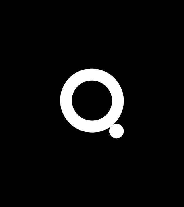
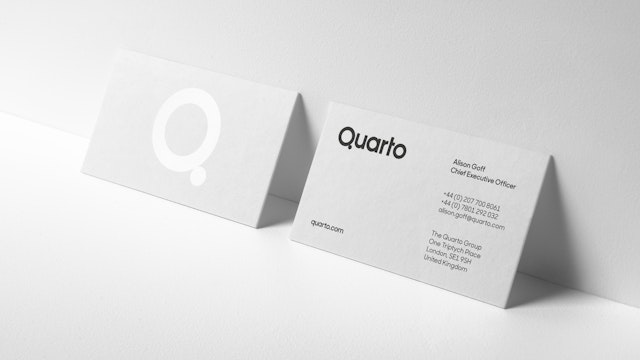
The design team focused on the letter ‘Q’ in the logo. The form was reduced to two circles to make the logo more streamlined, more memorable and more ownable.
Pentagram has designed the new identity for the publishing group Quarto.
Established in 1976, in ten years Quarto went from four original founders to launching on the London Stock Exchange. Today, Quarto is a global leader in illustrated non-fiction publishing, making and selling books that set out to entertain, educate and enrich the lives of adults and children around the world.
Quarto recently moved to new offices at One Triptych Place on London’s South Bank, giving access to large collective spaces that can be used for author events and creative workshops. The publisher has also just announced the launch of a new gift and product imprint Kaddo, as well as a new lifestyle imprint under Octopus’ former publishing director Eleanor Maxfield.
To coincide with the move, the publisher approached Pentagram Partner (and Consultant Creative Director at Quarto) Angus Hyland to create a new identity for the Quarto Group. The brief was to bring the brand identity in line with how stakeholders envisage the company moving forward—as a modern, confident, creative and ambitious organisation in the world of illustrated publishing.
The design team's aim was to produce a highly visible, up-to-date and refined identity to reflect the company's confidence and ambition. The first step was to drop the word ‘group’, creating a streamlined new brand name which is less corporate and formal and embodies Quarto’s core values of being nimble and dynamic.
Quarto has a range of very varied imprints and produces a wide range of book titles. It also works with a range of other external publishers and packagers. Due to these considerations, the design team decided to adopt a more simplified, modernist approach to the design in order to achieve a relatively neutral appearance that would work across a range of applications and in many different contexts.
The design team focused on the letter ‘Q’ in the logo as the letterform is such a distinctive character (and one that already differentiates the brand from its competitors). The form of the Q was reduced to two circles to make the logo more streamlined, more memorable and more ownable.
In book production, ‘quarto’ refers to how a printed sheet is folded in four to make up an eight-page signature (or section) within a section-sewn book. The literal translation of Quarto from Latin is ‘fourth’ or ‘quarter’, and these points of reference inform the design of the brand assets.
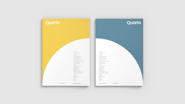
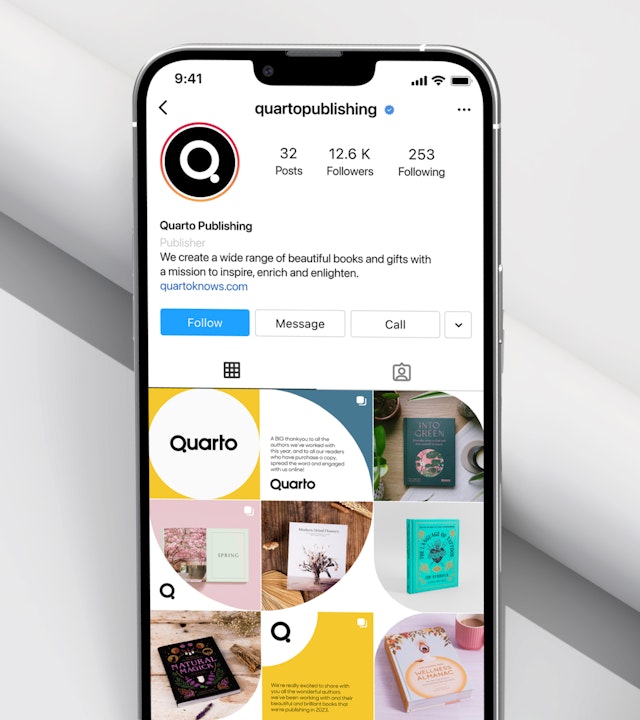
The use of geometric, circular forms in the logo alludes to the idea of ‘wholes’ and fractions. The main colour palette consists of four colours for each of the seasons and the graphic elements all derive from quarter divisions of a circle. Sharp Sans from Sharp Type Foundry was chosen due to its complementary geometric, circular forms that work well with the new Quarto logo and overall approach to the visual identity.
Angus Hyland comments: “It’s a really exciting time in the development and growth of Quarto and we wanted to celebrate this. The new visual identity is smart, approachable and reflects Quarto’s agile and forward-thinking approach.”
Office
- London
Partner
Project team
- Karolina Alvekrans
- Daniela Perez
- Charlotte Selby
- Alex Wright
Collaborators
- Roger Taylor (artworking)


