

The designers created a simple graphic system that marries the forms of the architecture with the dynamic spirit of Queens Theatre.
Queens Theatre is the premier performing arts venue in Queens, New York, presenting world-class theater, dance, music and comedy. The innovative productions are matched by a one-of-a-kind location: QT is located in the historic Theaterama, one of the three structures that originally comprised the New York State Pavilion at the 1964 World's Fair in Flushing Meadows Corona Park. Pentagram has designed a new identity for Queens Theatre that conveys its vibrant programming and unique setting. The logo employs simple shapes inspired by the geometric forms of the pavilion, which marks its 50th anniversary this year.
The designers worked closely on the project with Taryn Sacramone, Queens Theatre’s Managing Director. Queens is the most ethnically diverse county in the US, and the Theatre was looking for a visual language that would appeal to an incredibly varied audience and provide a cohesive system for promoting a wide range of activities. At the same time, QT needed an identity that would reflect its position as an important arts institution and help it stand out in New York City’s crowded cultural landscape.
“Our programming is incredibly diverse,” says Sacramone. “I wanted one strong identity that unified all of our materials and communications. We are also working to reach new audiences, and people unfamiliar with Queens Theatre will make an assumption about the artistic quality of our productions from the artistic quality of our branding. I wanted the look of our new identity to match the quality of what we put on stage.”
Established in 1989 and officially opened in 1993, Queens Theatre repurposed the Theaterama, one of the few structures spared demolition after the World’s Fair. The New York State Pavilion was designed by Philip Johnson and also includes the triple Astro-View towers observation decks and the open-air Tent of Tomorrow. The Pavilion is a modernist masterwork and an icon of the borough.
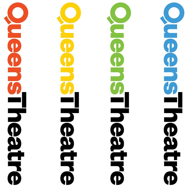
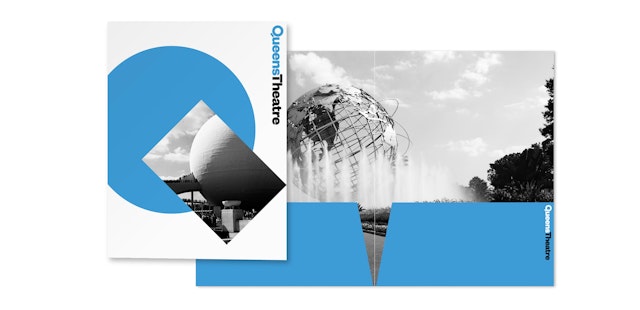
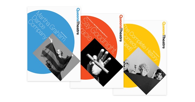
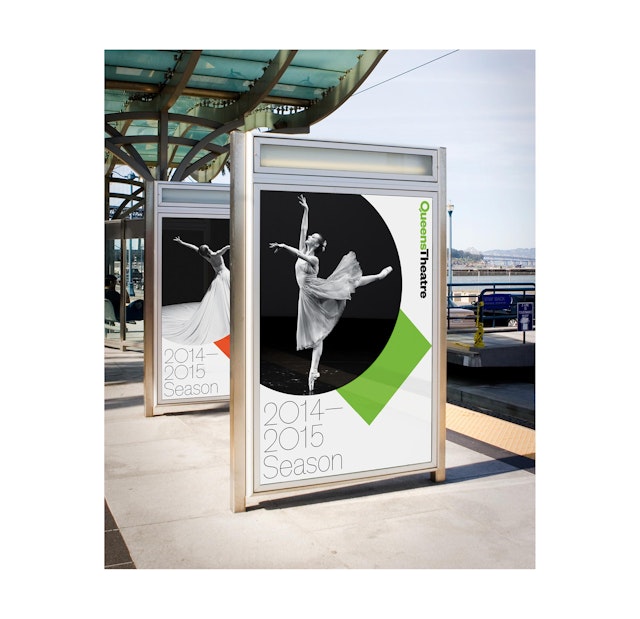
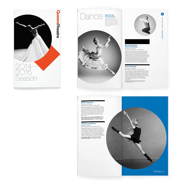
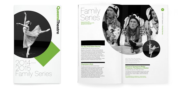
The designers created a simple graphic system that marries the forms of the architecture with the dynamic spirit of Queens Theatre. The logo uses a circle and rectangle to make the letter “Q,” with the shapes used as a containers for imagery. Institutional collateral like stationery and press kits utilize images of the architectural landmarks of the World's Fair (the New York State Pavilion is joined by the Unisphere), while materials promoting artistic programming use photographs of performers and productions. Color corresponds to different types of performance: blue for dance, red for theater, yellow for comedy, and green for family productions. For consistency, photography always appears in black and white.
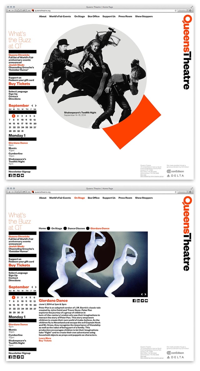
The logotype appears with a vertical orientation and is set in Founders Grotesk, with the letterforms of the “Q” and “T” customized to echo the architecture. Theinhardt is the secondary typeface, subtly modified to better complement the Founders Grotesk. Text in brochures and programs is always set in a single column and set off by black bars.
“It’s clean and smart and works for absolutely everything we do,” says Sacramone. “It’s sophisticated yet accessible—inviting to our longtime audience members and compelling to new ones. Because the identity is so strong and recognizable, every ad or poster will reinforce that Queens Theatre is regularly presenting and producing a wide range of work.”
