


Pentagram developed a future-focused strategy for the estate that based is on the notion of a ‘Sussex Origin’, positioning the area as a sparkling wine region comparable to Champagne.
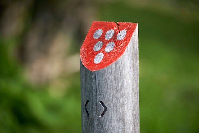
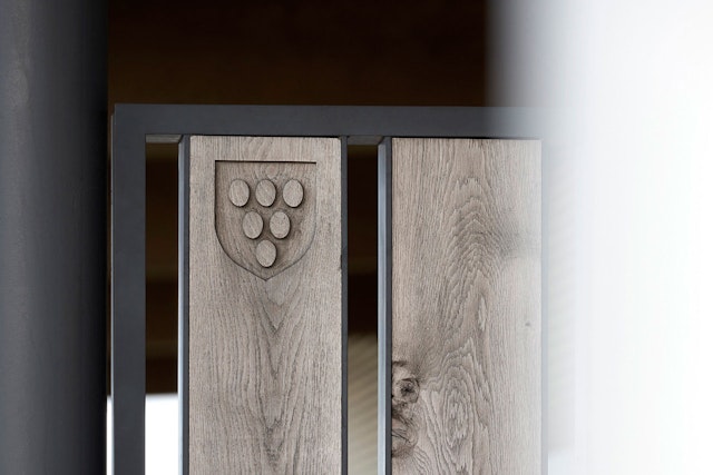
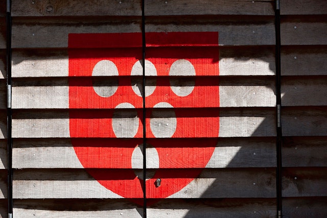
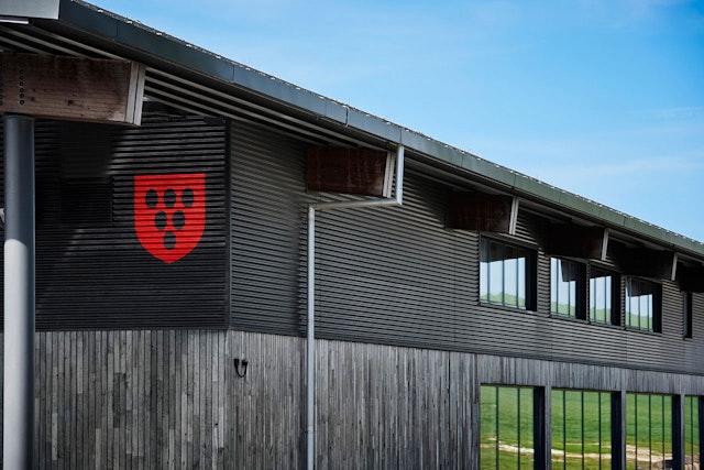
The logomark strongly infers the East Sussex coat of arms, using the same shield and colour, replacing the flag’s six martlets with grapes.
Pentagram has devised a brand strategy and visual identity for Rathfinny, a 600-acre wine estate on the Sussex South Downs that is set to become one of the largest single vineyards in Europe. Developed in the run-up to the estate’s first release sparkling wine in 2018, the identity across all applications has been detailed and implemented by Aloof Studio in Lewes.
The vision behind Rathfinny was conceived by its owners Mark and Sarah Driver, a founding partner of a hedge fund management group and a solicitor respectively. New entrants into the industry, their goal is to produce world-class sparkling wine at scale that could compete in the marketplace.
Rathfinny is a continuation of the South Downs’ distinguished history of farming, a practice which began during the Iron Age. The operation marries its prestigious past with distinctly modern tastes, processing the fruits that were once planted on ancient soil in a RIBA-nominated, state-of-the-art Winery, inviting guests to sleep, eat and practice yoga in carefully restored farm houses as well as opening a shop selling wines and local goods from the Duke of Wellington’s former gun room.
Pentagram worked with Deborah Taffler to develop a future-focused strategy for the estate. Pentagram’s solution is based on the notion of a ‘Sussex Origin’, positioning the area as a sparkling wine region comparable to Champagne and infers a future where people choose to celebrate with a glass of Sussex. It’s an ambitious goal, but Rathfinny’s south-facing aspect, ideal climate and plans to produce over a million bottles of sparkling wine annually makes it an achievable one.
Driver has since applied for a protected designation of origin status (PDO) from the EU for Sussex sparkling wine, which, if successful, would see Rathfinny’s wine enjoy the same prestige as Champagne and Burgundy. Officials are expected to rule in favour of the application, adding the drink to a host of other celebrated English PDOs including Arbroath smokies, Cornish clotted cream and Stilton cheese.
The visual identity furthers the brand strategy, building on the reputation of products from a ‘Sussex Origin’. The logomark strongly infers the East Sussex coat of arms, using the same shield and colour, replacing the flag’s six martlets with grapes. The chosen typefaces were designed by Eric Gill, who lived and worked for many years in Ditchling, five miles from Rathfinny.
A strong regional influence has been weaved through every part of the brand, demonstrated by the ongoing relationship with Sussex-based architect Martin Swatton, who created the masterplan for the site.
Office
- London
