The new brand needed to look elegant and stylish, and appeal to a more discerning, adventurous and health-conscious customer.


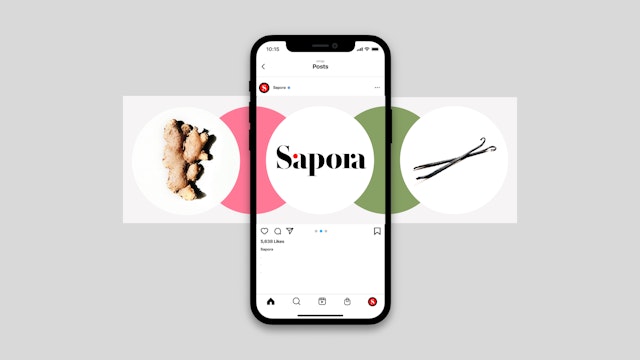
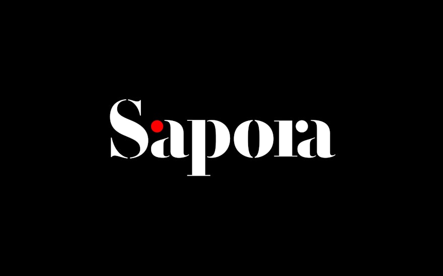
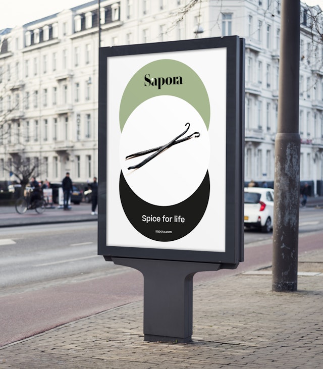
The Sapora logo is inspired by the stencil lettering found on spice freight packaging. A bright red dot features as part of the letter ‘a’ and represents the intense hit that spice gives to food, adding flavour and pleasure to the gastronomic experience.

Pentagram was approached by the Gulf Marketing Group (GMG) to develop the naming and brand identity for its upmarket and sustainable range of herbs and spices.
The new brand needed to reflect the company's values and beliefs, and its mission to harness the precious resources that nature provides us with. It needed to look elegant and stylish, and appeal to a more discerning, adventurous and health-conscious customer.
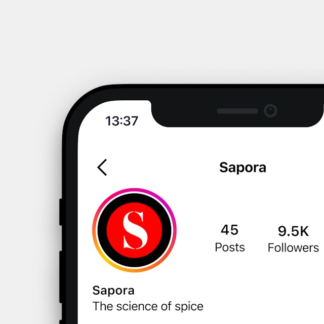
Pentagram was also tasked with naming the new brand. GMG needed a simple name that was globally appealing and diverse enough to sell in any country. The team explored names based around flavours, taste and nutraceuticals. It looked at the emerging discipline of neurogastronomy, and the way that scientists and chefs are exploring how the brain creates flavour sensations that not only arouse our appetites but also create memories and emotional bonds. Something which stimulates our stomachs and our minds is said to be ‘sapid’, and the name ‘Sapora‘ is a derivation of this.
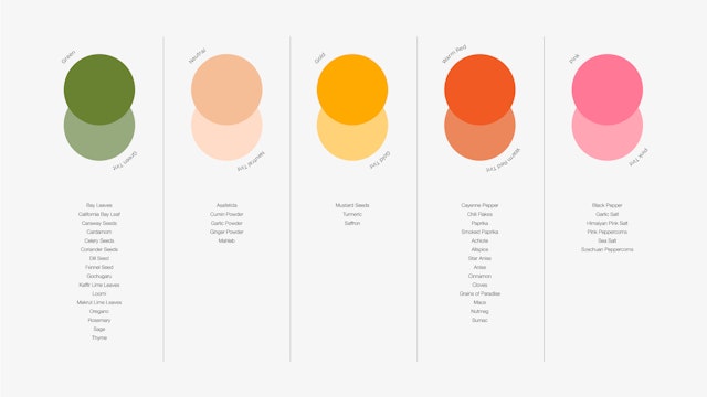
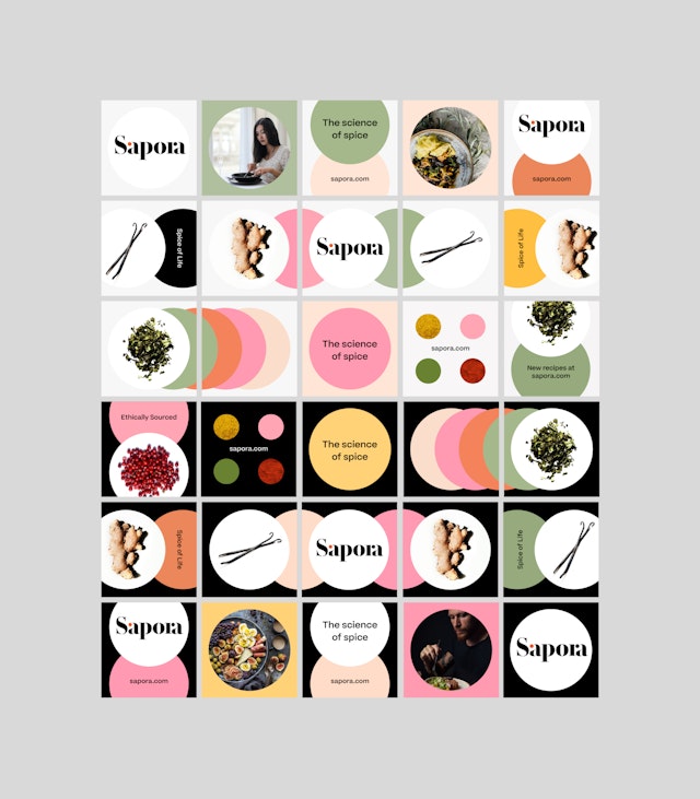
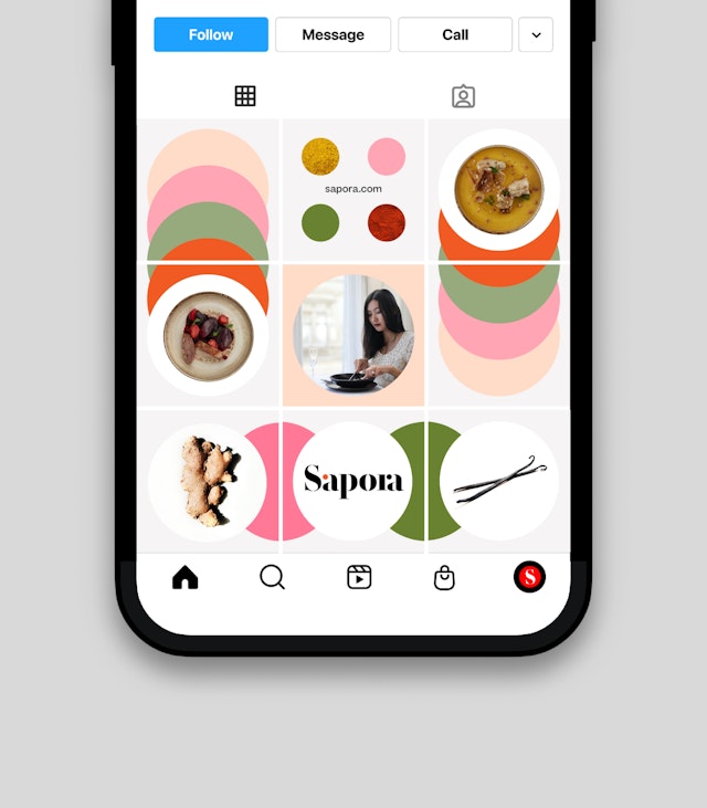
The letterforms of the Sapora logo were inspired by the stencil lettering found on spice freight packaging. A bright red dot features as part of the letter ‘a’ and represents the intense hit that spice gives to food, adding flavour and pleasure to the gastronomic experience. The circle motif features as a graphic device across the visual language—this reflects the science and methodology behind Sapora’s unique approach to spice blending. Arrangements of circles were inspired by scientific diagrams and infographics such as swatch palettes, Venn diagrams and spectrums—these are combined with photography and act as a frame for the products.
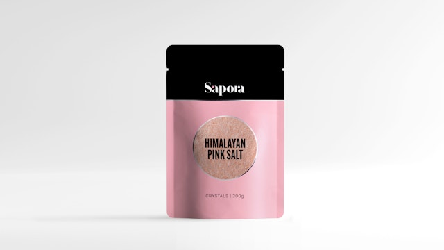
Sapora’s primary colours are red and black, these contrast with a warm but subtle range of secondary colours and tints that includes, green gold and pink tones. A playful application of colour throughout the range correlates with the different spices and flavours on offer.
Sapora’s primary typeface is Sharp Type’s Beatrice. Designed to function beautifully in a wide range of optical sizes the contemporary grotesk sans serif typeface is playful and distinctive in character, yet elegant enough for a premium product brand.
For both Sapora’s lifestyle and product photography, the team developed two different approaches to reflect both the health and sensorial aspects of spice and the brand. A light, more muted style of photography is used to communicate a sense of purity and wholesomeness, while a darker direction offers the opportunity to focus on sensory experiences. Dark backgrounds provide a contrast to the saturation of colour found in Sapora’s colourful range of spices and ingredients.
Pentagram has designed a brand identity for Sapora that perfectly encapsulates the spice company's unique approach and is sure to appeal to its discerning, adventurous and health-conscious customer.
Office
- London
Partner
Project team
- Alex Wright
- Charlotte Selby
- Shirley Wang
- Alice Murray
- Yorgos Panagopoulos
- Jack Brown
- Daniela Perez
- Karolina Alvekrans
Collaborators
- Roger Taylor (artworking)
- Alexie Sommer (naming)
- Colm Larkin (naming)
- Patrick Burgoyne (naming)
- Design Bridge (packaging structural design)


