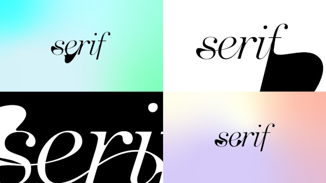
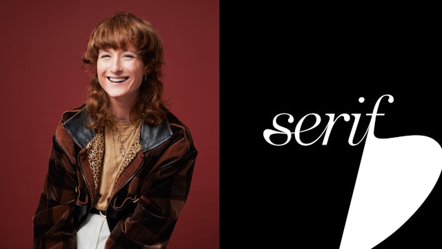
The vibrant visual language centers on a logo that transforms in fluid, expressive shapes to reflect the infinite identities within LGBTQIA+ communities.
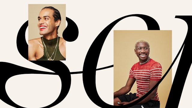
The brand positioning and messaging highlight Serif as a place where members are welcome to bring their own diverse identities and create connections.

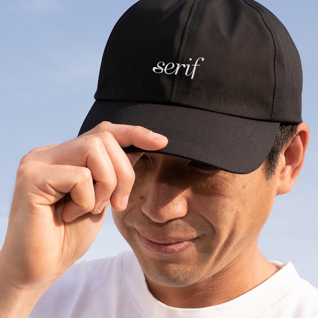



A black and white palette is the base for the identity, but at select moments, soft gradients can be applied to evoke subtle and fluid auras.



Serif’s organic typography is supplemented by the dot of the ‘i,’ a simple graphic device that has an irregular, unique shape and appears in countless permutations that represent the individual.
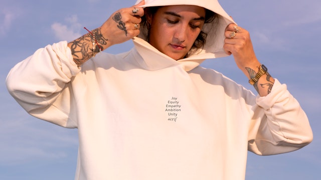

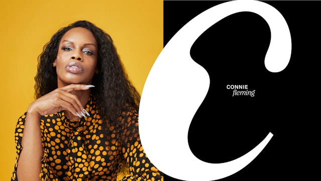
The identity serves as the framework for a brand architecture that can grow and evolve along with Serif as it introduces a variety of experiences and programming.
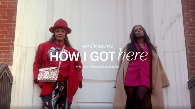


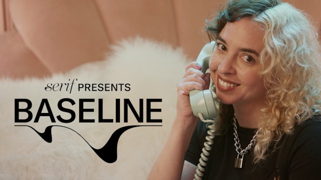
The user experience and digital design reflect the platform’s openness and accessibility, encouraging members to connect around experiences and events.
Serif is a new space connecting LGBTQIA+ communities through curated experiences and real-time conversations. The platform offers a place where members can share and collaborate with other users across different industries and experiences, participate in online discussions and events, and build professional, personal and creative networks.
Pentagram has developed a strategy, brand identity and digital design for Serif that is dynamic, engaging and inclusive. The project also encompasses brand positioning and messaging that highlights Serif as a place where members are welcome to bring their own diverse identities and create connections. The vibrant visual language centers on a logo with custom typography that morphs and transforms in fluid, expressive shapes.
The Pentagram team collaborated closely with Serif founder and CEO Brian Tran to develop the framework and mission of the brand. In the past, LGBTQIA+ communities gathered in communal physical places like centers, bars and clubs; existing digital experiences center around apps for sex and dating. Serif wanted to offer something new—an affinity space for digital connection, that was at the same time accessible to all. LGBTQIA+ communities are extraordinarily diverse, encompassing a range of identities as varied as the individuals who claim them. The platform wanted to appeal to everyone and be an affirming, inspiring place where people would feel comfortable to be themselves.
The project was a challenge, and an opportunity. In recent decades, the LGBTQIA+ communities have made remarkable strides towards equality and it has become easy to take these freedoms for granted—in some places. In most instances, each community was working for its own set of rights, and the group as a whole became fragmented in the world at large. Serif provides a space where they can all converge and be part of something bigger.
An essential part of the brand was recognizing the history of LGBTQIA+ movements and how far they have come, and acknowledging that Serif is able to be what it is because of these pioneers. The platform wants to contribute to this heritage of progress, and invite people to come into the space to be exactly who they are—to advance both themselves and the collective community.
This spirit of convergence is highlighted in messaging that describes Serif as “Made for all of us,” an idea that is summed up in the brand statement: “Alone, we only get so far. Serif brings together the extraordinary powers of the LGBTQIA+ community to help us all expand our individual and collective potential.”
The Serif brand identity is human, artful and energetic, fueled by movement and connection. The “Serif” name evokes an added stroke or flourish, and the wordmark is infinitely variable, with dynamic typography that changes and morphs to suggest different personalities, identities and facets. The fluid shapes and curves can be exaggerated and to create graphic compositions and windows for content.
The designers extended the logotype to a customized alphabet with alternates for every letter that express fluidity and individuality. These glyphs are used as personal icons on the platform, and can be deployed throughout the brand as typographic accents. The logo is complemented by a pair of brand typefaces that mirror its contrasting widths. The refinement of the logo is set off by the strong sans serif GT America (from Grilli Type), while Nib (from Colophon) has idiosyncratic serifs of its own.
Serif’s organic typography is supplemented and contrasted by the dot of the “i,” a simple graphic device that comes from the wordmark itself and is carried throughout the identity. The dot has an irregular, unique shape and appears in countless permutations that represent the individual. Overlapped, the perfectly imperfect circles evoke the power of community coming together. (This echoes a visualization from the brand strategy, which imagined Serif as a Venn diagram of interconnecting groups and identities.) The shape can act as a window or frame for imagery, and unite, connect or morph to tell a story in motion graphics.
The transforming Serif logo reflects the infinite identities within LGBTQIA+ communities, and the designers wanted to take a similar approach to color. A black and white palette forms the base for the identity, but at select moments, soft gradients can be applied to evoke subtle and fluid auras. Appearing in washes and gradations, this spectrum of color hints at the familiar idea of the rainbow, but in understated hues and combinations that offset the crisp contrast of the identity. The colors are used to personalize user glyphs and highlight different themes within the platform.
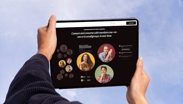
The Pentagram team helped create the Serif user experience and digital design across the web and mobile app, developing a site hierarchy that is welcoming, elegant and easy to use. The simple interface reflects the platform’s openness and accessibility, encouraging users to connect around experiences and events. The homepage spotlights upcoming activities and new members, and surfaces user profiles and recent interactions to build a sense of community. A different theme will be featured every quarter (the first is “Creating Spaces”), signaled by a change in the color palette.
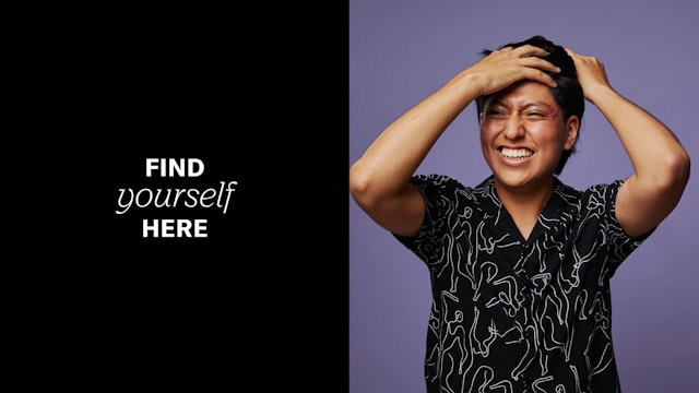
Serif members are represented by their own unique dot, and can customize their profiles to reflect their individual identity. Users can upload a photo for their member icon or the system will generate a customized glyph monogram from the Serif alphabet. The Pentagram team also helped design the process of joining, which includes signing a commitment to create “a space (and world) where we can all be our true selves and forge meaningful connections.”
The identity serves as the framework for a brand architecture that can grow and evolve along with Serif as it introduces a variety of experiences and programming. Building on the dot, the designers imagined these sub-brands as a sort of solar system with Serif at the center, orbited by various categories, verticals and initiatives.
The name Serif has roots in typography but hints at something larger. Inspired by this, the Pentagram team developed a sub-brand naming convention that borrows from typographic language to create something distinct and ownable. The spinoffs build on Serif’s visual language to establish their own graphic identities.
The Counter is a safe space within Serif where users can share thoughts and ideas—a place to get together and talk, like an intimate coffee shop or café. The name is a play on this convivial setting and the counter of a letter, the interior space enclosed by the letterform.
Serif’s call-in advice show is named Baseline—a starting point for discussion and a realignment through conversation. The logo’s own baseline transforms like a soundwave, twisting and curling like the flourishes of the master brand.
Office
- New York
Partner
Project team
- Mira Khandpur
- Chad McCabe
- Jase Hueser
- Greg Morrison
- Elizabeth McMann
- Shivam Sinha
- Beatriz Congar
- Zoe Chrissos
- Dianne Kim
Collaborators
- Eva Green, strategy
- Kyle Barron-Cohen, strategy
- Steven Merenda, designer
- Daniel Seung Lee, portrait photographer
- Claudia Mandlik, photography
