
The identity updates Slack’s familiar hashtag logo to work consistently in different scales and contexts.


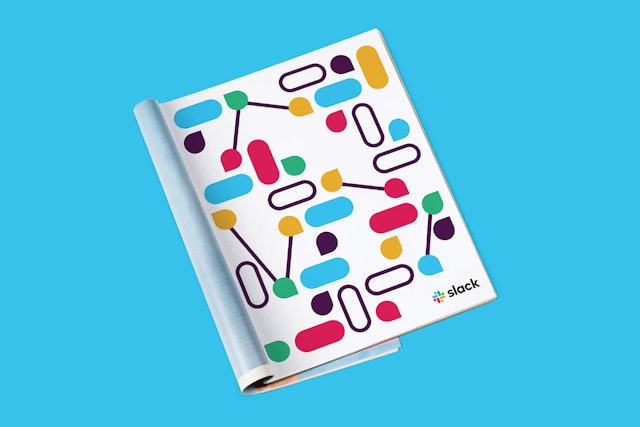
The extended visual language introduces a more refined color palette while retaining the brand’s playful visual personality.


Slack is a collaboration hub that is changing the way people work and communicate, helping workers be more productive through a cloud-based set of proprietary collaboration tools. Pentagram has designed a new brand identity for Slack that captures the software’s simplicity and ease of use, updating its familiar hashtag logo to work consistently in different scales and contexts. The extended visual language introduces a more refined color palette but retains the brand’s playful visual personality.
Pentagram worked closely on the project with Slack founder and CEO Stewart Butterfield and the in-house design and brand team. The update is the first significant change to Slack’s brand identity since the company launched in 2013 with a logo that resembles a hashtag, or octothorpe. The hashtag is an organizing element in the platform, signaling the beginning of the channels where teams can talk about individual projects.
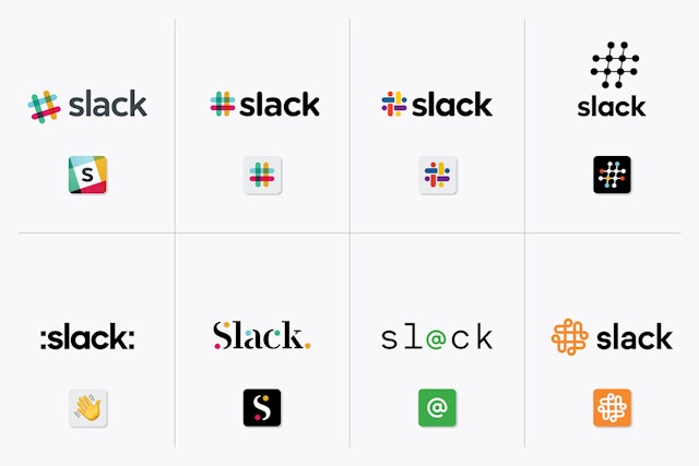
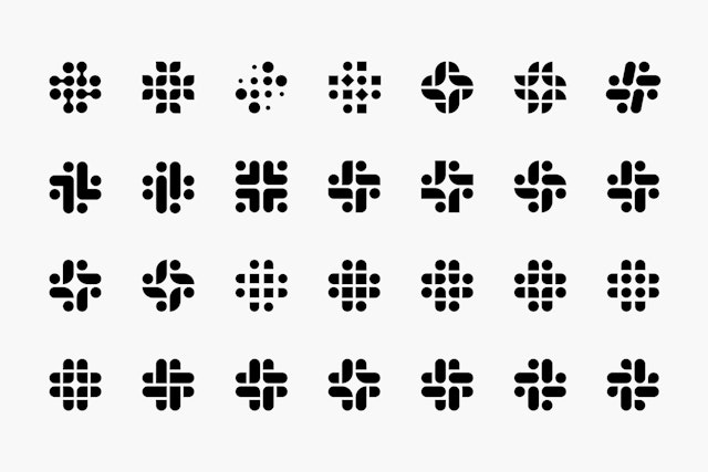
Working with the creative team at Slack—and, naturally, using the Slack platform itself to collaborate in real time, Pentagram explored a wide range of possibilities for the new identity, from options that suggested connect-the-dots, complex knots, emojis and people-like shapes, to systems that celebrated the platform’s unique visual vocabulary.
Ultimately, the team decided to retain the equity of Slack’s familiar octothorpe, retooling it to eliminate reproduction challenges and increase consistency across applications. Derived from the original logo and built on a grid, the new octothorpe is comprised of two basic geometric shapes—a speech bubble and lozenge—that can be extracted and used as graphic elements. The speech bubble evokes communication and connectivity, and will form the basis of a system of customized icons, illustrations and motifs with rounded corners that echo the shapes of the logo. The new octothorpe can scale up or down to optimize legibility at various sizes.
The updated palette features four primary colors, more manageable than the original’s eleven, which suffered against any background color other than white. These have been optimized to look better on screen, and the identity also retains Slack’s distinctive aubergine purple as an accent color. Used in the platform’s main communication channel, the color makes Slack instantly recognizable against the white of other desktop windows.
Over the coming months, the new direction will roll out across Slack and its brand expressions, including the website, in advertising and in some places in the software itself.
