The versatile type family allows the system to visually modulate from quiet to loud across a variety of programming and applications.


The goal of the redesign was to reinforce the Orchestra’s premier position while making the institution more accessible to new audiences.


The foundational system reflects the understated and dignified personality of the Orchestra while also having a built-in flexibility that allows for fresh and surprising seasonal campaigns.

With a reputation that reaches far beyond its regional roots, The Cleveland Orchestra is one of America’s most accomplished and internationally respected symphony orchestras. Founded in 1918, the company is one of the “Big Five” US orchestras and brings its acclaimed artistry to concert performances, touring residencies, broadcasts and Grammy Award-winning recordings. The Orchestra makes its home at the historic landmark Severance Hall in University Circle, and also presents a summer season at Blossom Music Center in Cuyahoga Falls. Additional portions of the year are devoted to touring around the globe.
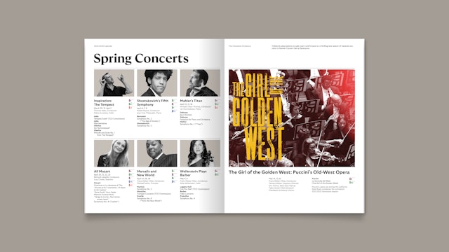
The Cleveland Orchestra has a legacy of innovation; it was among the first American orchestras to be heard on a regular series of radio broadcasts. Today, its concerts are presented in a variety of formats for a variety of audiences, including casual Friday night concerts, film scores performed live by the Orchestra, collaborations with pop and jazz singers, ballet and opera presentations, and standard repertoire juxtaposed in meaningful contexts with new and older works.
The goal of the redesign was to reinforce the Orchestra’s premier position while making the institution more accessible to new audiences. As the Orchestra continued to expand its offerings, it needed cohesive branding that would function in harmony across a wide array of spaces, programs, recordings and publications, including digital platforms.
Pentagram collaborated on the project with AEA Consulting and worked closely with the Orchestra’s Chief Brand Officer Ross Binnie and Senior Director of Marketing Julie Stapf, along with President and CEO André Gremillet. The process involved extensive research and interviews with multiple stakeholders including board members, staff and musicians, as well as an analysis of the Orchestra's key brands, peer institutions, and audiences.
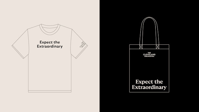
The strategic phase, led by Daniel Payne at AEA, defined the brand articulation and architecture, organizing over 100 existing sub-brands into three fundamental groups: performance (venues both physical and digital), learning (music education), and connection (member, donor and supporter groups such as the Friends of The Cleveland Orchestra, the Heritage Society, etc.) As part of the framework, AEA also distilled the Orchestra’s proposition into a new brand positioning: “Expect the Extraordinary.”
This work informed the development of the new identity, which establishes a lasting foundational system that reflects the understated and dignified personality of the Orchestra, and also has a built-in flexibility that allows for future initiatives and fresh and surprising seasonal campaigns. The visual language is open, friendly and approachable, to welcome those who may feel excluded from the world of classical music.
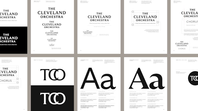
The new branding avoids motifs of musical notation, concert halls and conductors’ gestures that are ubiquitous in the category. Instead, the identity takes a more direct approach with elegant typography that nods to the repertoire of the Orchestra and the architecture of its historic home. Centering the focus on “Cleveland,” the stacked wordmark bridges the classical and contemporary with a typeface that is neither serif or sans serif, but a custom design in between with distinctive arced swells at the terminals of the letters.
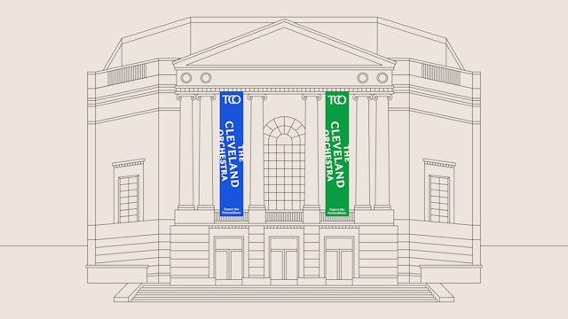
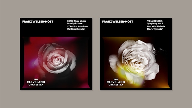
The rest of the identity leverages the dramatic qualities of the font GT Ultra by Grilli Type. This versatile family has 33 styles ranging from very thin to extra bold, allowing the system to visually modulate from quiet to loud across a variety of applications. GT Ultra encompasses both traditional serif versions and a clean, modern sans serif. In the Orchestra branding, serif weights are used for the classical concerts at Severance Hall and other prestigious national and international venues, while the sans serifs are employed for the less formal family, school and community performances, including those at Blossom.
The program also introduces a new “TCO” monogram, embracing and making public an acronym that was previously used only within the organization. The shortened, scalable version of the name can be utilized as a graphic element in patterns, as an icon on social channels, or as an emblem on applications like pins, instrument cases, and apparel.
The flared serifs of the letterforms extend to framing shapes and containers that add a subtle layer of identity to the system. Like the multifaceted typography, the imagery continuously changes throughout the season. Branding for the more classical performances utilizes traditional photography, while the summer programs and those for families, schools and the wider community employ illustration. Both sets of communications share a bright, lively color palette that convey the artistic vibrancy of the institution.
Office
- New York
Partner
Project team
- Shigeto Akiyama
- Rob Hewitt
- Laura McNeill
- Gracia Lee
- Avery George