The challenge was to create an ownable visual identity that related to South Asian design traditions without feeling overly predictable or cliché.




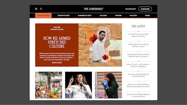
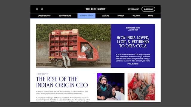
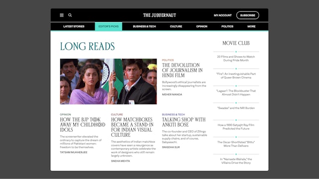
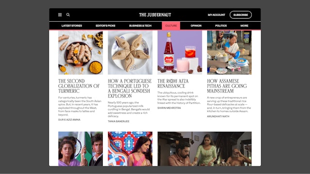
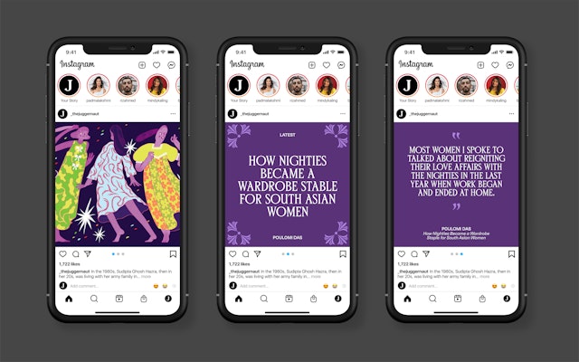
The final palette includes 22 colors found throughout South Asian visual art, fabrics, films, and posters, incorporating a wide range that balances the vibrant with the subdued.

The Juggernaut is a media company that publishes well-reported stories on South Asia and the South Asian diaspora. Pentagram partner Matt Willey and team have collaborated with The Juggernaut to redesign its brand identity and website, including the development of a bespoke typeface created in collaboration with Bombay-based type designer Shiva Nallaperumal of November.
The Juggernaut needed a holistic visual system that captured contemporary South Asian culture, honored the distinctive visual heritage of the region, and was adaptable across formats. The challenge was to create an ownable visual identity that related to South Asian design traditions without feeling overly predictable or cliché.
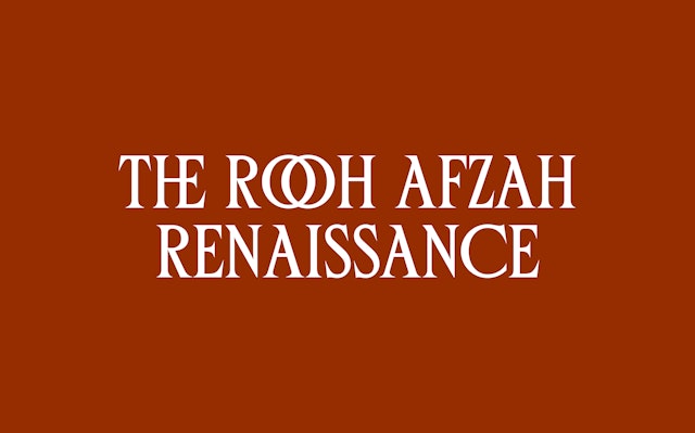
The bespoke typeface design follows a practice upheld by many Indian sign-painters of the early 20th century writing in Latin: no use of lowercase, tight space, with a flourish and other ornamental gestures reminiscent of Devanagari. The typeface is equipped with a unique ligature set inspired by South Asian scripts, which heavily depend on complex conjuncts and ligature systems. The Juggernaut wordmark is constructed from a modified version of the bespoke typeface, with two uppercase Gs redrawn as lowercase letterforms that connect at the bottom to form a ligature reminiscent of Tamil script.
The bespoke typeface has been paired with Oli Grotesk, a workhorse sans with a distinct character for small details, and Sentient, an elegant yet sturdy serif for immersive reading.
Color is another essential element of The Juggernaut’s identity. The final palette includes 22 colors found throughout South Asian visual art, fabrics, films, and posters, incorporating a wide range that balances the vibrant with the subdued. Each of the Juggernaut’s content categories has been assigned both a light and dark hue to create a layered and dynamic palette.
The brand identity was further developed to include a set of nine pattern blocks inspired by South Asia’s woodblock printing history, which has been used in the region since the 12th century and remains a culturally significant art form today. The distinctive patterns and dynamic palette are flexible elements that are utilized in all applications – including web and mobile – to create an identifiable look and feel that is adaptable across platforms.
Client
The JuggernautSector
- Publishing
- Arts & Culture
Discipline
- Brand Identity
- Digital Experiences
Office
- New York
Partner
Project team
- Chantal Jahchan
- Bina Thorsen
- Avery Cross
Collaborators
- Shiva Nallaperumal
