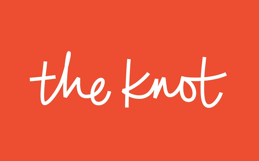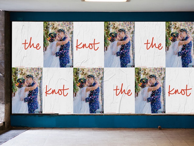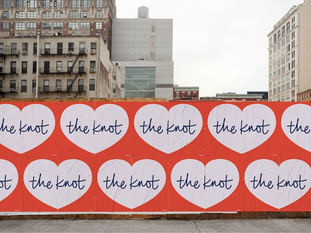
The new identity centers around an energetic, informal signature rendered in a vibrant, passionate red.


The gestural spontaneity of the logo reflects a sense of celebration, personal expression, and ease of use.


If you’ve gotten married in the past two decades, chances are you’ve used The Knot to plan your wedding. Since it first launched in 1996, the site has helped over 25 million couples through the entire wedding process, from inspiration to finding and booking vendors and services. Eight in 10 couples now use the platform to plan their celebrations.
Pentagram has collaborated with The Knot on its first rebranding, refreshing the visual identity with a new logo and color palette that reflect a broader and more inclusive sensibility. The new identity centers around an energetic, informal signature rendered in a vibrant, passionate red. The new look will be implemented across The Knot’s digital platforms and quarterly magazine, and launches this week in time for National Wedding Planning Day on March 1, kicking off wedding planning season.
Pentagram worked closely on the project with leadership at The Knot. The site is a pioneer of the wedding marketplace, and its original logo alluded to traditional “wedding” script. With couples of all ages and cultural traditions planning weddings that express their own style, The Knot wanted to update its branding to appeal to a wider audience and be more contemporary. They wanted the new mark to be more informal, to convey The Knot’s mission to support all couples and their weddings, regardless of style, culture, sexual orientation, scale or budget. The gestural spontaneity of the logo reflects a sense of celebration, personal expression, and ease of use. In its playfulness, it feels fresher and more modern.
Like the wordmark, the visual language has evolved to feel more inclusive. The previous identity featured a soft, pale blue (inspired by “something old, something new, something borrowed, something blue…”) that is a traditional signifier of wedding-related imagery. The rebrand introduces a striking red that is assertive and passionate. The color is part of an expanded palette that opens the brand to more varied expressions across its different platforms.
A supporting vocabulary of graphic elements was derived from the loops and arcs of The Knot signature. The repertoire of forms isolates enlarged details of the wordmark―cropped strokes, ligatures and ascenders of letterforms―for use as background shapes or frames for photography, creating a cohesive experience across the brand. Primary typography is set in Tisa Sans Pro, a modern sans serif that sets off the handwritten wordmark.
Pentagram’s work was produced in tandem with a broad revamp of digital and mobile platforms that, together, constitute a new chapter for The Knot.