


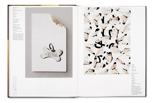
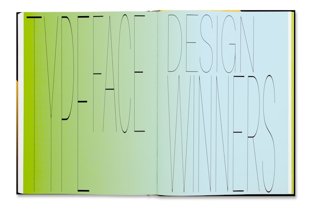
Typography is typically treated with such scrupulous care and reverence by graphic designers that the designers wondered what would happen if it was deliberately handled in a more primitive way.


For the past 61 years, the Type Directors Club has encouraged graphic designers to achieve excellence in typography through its annual TDC competition. To design Typography 36, the annual of TDC 61, Pentagram has done precisely the opposite: His design for the book mistreats type by stretching, expanding and elongating it to the brink of legibility, all against a gaudy background of Day-Glo color. The annual, which presents the winners of the 2014 competition, was released by Verlag Hermann Schmidt.
Typography is typically treated with such scrupulous care and reverence by graphic designers that the designers wondered what would happen if it was deliberately handled in a more primitive way. The perversity of the idea was especially appealing and amusing in the context of a TDC annual.
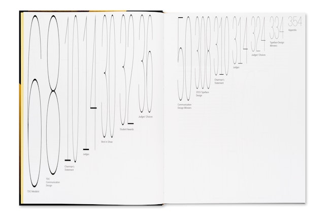
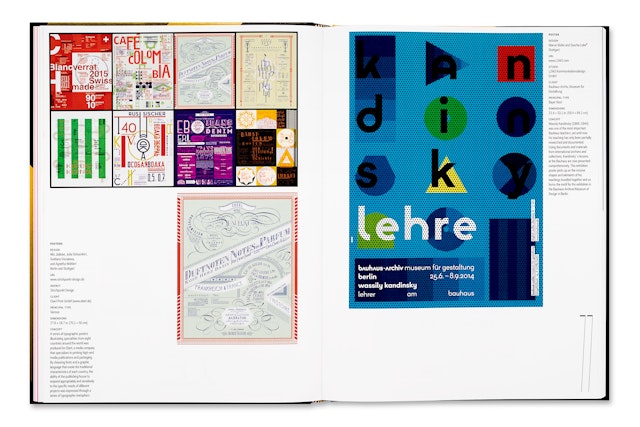
The unusual approach also answered the built-in challenge of annual design: How do you create a setting that simultaneously highlights the wide-ranging, award-winning work at hand and still looks like a cohesive design itself? The project brief for an annual typically asks for 20 to 24 pages of “design” that hosts 200 pages of others’ work. The final result can look episodic; spreads introducing the various sections are separated and surface differently than the fantastic design throughout.
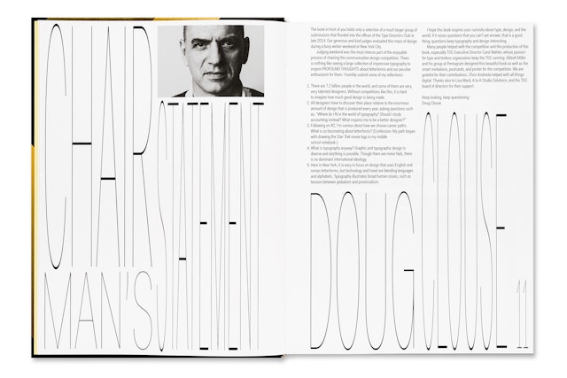
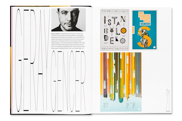
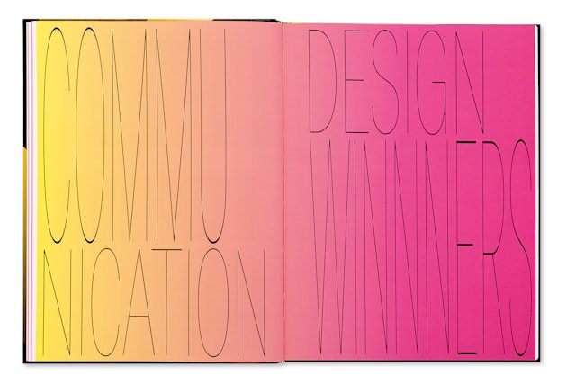
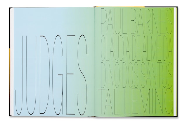
The book finds its balance by using “bad” design to frame the good. For title pages, the table of contents and other organizing spreads, the designers did the simple things that bad design does—stretching type to fill available space, stacking words in ungainly compositions, and using color in a gradated rainbow effect. In the end, the extended typography achieves its own kind of grace, filling out the spreads in tracery of letterforms.
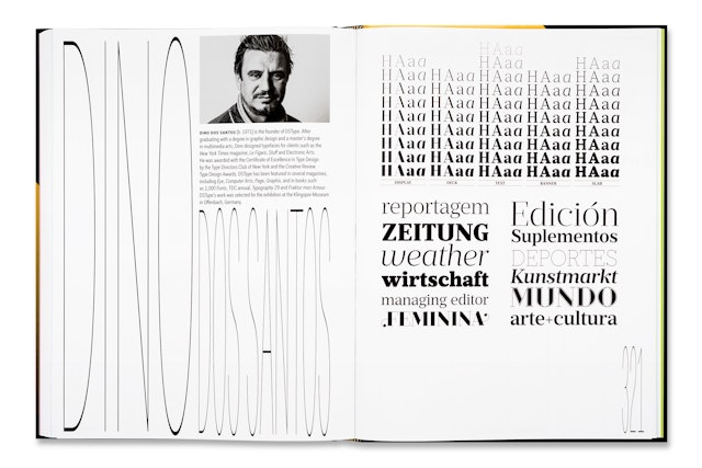
For the typeface, the designers selected the highly functional sans serif Fakt, designed by Thomas Thiemich. The font is so well drawn, it holds up beautifully when stretched. The cross bars thicken as the arms, stems and other lines are extended. Pentagram previously employed the font in a much more respectful way in the environmental graphics for the Centro Roberto Garza Sada at the University of Monterrey, Mexico, which highlighted the true, pristine character of the font. Pentagram asked Thiemich’s permission to misapply Fakt for the annual, and Thiemich welcomed the idea, giving his blessing in a statement in the front of the book. (The radical modification technically violates the contractual rules of the type’s usage.)
Designed for maximum impact in bookstores, the annual cover is a blingy, black-tie version of what is going on inside. The letters “TDC” have been foil-stamped in gold and black gradients for a dimensional effect.
