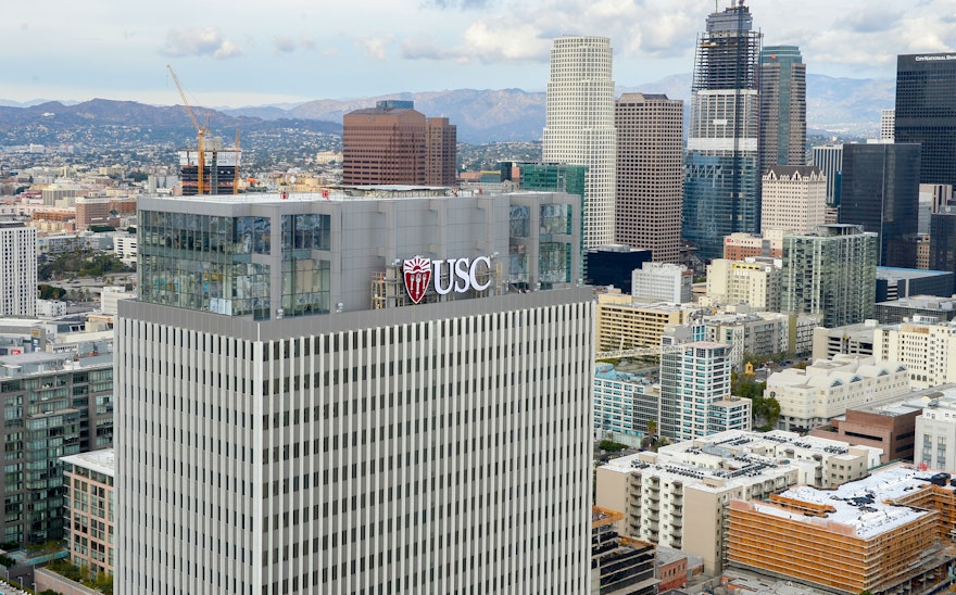


The new identity gives the university's academic units a simple typographic mechanism to express their unique personalities.
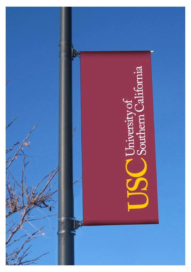
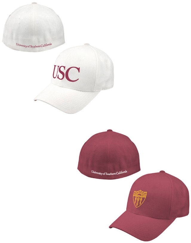
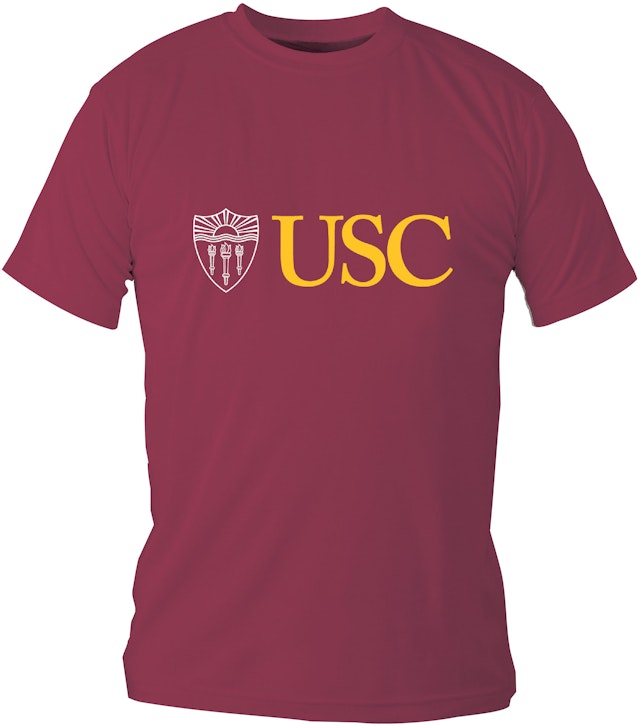


The University of Southern California (USC) was founded in Los Angeles in 1880, making it California's oldest private research university. In 1994 Saul Bass, the venerated L.A.-based graphic designer, designed an identity that served as the institution's primary graphic representation until last spring when Pentagram was tapped to develop a whole new identity for the university. The new identity, designed by Partner DJ Stout and Associate Julie Savasky in Pentagram's Austin office, was officially announced this month. The new identity system gives USC a consistent but flexible graphics program that rectifies many of the inconsistencies and problems that evolved since the Bass identity was launched.
"When Saul Bass designed his identity system for USC the world was a very different place," says Stout. "In 1994 USC was a smaller and less complex organism, computers had just arrived on the scene, and there was no such thing as a smartphone. Saul Bass didn't have to worry about how his USC logo would look on an iPhone."
Bass had developed a system that addressed the identity needs of the university and its many unnamed academic units—the colleges, institutes and foundations under the big umbrella of USC—but the system he developed was not very flexible or pragmatic, so those entities began creating their own logos that were not consistent with the university's overarching brand identity. "Basically they all went rogue, and that spawned a quagmire of identity sins," says Stout.
The growing USC of today has many unique needs. All but five of the 19 academic units have received naming gifts, so the new identity developed by Stout and Savasky is a more consistent and useable system that will pull the many individual acts back under the big top of the university. "There are so many units and divisions within USC, it was a problem that they all looked different," says Stout. "It was a missed branding opportunity." The new identity gives the university's academic units and sub-brands a simple consistent system that is easy to adhere to and provides them with a simple typographic mechanism to express their own unique personalities.
As part of the new identity system an updated monogram was established and specific logotypes were created for use across all media, including a primary logotype, a formal logotype and an informal logotype. New logotypes also were created for each of USC’s academic units, including the new family of Keck entities that were established on the Health Sciences campus on November 1 with the introduction of the Keck Medical Center of USC and the renaming of the university hospital.
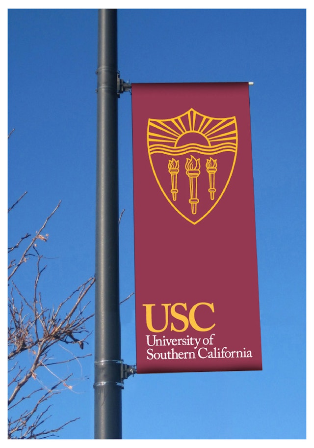
In addition to designing a new USC monogram, Stout and his team redrew the university's academic crest so it holds up better on websites and mobile devices, and established the crest's shield as the school's primary graphic icon. "The shield, pulled out from the university's traditional academic crest, and redrawn, is actually a great symbol for USC," says Stout. "It is a simple representation of the sun shining over the waves of the Pacific Ocean. What distinguishes the USC name from the other universities in California, or the world for that matter, is the fact that it is The University of 'sunny' SOUTHERN California." The shield, like a Trojan's (the school mascot), is a symbol of strength and leadership, but it is also a traditional academic symbol, like the shields and crests used as marks by many of the top academic institutions in the world.
Sector
- Education
Discipline
- Brand Identity
- Digital Experiences
