

The wordmark emphasizes the “UP” in the name and creates a space that can be used as a window into the stories Upworthy tells: The “U” can function as a container for imagery from individual videos or categories of content.


A welcome antidote to an Internet awash in trolls, snark and negativity, Upworthy demonstrates the power of positive posting in viral videos that document everything from a “pay-it-forward pizzeria” for the hungry to a group of 10-year-olds taking on global warming to a father who paints his nails to bond with his young daughter. Launched in 2012, the media company produces shareable stories that focus on issues that matter, bring people together and show how they can help change the world for the better. Pentagram has designed a new identity for Upworthy that captures its irresistibly optimistic point of view.
Upworthy calls itself “social media with a mission,” and it has made good on its promise “to prove that what’s important can be incredibly popular, even if what’s popular isn’t usually important.” The company was co-founded by Eli Pariser, a former leader of MoveOn.org, and Peter Koechley, a viral video producer and former managing editor of The Onion. The pair noticed that plenty of online attention is paid to “clickbait” that is largely meaningless—cat videos, Twitter feuds, Kardashian exploits—and wanted to shine a light on more worthwhile, empowering and uplifting stories as a different type of viral content. Upworthy initially helped curate and surface existing stories with a positive impact, an approach that was so successful Fast Company called Upworthy the “fastest growing media site of all time,” and then in 2015 began producing engaging content of its own. Its top stories and Facebook and YouTube videos receive hundreds of millions of views a month, and its backers include co-founders of Facebook, BuzzFeed and Reddit. In 2013, it entered into a partnership with the Gates Foundation to bring awareness to global health and poverty issues.
The new brand identity supports Upworthy’s mission with a straightforward, accessible and instantly recognizable logotype. The wordmark emphasizes the “UP” in the name and creates a space that can be used as a window into the stories Upworthy tells: The “U” can function as a container for imagery from individual videos or categories of content. The logotype stacks the name, a flexible approach that is also used for the company's tagline and carried through to sub-brands like the "Upworthy Originals" endorser for original video content.
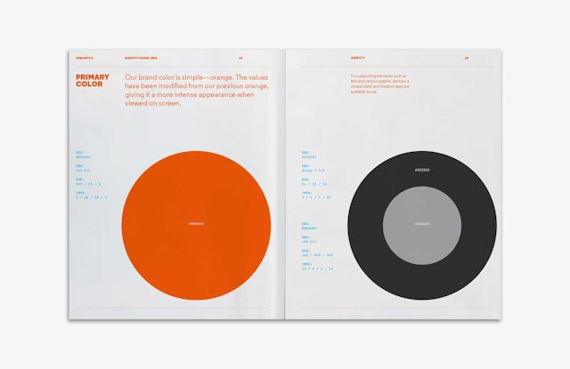
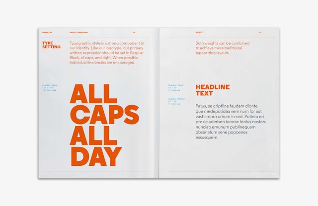
The primary brand color is a bright, friendly (but intense) orange, and primary typography is set in the highly readable Regular Black, which shares geometric qualities with the logotype. Together, the elements help establish an appropriately earnest and enthusiastic visual personality for the brand.