
The project updates the iconic WB Shield and makes it the foundation for a comprehensive identity system, including a custom typeface inspired by the logo.

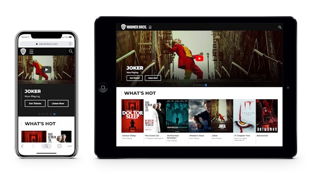
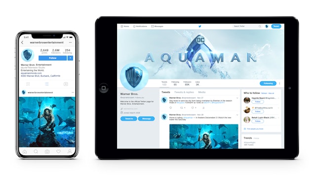
The logo has been optimized to perform across various platforms and scales, from the small-space digital world to environmental installations.


Warner Bros. is one of the world’s leading entertainment studios, producing films, television, interactive entertainment and consumer products that include the DC and Harry Potter franchises, blockbuster movies like “Joker,” “The Lord of the Rings” trilogy and “It,” and hit TV shows like “The Big Bang Theory,” “Friends” and “Ellen.” Pentagram collaborated with Warner Bros. on a new brand identity and brand strategy that draws on the company’s incredible heritage to position it for the future, looking ahead to the studio’s centennial in 2023. The project updates the iconic “WB” shield and makes it the foundation of a comprehensive identity system, including a custom typeface inspired by the logo.
The Pentagram team worked closely with a core team at Warner Bros. on the project, led by Dee Dee Myers, Executive Vice President, Worldwide Corporate Communications and Public Affairs and her team; Barry Ziehl, Senior Vice President, Public Affairs and Strategic Initiatives; and Katie Kotchka, Vice President for Strategic Communications; as well as a Warner Bros. “brand council” with representatives from across the Studio, including Lisa Gregorian, President and Chief Marketing Officer for Warner Bros. Television Group; Blair Rich, President, Worldwide Marketing for Warner Bros. Pictures Group and Warner Bros. Home Entertainment; Pam Lifford, President of Warner Bros. Global Brands and Experiences; Kiko Washington, Executive Vice President, Worldwide Human Resources, Warner Bros.; Thomas Gewecke, Chief Digital Officer and Executive Vice President, Strategy and Business Development, Warner Bros.; and JP Richards, Executive Vice President, Worldwide Marketing and Chief Data Strategist, Warner Bros. Pictures.
The brand identity was a dream project for the Pentagram team, who are all pop culture aficionados and welcomed the opportunity to work with the entertainment giant. As part of their research, the group visited Warner’s headquarters in Burbank, including the legendary studio lot and Commissary, where they felt the history of the storied company and imagined the stars who have been there before. Originally founded in 1923 by brothers Harry, Albert, Sam and Jack Warner, the studio has produced countless entertainment landmarks over the years, including films like “Casablanca,” “Rebel Without a Cause,” “A Clockwork Orange,” “Blade Runner,” “Goodfellas,” “Ocean’s Eleven,” “The Matrix,” “The Dark Knight,” “Wonder Woman,” and “Dunkirk,” among many others; Bugs Bunny and the “Looney Tunes” cartoons; and television series like “The West Wing,” “ER,” “Watchmen” and the miniseries “Roots,” to name just a few.
Warner Bros. has long been recognized as an industry pioneer, introducing innovations like the first synchronized dialogue in movies, or “talking pictures,” in 1927, and some of the first color films. The studio was also responsible for developing groundbreaking special effects for films like “The Matrix” that reshape the possibilities for telling incredible stories.
This legacy of innovation was key to developing a new brand strategy and positioning for Warner Bros., the first phase of the project. As the rise of digital streaming and other technologies changes the entertainment industry, the company wanted to reexamine its role and lay the groundwork for the next 100 years. The strategy would function as a guiding principle for the company’s creators and also help attract new talent. As part of the process, the Pentagram team conducted in-depth research, interviews and discussions with staff and stakeholders around the world. They quickly recognized that Warner Bros. and its employees and creative partners including filmmakers, writers, producers, show runners, actors and production staff are all driven to tell great stories and that the company has storytelling in its DNA. The new brand position—“We believe in the power of story”—captures that legacy and will help focus and guide the company as it moves forward.
This renewed sense of focus can be seen in the clean lines of the redrawn logo. The Warner Bros. shield is one of the most iconic logos in the world, visual shorthand for entertainment recognized around the globe. The symbol has been used going back to the company’s roots and periodically updated over the decades (and occasionally replaced by something else, only to be resurrected in subsequent versions). Warner Bros. wanted to build on this legacy and make the shield more functional and effective. The previous iteration, introduced in 1993, was highly detailed and hard to use at a small scale and in digital contexts, which are increasingly important.
The update streamlines the logo to its key elements, returning the shield and monogram to prominence and losing the sash. The redesign refines the shield with a form based on the classical proportions of the golden ratio. The designers looked at the construction of the letterforms of the “WB” monogram, preserving their quirkiness but making them more modern. The letters of the monogram align as though made in one continuous gesture, emphasizing unity and connection.
The logo has been optimized to perform across various platforms and scales, from the small spaces of the digital world to giant installations like the iconic water tower on the Warner Bros. studio lot. It also works well with a wide range of content. The logo appears in the signature Warner Bros. blue, which has been brightened to a more contemporary hue, with the wordmark set off in a slightly darker shade to create a complementary contrast.
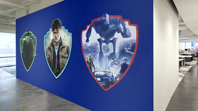
The team also created a dimensional version of the logo, to be used exclusively for on-screen content and special cases. The dimensional mark has the clean, streamlined look of the new logo, but with a depth that hints at the content experience. The logo can be customized for the opening and closing moments of individual movies and shows. It can also function as a window for imagery and sequences, using the edge of the shield as a frame.
The distinctive monogram has been expanded into a custom typeface, Warner Bros. Condensed Bold, used for the wordmarks of the various divisions and other display typography. Designed by Pentagram and expanded into a full family of fonts by Jeremy Mickel, the typeface has a look and feel that is uniquely Warner Bros., with condensed letterforms that relate to the elongated “WB” in the shield. Details in the logo’s letterforms are echoed in the font; for instance, the curvature of the “R” references the redrawn “B.” Like the redrawn logo, the typeface carries a sense of the company’s history, but is clean, modern and timeless.
Oberman and her team at Pentagram previously collaborated with Warner Bros. on brand identities and logos for several of its divisions and properties.
Office
- New York
Partner
Project team
- Timothy Cohan
- Greg Morrison
- Tom Grunwald
- Todd Goldstein
- Lisa Grant
- Alpa Pandya
- Austin McGhie
