WMG engaged Pentagram to create an overarching strategic position and brand identity with a new visual language to amplify its status as a next-generation music entertainment company while paying tribute to its heritage.


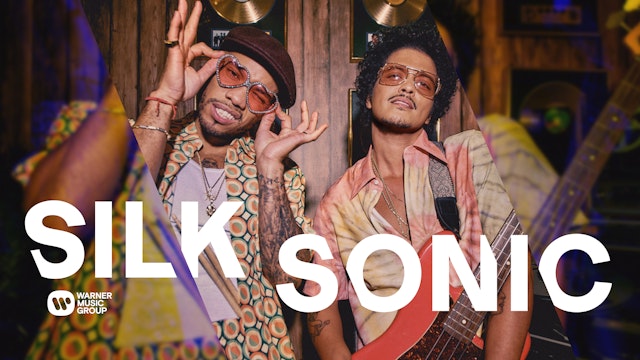
Pentagram developed the brand idea “Vision and Voice” to inform organization-wide brand pillars as well as the creative work that would become WMG’s new visual identity.
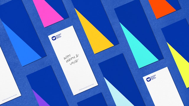
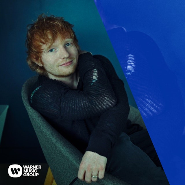
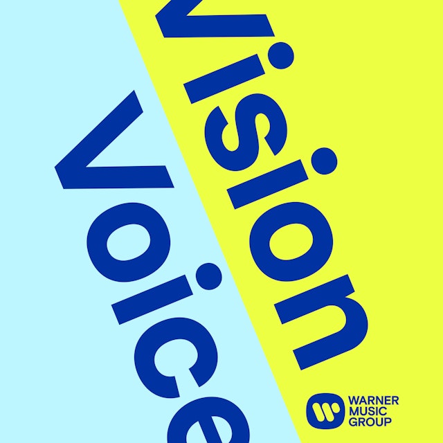
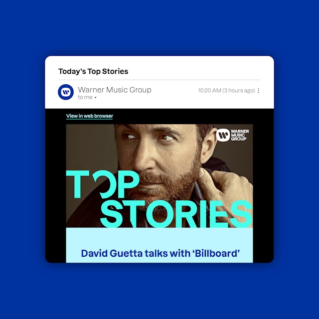
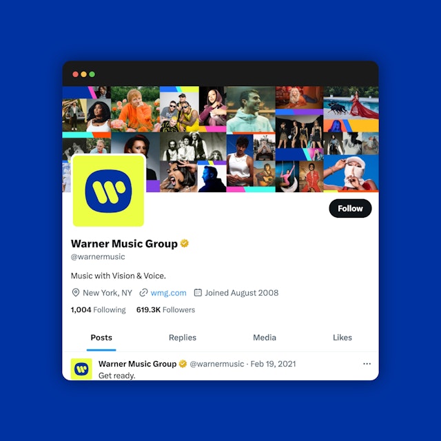
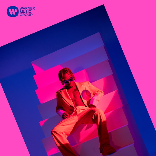
The design team examined the existing W logo and identified the 67-degree angle of its lines as a visual theme for the brand message.

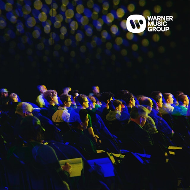


A legendary music entertainment company with a long and illustrious legacy, Warner Music Group (WMG) has thrived in recent years thanks to its strategic focus on the future. The organization encompasses Warner Recorded Music (which represents a vast range of record labels, from Warner Records to Atlantic to Parlophone to Elektra), as well as the publishing company Warner Chappell Music (which manages the catalogs of countless iconic songwriters, including Stephen Sondheim, Sam Smith, David Bowie, Madonna, Radiohead, Kacey Musgraves, and Lizzo), and the company’s corporate functions.
However, WMG has proven itself to be much more than the sum of its storied parts. Amid the tumultuous shifts in the entertainment landscape of the 2000s, the company has successfully forged a new path forward, buoyed by its early adoption of streaming and other licensing for digital platforms — while still retaining and honoring its roots.
THE CHALLENGE
With so many facets to WMG — recording, publishing, streaming, and more — the company was interested in presenting a clear and unified brand story that applied to the entire organization. To accomplish this, it engaged Pentagram to create an overarching strategic position and brand identity with a new visual language to amplify its status as a next-generation music entertainment company while paying tribute to its heritage.
Warner Records and Warner Chappell Music had both undergone brand updates in recent years, while WMG had not. Changing the iconic W logo (designed by Saul Bass in 1972) was not an option, so the refreshed identity would have to help make a mark everyone was familiar with feel new and exciting again.
THE STRATEGY
Pentagram conducted interviews with stakeholders at every level of the company and determined that, at its core, WMG is viewed as an “independent major” — a global powerhouse that retains the spirit of a nimble up-and-comer. From this finding, Pentagram developed the brand idea “Vision and Voice” to inform organization-wide brand pillars as well as the creative work that would become WMG’s new visual identity.
That phrase "Vision and Voice" conveys the company’s power and reach, as well as its authenticity and diversity. It also expresses a duality of ideals — “unity and individuality,” “foresight and presence,” “intuition and passion,” and “head and heart” — that gives WMG’s brand identity a foundation upon which it can grow and flourish, as a unified whole.
THE SOLUTION
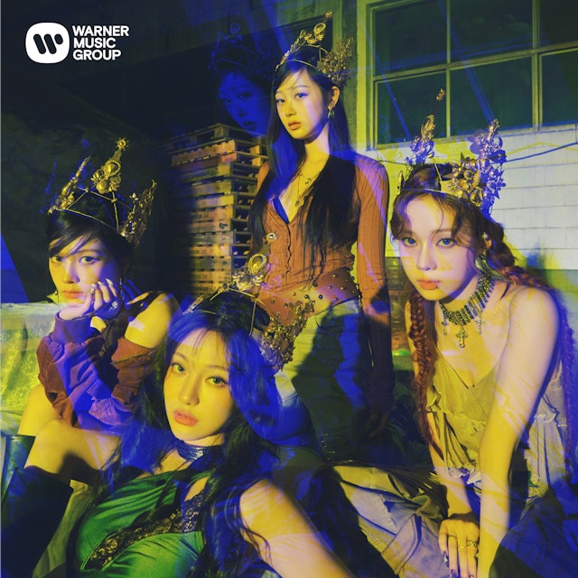
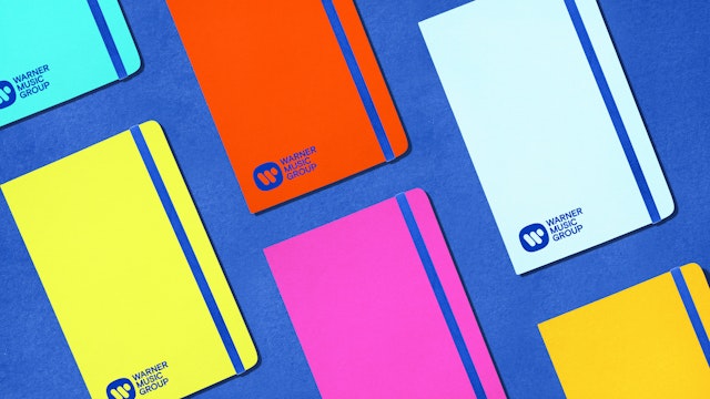
With the Vision and Voice concept in place, Pentagram set out to boost the impact of the W logo by updating its former medium-blue tone to a darker, bolder blue. The Saul Bass icon was incorporated into a more modern lockup that, along with a color palette of hot, music-inspired colors, gave the brand a bright, clean new feel.
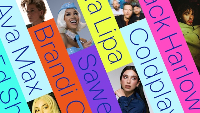
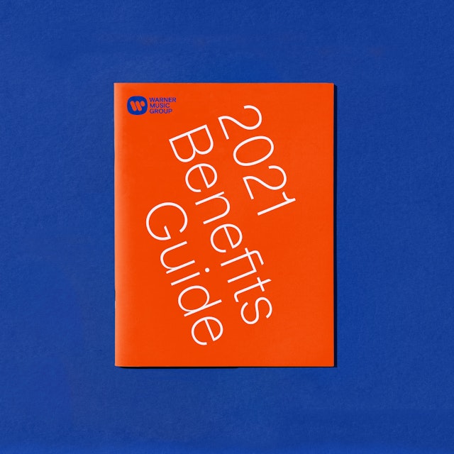
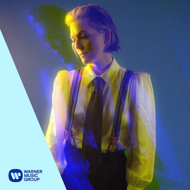
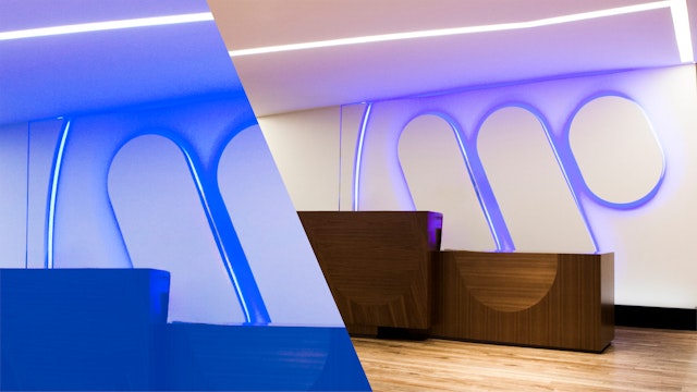
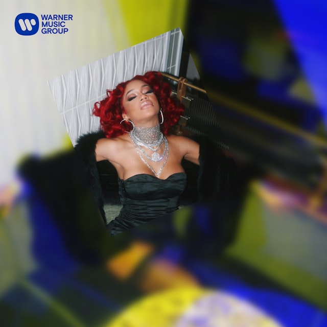
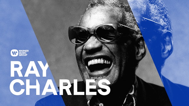
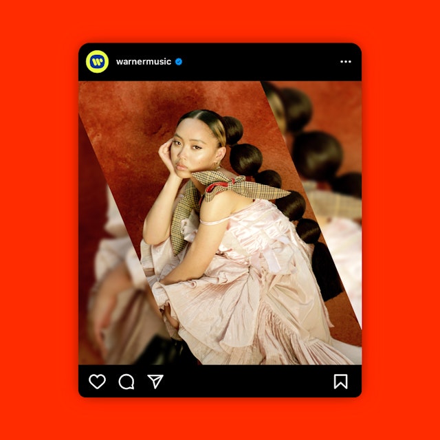
Next, the design team examined the existing W logo and identified the 67-degree angle of its lines as a visual theme for the brand message. The diagonal represents WMG’s vision: the ability to see things from “a different angle” while remaining unified and purposeful inside its frame. Pentagram cut 67-degree slices across WMG’s platforms — including its website, marketing materials, internal communications, and social media. The effect drives home the yin-yang duality of the brand idea, while expressing a slightly skewed perspective befitting a 21st century creative music entertainment company.
The flexible elements of the system — expressive typography, dynamic layering, and vibrant colors — represent WMG’s voice: honoring individuality, personal identity, and creative freedom.
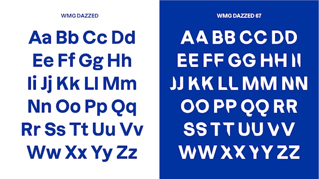
Pentagram collaborated with the type foundry Displaay to develop two custom typefaces that highlight the 67-degree angle. WMG Dazzed trims off the tails of the letterforms diagonally, mimicking the brand’s visual language while still reading cleanly. Dazzed 67, on the other hand, shaves off the sides of entire letters at that same 67-degree angle. Used exclusively in all-caps styling, Dazzed 67 gives an overt exclamation of edgy personality to promotional materials.
Text and images are often rotated on the angle or divided by the diagonal line, with copy on one side and a photo or video on the other. This layering effect creates a sense of dynamic movement — a concept central to music — especially when coupled with rhythmic animations.
Taken together, the angled lines, the contemporary and edgy font, and the upbeat color palette breathe new life into the brand. The identity strikes the right note for an organization with a vibrant history of amplifying off-kilter viewpoints and championing colorful, multi-layered artists and songwriters who, like the organization itself, express their vision and voice.
Client
Warner Music GroupSector
- Entertainment
Discipline
- Brand Identity
- Digital Experiences
- Brand Strategy
Office
- New York
Partner
Project team
- Mira Khandpur
- Greg Morrison
- Jase Hueser
- Matt Varner
- Anastasia Kharchenko
- Lisa Grant
Collaborators
- Displaay Type Foundry, typography
- Third Person, strategy
- Todd Goldstein, strategy
